Yevonde: an introduction to the woman who pioneered colour photography

Yevonde: an introduction to the woman who pioneered colour photography

The National Portrait Gallery, London, reopens in June following a three-year closure for the “largest redevelopment” in its 127-year history. Its opening exhibition, Yevonde: Life and Colour, will be the most comprehensive to date on British photographer, Yevonde Middleton (1893-1975).

Signing her work simply, Yevonde (though she also worked under “Madame Yevonde”), she was a celebrated portraitist, innovative colourist and advocate for women in the profession. In short, she was a pioneer. Yet Yevonde is not widely known outside photography circles.

In 1921, she became the first women to lecture at the Professional Photographers’ Association. In the 1930s – against a tide of resistance – she championed the use of colour photography and was the first person in Britain to exhibit colour portraits.

Over a 60-year career, Yevonde photographed the rich and famous. Around 10,000 sitters passed through her studios. She also ran a successful commercial photography business until the year before her death, shortly before her 83rd birthday.
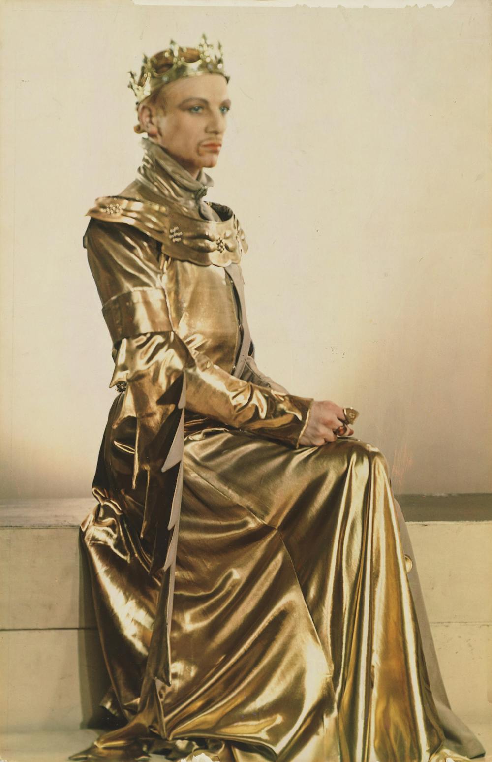
John Gielgud poses in an all-gold dress with a crown, looking to the right of the photograph. The colour is highly saturated.

John Gielgud as Richard II in Richard of Bordeaux by Yevonde (1933).
Courtesy of the National Portrait Gallery

From her teens, Yevonde was an advocate of women’s suffrage and was active in the Women’s Social and Political Union, the militant wing of the suffrage movement, from 1909.

However, a personal disinclination for suffragette lawbreaking (and the prison sentence that would likely follow) led her to champion women’s emancipation via a different route.

In her autobiography, In camera (1940), she remembers thinking at age 17: “I must earn my own living … To be independent was the greatest thing in life”.

It was an advertisement in suffrage newspaper Votes for Women, that gave Yevonde the idea that photography could offer economic independence.

Yevonde’s only formal training was an apprenticeship to Charlotte (Lallie) Charles (1911-13). Despite not finishing, and taking only one photograph throughout, it gave her the fundamentals to start a photographic business.

In 1914, having just turned 21 – and with some funding from her family – she opened her first studio.

Colour photography and innovation

Yevonde’s decision to set out on her own coincided with the decline of Lallie Charles’ studio. This reflected a widespread malaise in photographic portraiture, which was at that time stylistically confined to long-established conventions of black and white.
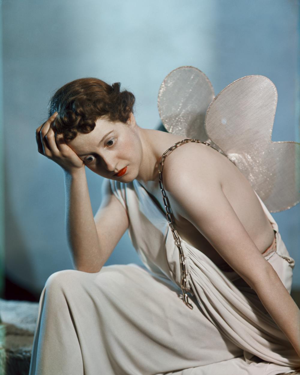
Dorothy Gisborne with her head in her hand wears a white robe dress and fairy wings, against a blue backdrop.

Dorothy Gisborne as Psyche, by Yevonde (1935). A recent discovery which is testament to the National Portrait Gallery’s ongoing research.
Courtesy of the National Portrait Gallery

She explained that clients were: “Getting tired of the pale soft … prints, tired of the artificial roses, of the Empire furniture … They grumbled at the lack of variety in the poses.”

Seeing an opportunity to try something different, she developed a more dynamic approach and style, establishing a moderately successful business despite the disruption of the first world war and a stint as a land worker.

But it was with the advent of Vivex – a technically demanding process for colouring photographs – around 1930, that Yevonde’s breakthrough came, despite strong resistance to colour photography from within the profession and potential clients.

“I started experimenting madly”, she remembered in her autobiography, “oblivious of the fact that people did not want such things.”

She believed that photographers had become:

So engrossed in the beauty of light and shade and in their deep velvety blacks and sparkling whites that they will tell you quite seriously that the colour photograph is unnecessary and unnatural.

At the same time, Yevonde was excited to discover that a few studios were beginning to explore the new process, despite feeling that their preoccupation with achieving naturalistic colour rendered everything “astonishingly unattractive”.

She declared that her priority was to use colour differently, to “produce a striking and original picture”.

Yevonde’s Goddesses Series
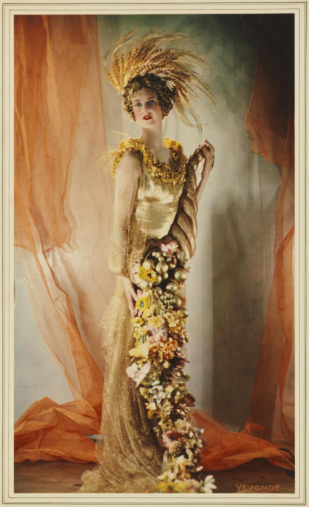
Lady Dorothy Warrender stands in a gold dress with a trading spring bouquet. She wears an orange feather headdress which looks like flames licking the crown of her head.

Lady Dorothy Warrender as Ceres by Yevonde (1935).
Courtesy of the National Portrait Gallery

Yevonde’s most famous project – the Goddesses Series of 1935 – was inspired by a charity ball. Soon after she photographed several society women in the guise of a mythological goddess. Each woman was furnished with props derived from Yevonde’s, sometimes whimsical, interpretation of their attributes.

For me, the series reveals both the extent and the limits of her pioneering spirit.

Despite her attempts to renegotiate the conventions of her time, Yevonde – ever the expedient businesswoman – was mindful of her client’s wishes, the majority of whom were female. As a result, many of her subjects align with the prevailing expectations of beauty and behaviour: looking sultry but with a submissive air, gazing wistfully out of the frame.

But in other examples, the women she photographed appeared liberated from the shackles of expectations for their sex. There’s daring composition and movement in the representation of Ariel and the confrontational gaze of Medusa.

In other work, an audacious use of saturated primary colour is highly effective, as in the portrait of actress Vivien Leigh.
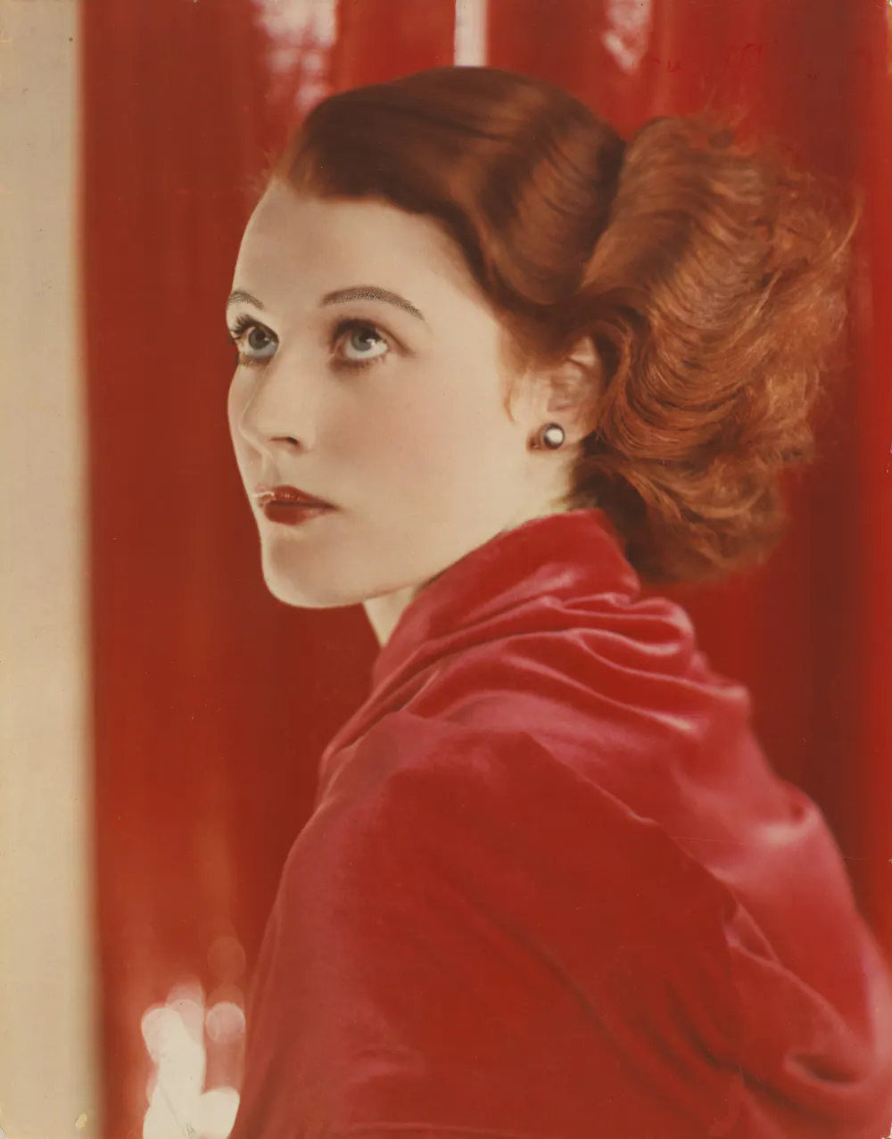
An all-red portrait of Joan Maude in close up. Her hair is red and waved, she wears a red shirt and stands against a red backdrop, looking skywards.

Joan Maude by Yevonde (1932).
Courtesy of the National Portrait Gallery

In her photograph of actress Joan Maude, a vibrant palette of reds is brought together in a single image. This shows an industrious photographer thrilling to the possibilities offered by the new colour technology.

Sadly, with the outbreak of the second world war, Vivex ceased trading and Yevonde was obliged to return to black and white.

Throughout her career, Yevonde sought to promote and motivate other women photographers, encouraging them to “come out and meet one another” and to “join the association” of photographers.

“We must see one another’s work and criticise, and, more important still, receive criticism,” she wrote in her autobiography, “or we shall never improve”.

Most previous exhibitions have favoured Yevonde’s Goddesses Series. The planned show at the reopened Portrait Gallery, however, will broaden the scope considerably and include some newly discovered works.

As much as I love Yevonde’s use of colour, I am looking forward to seeing her later portraits in black and white and her practice of bringing elements of surrealism into her portraiture and other commercial work.

Yevonde: Life and Colour will be at the National Portrait Gallery, 22 June to 15 October 2023.

Photographer is Shot at While Taking Photos of the Dallas Skyline

Photographer is Shot at While Taking Photos of the Dallas Skyline

Dallas skyline

A photographer had a terrifying incident while taking pictures of the Dallas skyline when men chased and shot at him.

Ron Shipp was on the Houston Street Viaduct over the Trinity River and believes a group of men targeted him for his camera equipment.

“I’ve been out here countless dozens of times,” Shipp tells NBC DFW. “Day and night and never once felt unsafe.”

However that changed on Wednesday, April 12 after he heard voices coming from beneath the bridge while out shooting at 23:00 and instantly felt unsafe.

“Probably within 30 yards of leaving my car I could hear voices in the shadows behind me,” he tells Fox 4. “I saw some movement but I couldn’t see people. It concerned me, but not a lot.”

“Every time I walked out, they kept coming closer and closer. They weren’t on the bridge, I knew that much,” he says.

“I looked over the bridge again and saw two men 20 yards away and I realized they were using the outside ledge and the handrail to kind of walk and approach me hidden down low.”

Shipp says the sight of two grown men going to that much effort to approach him in the dark really scared him.

When Shipp realized that there was a group of at least four men stalking him, he began to run toward downtown — that’s when he heard gunshots.

“I saw flashes from a handgun and heard six shots right in my direction, it motivated me to run much faster,” he explains.

Shipp avoided being shot and reported the incident to the police. He has gone public with his story to warn other photographers who frequent there for photos.

“Empty bridge does not mean you are safe,” he adds.

Shipp regularly sets his camera up from South Dallas to capture stunning landscape shots of downtown Dallas.

“This is one of my favorite and most frequent locations to visit,” he tells Fox 4. “Especially after dark when the city is lit up.”

Despite the scary episode he plans to come back to the bridge but this time with a group of photographers.


Image credits: Header photo licensed via Depositphotos.

Why Is Vermeer’s Girl with a Pearl Earring So Famous?

Why Is Vermeer’s Girl with a Pearl Earring So Famous?


Girl with a Pearl Earring, 1665, painted by Dutch Golden Age master Johannes Vermeer during the late 17th century must surely be one of the best-known paintings of all time, coming at a close second only to Leonardo da Vinci’s Mona Lisa, 1503. So much so, it has often been referred to as the ‘Mona Lisa of the North’. But what is it about this modestly scaled, enigmatic portrait that has attracted so much attention over the centuries? In part, the painting’s fame today is thanks to Tracy Chevalier’s bestselling fiction novel of the same name, published in 1999, which imagined the life of the girl behind the scenes, and in turn led to a Hollywood film adaptation in 2003, followed by a play is 2008. Meanwhile Banksy’s famed riff Girl with a Pierced Eardrum in 2014, is amongst numerous spoofs and spin-offs.

But the painting’s enduring appeal has far more than clever marketing to thank for its worldwide recognition. We look closer at some of the painting’s key qualities that have made it such an unassuming icon of art history

Vermeer’s Girl with a Pearl Earring Has an Enigmatic Quality

johannes vermeer girl with pearl earring dutch golden age
Girl with a Pearl Earring by Johannes Vermeer, 1665, via Mauritshuis, The Hague

The enigmatic mystery of Vermeer’s subject has been a subject of fascination amongst art historians and enthusiasts for many centuries. One of the most intriguing aspects of the painting is that no one actually knows who the sitter for the painting actually was. Instead, she is a ‘tronie’ or an imaginary character, which Vermeer has dressed up in sumptuous fabric and pearl earrings. Although a sitter would most likely have posed for the painting, many writers believe Vermeer has idealized his model to fit a particular type, giving her smooth, flawless porcelain skin, red, moist lips, and large, glistening eyes that meet ours with a soulful, intimate gaze. 

Vermeer’s Study Explores Dramatic Lighting

johannes vermeer's girl with pearl earring
Girl with a Pearl Earring by Johannes Vermeer, 1665, via Mauritshuis, The Hague

The dramatic, chiaroscuro lighting is one of the most striking and enduring aspects of Vermeer’s Girl with a Pearl Earring. Vermeer plays with how an almost black backdrop becomes the ideal setting for his young woman, who stands out like a spot lit actor on a stage. Raking, chiaroscuro light seems to stream in from the right, catching the young woman’s pale, luminous skin face and the shimmering drapery falling from her head, creating a crisp, clear illusion of volume in space. Vermeer pays particular attention to the light on the young woman’s eyes, lips, and the suspended pearl falling from her ear. Recent studies of Vermeer’s painting reveal that he had once painted in a green curtain behind her, before obscuring it with darker color to create a greater quality of mystery and intrigue. 

Get the latest articles delivered to your inbox

Sign up to our Free Weekly Newsletter

The Painting Looks Different from Vermeer’s Other Work

johannes vermeer milkmaid genre painting dutch golden age
The Milkmaid by Johannes Vermeer, c. 1660, via Rijksmuseum, Amsterdam

One of the reasons why Vermeer’s painting fascinates historians is because it is an outlier in Vermeer’s overall oeuvre. Although he only produced a small volume of paintings during his lifetime, his paintings have predominantly focused on interior scenes viewed from a distance, with features such as floor tiles, windows and furniture creating perspectival lines that pull us into the scene. While Vermeer often painted women alone in interior settings, this painting stands out for its closely cropped design, in which there is little to no background detail. Instead, the painting is a masterful exercise in simplicity, restraint, and elegance. 

The Painting Has Appeared in Many Book, Film and Art References

banksy girl with pierced eardrum
Banksy, Girl with a Pierced Eardrum, 2014

Vermeer’s Girl with a Pearl Earring was less popular than the artist’s other paintings during his day, and it was even lost for over 200 years! Since going on display at its current home in the Mauritshuis in the Hague in 1902, however, all this has changed. Chevalier’s novel, published in 1999 was an international bestseller which did much to publicize the painting, along with subsequent film and play adaptations respectively in 2003 and 2008. Following the success of Banksy’s mural in 2014, famously adorned with a facemask during the global pandemic, the Mauritshuis museum launched a competition in March 2023, titled My Girl with a Pearl, asking artists to reimagine the artwork in their own creative way, with some surprising and unexpected results including painting, photography, digital imaging, ceramics and felting.

Polish photographer Zofia Nasierowska is celebrated in today’s Google Doodle

Polish photographer Zofia Nasierowska is celebrated in today’s Google Doodle

You may have noticed that today’s Google Doodle (the logo atop the Google homepage) is a picture of a 35mm film camera celebrating Zofia Nasierowska, a Polish photographer who would’ve been celebrating her 85th birthday. Known best for her portraits of influential Polish people, her passion for the art form was influenced by her father from an early age. 

Considered one of the most significant Polish photographers of her years, Zofia picked up a camera aged just seven years old. Her father, Eugeniusz Nasierowski, was also a well-known photographer, and just four years after she started learning photography she landed her own exhibition. 

• Check out the best film cameras from years gone by that are still popular today

Although her love for photography started close to home, the young photographer continued to expand her love for the subject at the Leon Schiller National Film School in Lódź, Poland, where she photographed many of her peers. 

Some of Nasierowska’s most famous portraits include a photo of Barbara Brylska, a Polish actress who appeared in Pharaoh and Irony of Fate, Polish actor and comedian Jan Kobuszewski, and the Polish singer / actress Kalina Jędrusik. 

All her photos were shot in black-and-white and, in one particular self-portrait, she can be seen using a Praktisix medium format camera – which appears to be the camera on which the Google Doodle is modeled, with a portrait of Nasierowska in the viewfinder. 

Although the photographer died in 2011 after a battle with brain cancer, her photography career spanned 35 years, only ending when she developed an eye disease. She continued to work with photographers and inspire a new generation – so much so that a Librabry in Elk, Poland, was named after her. 

She may not be as well known as some of the other photographers of her era, such as Cindy Sherman, Annie Leibovitz or Robert Mapplethorpe, but she is still remembered as one of the greatest Polish photographers of all time thanks to her movie star-style portraits. 

If you enjoyed this article, check out the 50 best photographers ever including Ansel Adams, Henri Cartier-Bresson and Vivian Maier, along with the best film for your camera.

Reimagining Circular Design With a Perfectly Suited Collaboration Between Aquafil + noho

Reimagining Circular Design With a Perfectly Suited Collaboration Between Aquafil + noho

With Earth Day barely in our rearview mirrors, there may be no better time to highlight ECONYL®, a brand that’s been reimagining what eco-design looks like since 2011. Design plays such a large, important role in our everyday lives – from products to systems to services – and the brand has always sought to connect with those doing the creating. While our abilities to design and buy new products are limitless, the planet’s resources are not. But with ECONYL®’s regenerated nylon it’s possible to have both. “Innovation is a key part of securing a company’s future. It should always be coupled with sustainability for representing a key driver of profit and long-term growth for many of today’s businesses,” said Giulio Bonazzi, president and CEO of Aquafil Group, the company behind ECONYL®.

Photo: Aquafil

When it comes to the ecological impact of a product, 80% is determined during the design phase, making it crucial that we examine how products are produced and consumed from the start. Using ethical, sustainable principles and materials is essential to moving closer to the end goal of a circular economy, and we can continue the journey by “designing out waste and pollution,” keeping products and materials in use longer, and regenerating natural systems. For these reasons – and many more – Aquafil is focused on collaborating with brands to reimagine products for a better future.

regenerated nylon being made

Photo: Aquafil

ECONYL® regenerated nylon provides the high performance and durability brands have been relying on since hosiery became popular in the 1940s. Since then, the extremely versatile material has expanded into interior design, automotive manufacturing, and beyond for its unparalleled ability to be stretched and molded. Standard nylon comes at a high price to the environment, but ECONYL®’s regenerated nylon is a kinder choice that can be made without sacrificing on performance or durability. The brand goes to long lengths to collect and recycle nylon waste that includes carpets, fishing nets, and fabric scraps. All of it is depolymerized back into its raw form – caprolactam – during a chemical recycling process. It’s then polymerized once more, resulting in 100% usable nylon that can make new products. And because it’s infinitely regenerable, it can all happen again and again and again.

spools of various colors of regenerated nylon

Designers can understandably be a bit apprehensive about using recycled material, but customers who have created with ECONYL® nylon are pleasantly surprised. It’s chemically identical to nylon sourced from oil, has the same performance characteristics, there’s no downgrade in quality, and the solution-dyed yarn is bleach and fade resistant. ECONYL® nylon can be used in any product where nylon 6 is used: apparel, carpets, industrial ropes and cables, sunglasses, and even as a filament in furniture or 3D printing.

Brands around the world are finding value in regenerated nylon for its high performance and lower embodied carbon than its oil-sourced counterpart. Its regenerative properties can empower designers to reimagine their creative process by designing with the end in mind. Encouragement lies not only in the replacement of materials, but also with the possibilities of products that can be easily dismantled and reused again in a circular economy. The creative opportunities and possibilities are limitless.

modern black dining chair on white background

noho, a sustainable furniture company based in New Zealand, was on the hunt for a recycled, earth-friendly, raw material for an innovative chair design. ECONYL® regenerated nylon fit the bill, and soon a collaboration was launched by the two brands to create the noho move™ chair. “We love seeing ECONYL® nylon being used in innovative ways, especially now being sourced by an inventive company like noho, the first furniture brand in the world to see waste plastic as a long-term furniture solution,” said Bonazzi.

a dining table with two people surrounded by white modern dining chairs overlooking a large body of water

Designed by Formway, Lead Designer Paul Stevenson, shared, “I think we started working on noho move in 2014, and in all there were probably about three years of pretty intense design development, followed by two years of testing to meet furniture standards and get noho move ready for production.”

After observing the many different ways people use their dining room tables, the team came up with a plan for the chair. “We started building prototypes that had the types of movement we thought people would need. We saw a lot of leaning forward toward the table, so we wanted to make the seat respond to that by tipping forward with you. Lots of times when people were talking they would lean back to listen, then lean in to speak,” said Stevenson. “We know from our previous research that that movement is really healthy for your spine, so we wanted to integrate that as well.”

modern white chair at a desk with computer monitor

“For us, the idea to create a singular seamless motion was key, we really wanted to tie the movements together, and that’s where the idea for the auxetic shell started to come in, it had to be flexible but still supportive to fit people of different shapes, sizes, and ages,” Stevenson explained. Prototypes were then set up in people’s homes and filmed while in use. From the footage Formway was able to gather even more data about how people move during different activities to map out their posture and motions. In the end, it made for a better product that the user could comfortably enjoy.

The final challenge came when it was time to make the ergonomics aesthetically appealing in the home. Stevenson said, “We really wanted the chair design to be clean and simple so that it looks good at a dining table, but it still had to allude to the performance we had integrated. We wanted to show that it’s a moving, flexing, comfortable chair. I think we achieved that with noho move and I’m really proud of it.” The team at noho appreciated being able to work directly with the nylon scientists and technicians at Aquafil, with the two brands truly supporting one another throughout the process. noho move was successfully launched in 2020.

modern black dining chair with a lit fireplace in the background

The noho move chair is a concrete example of how high design and the sustainability of ECONYL® nylon can coexist. “noho found meaningful alignment with Aquafil, as both our companies are on a mission to produce products that reduce harm to our planet through thoughtful design and the implementation of sustainable materials,” added Bonazzi. “The noho move chair is revolutionizing residential seating design by addressing issues of health, movement, multifunction, and sustainability in monumental ways, while also pushing the boundaries and performance capabilities of the material. This is part of noho’s DNA, and I firmly believe they will amaze us with other beautiful pieces of sustainable design.” You can make the noho move chair part of your own space through ECONYL®’s e-shop.

Moving forward, industries will continue to move toward sustainable ingredients like ECONYL® nylon. Bonazzi said, “The interior design and furniture industries, as well as the textile industry, will have to be sustainable both socially and environmentally in order to survive. There are lots of issues to be considered and lots of challenges to face. It will be a long and hard journey, but starting with the right materials (and for sure, ECONYL® nylon is on the top of the list) is part of the solution.”

Learn more about recycled, sustainable ECONYL® regenerated nylon and its capabilities at econyl.com.

Kelly Beall is senior editor at Design Milk. The Pittsburgh-based graphic designer and writer has had a deep love of art and design for as long as she can remember, and enjoys sharing her finds with others. When undistracted by great art and design, she can be found making a mess in the kitchen, consuming as much information as possible, or on the couch with her three pets. Find her @designcrush on social.

‘Street photography’ focus of next Delta Photo Club workshop

‘Street photography’ focus of next Delta Photo Club workshop

Acclaimed photographer and long-time Delta Photo Club member Jean-Francois Cleroux will be offering an “Introduction to the Art of Street Photography” for the club’s next online workshop.

Happening Wednesday, May 3 on Zoom, Cleroux’s two-hour class provide a quick history of street photography, discuss what street photography is and is not, as well as “why it’s important for you to understand what street photography is for you,” according to the event’s description.

Cleroux will also cover being comfortable photographing people,“you and the law,” gear and settings, as well as the compositional and artistic elements that make for great street photography.

An internationally award-winning photographer, instructor and photo judge, Cleroux has been doing photography since eighth grade. His images have been published in magazines in Europe, India and North America, including on the covers of Popular Photography and Photo magazines. He has exhibited works in Canada, the U.S. and India, and has taught in Europe and in America.

“Francois loves creating images from very simple minimalist works to very large complex installations. Although most of his artistic projects are personal and not shared, he has created ‘tabulaRASA,’ a photographic artists collective, which helps other artists create, cultivate and refine their works and projects,” reads a bio included with the event’s description, adding he has also started a photographic artists mentorship program.

SEE ALSO: Echoes of George Floyd death in Charles Campbell’s new ‘Ocean to Livity’ art show in Surrey

In recent years, Cleroux has pursued his passion for street photography, establishing streetsihavewalked.com to promote street photography in the Vancouver area and offering a free self-paced street photography class.

For DPC members in good standing, this upcoming session will be followed with outings guided by Cleroux, as well as a show-and-tell session with him to discuss images taken during the outings and submitted by club members.

“An Introduction to the Art of Street Photography” will take place on Wednesday, May 3 from 7:30 to 9:30 p.m. via Zoom.

To attend, you must either be a member of the Delta Photo Club (memberships cost $40/year for individuals, $70 for families, and $25 for youth and students; join by filling out the form at deltaphotoclub.com/member-sign-up-form) or, to join as a guest, send an e-transfer of $10 to treasurer@deltaphotoclub.com by noon on May 3 (please include your name, email address and club affiliation with the transfer).

For more info about other upcoming club events, visit deltaphotoclub.com/workshops.

To learn more about the Delta Photo Club or using the Zoom platform, email president@deltaphotoclub.com.

SEE ALSO: Happening around Delta: week of April 20


editor@northdeltareporter.com

Like us on Facebook and follow us on Twitter

DeltaPhotography

‘Street photography’ focus of next Delta Photo Club workshop – Surrey Now-Leader

‘Street photography’ focus of next Delta Photo Club workshop – Surrey Now-Leader

Acclaimed photographer and long-time Delta Photo Club member Jean-Francois Cleroux will be offering an “Introduction to the Art of Street Photography” for the club’s next online workshop.

Happening Wednesday, May 3 on Zoom, Cleroux’s two-hour class provide a quick history of street photography, discuss what street photography is and is not, as well as “why it’s important for you to understand what street photography is for you,” according to the event’s description.

Cleroux will also cover being comfortable photographing people,“you and the law,” gear and settings, as well as the compositional and artistic elements that make for great street photography.

An internationally award-winning photographer, instructor and photo judge, Cleroux has been doing photography since eighth grade. His images have been published in magazines in Europe, India and North America, including on the covers of Popular Photography and Photo magazines. He has exhibited works in Canada, the U.S. and India, and has taught in Europe and in America.

“Francois loves creating images from very simple minimalist works to very large complex installations. Although most of his artistic projects are personal and not shared, he has created ‘tabulaRASA,’ a photographic artists collective, which helps other artists create, cultivate and refine their works and projects,” reads a bio included with the event’s description, adding he has also started a photographic artists mentorship program.

SEE ALSO: Echoes of George Floyd death in Charles Campbell’s new ‘Ocean to Livity’ art show in Surrey

In recent years, Cleroux has pursued his passion for street photography, establishing streetsihavewalked.com to promote street photography in the Vancouver area and offering a free self-paced street photography class.

For DPC members in good standing, this upcoming session will be followed with outings guided by Cleroux, as well as a show-and-tell session with him to discuss images taken during the outings and submitted by club members.

“An Introduction to the Art of Street Photography” will take place on Wednesday, May 3 from 7:30 to 9:30 p.m. via Zoom.

To attend, you must either be a member of the Delta Photo Club (memberships cost $40/year for individuals, $70 for families, and $25 for youth and students; join by filling out the form at deltaphotoclub.com/member-sign-up-form) or, to join as a guest, send an e-transfer of $10 to treasurer@deltaphotoclub.com by noon on May 3 (please include your name, email address and club affiliation with the transfer).

For more info about other upcoming club events, visit deltaphotoclub.com/workshops.

To learn more about the Delta Photo Club or using the Zoom platform, email president@deltaphotoclub.com.

SEE ALSO: Happening around Delta: week of April 20


editor@northdeltareporter.com

Like us on Facebook and follow us on Twitter

DeltaPhotography

Cheat sheet: Five factors that affect exposure in photography

Cheat sheet: Five factors that affect exposure in photography

Aperture is just one of the factors that controls exposure – and the amount of light that creates the image on the camera’s CMOS sensor. In fact, there are five different factors that make up the right exposure for your photographs. To understand how the factors work together, it can help to think of exposure as being similar to filling a cup with water…

Click the top-right-hand corner of the image to enlarge (Image credit: Future)

(opens in new tab)

Think of the aperture is how far the faucet is turned on – do you want a trickle or a torrent? Think of shutter speed as the amount of time the tap is left turned on. It works hand in hand with aperture – you can have the tap on full for a short time,
or open just a little bit for longer to get the same volume of water. The ISO sensitivity setting is like the size of the glass. For short exposures, choose a small cup! Exposure is also dependent on the light intensity; This is like the water pressure – and this affects how far the tap is turned on, and for how long. Finally, exposure is not all about science – it is also about artistic interpretation. Exactly how full do you prefer your cup of water to be?

Altering the aperture is one of the photographer’s most potent  weapons, but this apparently simple control can lead to confusion. The exact setting used can create varied – and seemingly contradictory – effects. And then there is the peculiar number scale used – the numbers themselves appear randomly generated, and arranged in the wrong order!

First and foremost, the aperture is a simple hole – an opening that can be varied in size, so as to control the amount of light reaching the camera sensor. Used in conjunction with shutter speed (the length of time the sensor is exposed to light), the aperture lets you match the exposure to the brightness of the scene. The wider the hole, the more light that is let in – helping you to compensate for darker conditions, say, or letting you use a faster shutter speed.

The aperture is not actually in the camera – but in the lens. As a mirrorless camera’s or DSLR’s lens is interchangeable, the range of aperture settings available varies depending on the particular lens used. Notably, expensive lenses tend to have significantly wider maximum apertures than budget zooms.

What frustrates everyone new to photography is the f/stop scale used to measure the size of the aperture. The strange numbering system, however, is not random. The first thing to realize is that the numbers are not integers, but fractions. So f/4 is not 4 but a quarter.

Read more
The exposure triangle explained (opens in new tab)
How to understand f-stops (opens in new tab)
How to understand ISO settings (opens in new tab)
Photography tips (opens in new tab)
Photography cheat sheets