Visual Vernaculars: An Ode to Everyday Images | Magazine

Visual Vernaculars: An Ode to Everyday Images | Magazine

Over the last year, MoMA’s Department of Photography has been home to the poet Robin Coste Lewis, who joined us as part of the inaugural cohort of Ford Foundation Scholars in Residence. During her residency, Coste Lewis expressed an interest in the Museum’s holdings of vernacular photography. Her recent book, To the Realization of Perfect Helplessness (2022), is a genre-bending exploration of poetry, photography, and human migration through a personal meditation on the photographic vernacular of her own family.

With the support of curatorial assistant Antoinette Roberts, Coste Lewis and I worked through the Museum’s expansive holdings of vernacular photographs—encountering elaborate albums, intimate portraits, touching snapshots, and even “trick pictures” that playfully anticipate the formal photographic interventions popular among the European avant-garde. MoMA’s collection gallery Visual Vernaculars unites photographs such as these alongside a selection of works inflected by the logic of the everyday. The artworks on view in this gallery inspired Coste Lewis to write a number of texts, which appear below. Speaking directly to the pictures on view, her poetic ruminations reveal the role of photography in the construction of a self-image, giving form to interrelated social identities, relationships, and communities.
—Oluremi C. Onabanjo

Unidentified photographer. Untitled. c. 1900

Unidentified photographer. Untitled. c. 1900

From left: Unidentified photographer. Untitled. Late 1840s; Unidentified photographer. Untitled. 1860s

From left: Unidentified photographer. Untitled. Late 1840s; Unidentified photographer. Untitled. 1860s

The mother has been a recurring figure throughout human history. Goddesses, Divinities, the One Who Gives Birth to the entire universe. Images, objects, epics, and hymns that exalt the maternal saturate every aspect of artistic engagement regardless of location, continent, time period, or medium. With the advent of photography in the 19th century, this artistic phenomenon continued from the earliest of photographic technologies: daguerreotypes and ambrotypes. And because of the accessibility photography offered—and still offers—to everyday people, photography’s vernacular historical record is saturated with images of mothers of all kinds.

From left: Blanche Parker. The Story of My Life and Friends as Told by Snapshots from Fourteen On. 1916–23; Unidentified photographer. Untitled. c. 1945The Story of My Life and Friends as Told by Snapshots from Fourteen On. 1916–23. Album page with collaged gelatin silver prints and papers with handwritten captions, 10 × 13" (25.4 × 33 cm). The Museum of Modern Art, New York. Gift of Peter J. Cohen; Unidentified photographer. Untitled. c. 1945. Gelatin silver print with ink, 4 1/2 × 3 1/16" (11.4 × 7.8 cm). The Museum of Modern Art, New York. Gift of Peter J. Cohen” data-image-overlay-item data-image-overlay-src=”/d/assets/W1siZiIsIjIwMjMvMDgvMDIvNDYxdzU1N211ZV80X2FuZF81X1JDTC5qcGciXSxbInAiLCJjb252ZXJ0IiwiLXF1YWxpdHkgOTAgLXJlc2l6ZSAyMDAweDIwMDBcdTAwM2UiXV0/4%20and%205%20RCL.jpg?sha=a0e760ab9eac8e3f” tabindex=”0″ ontouchstart onerror=”window.MoMA.onImageError(this, 1)”>

From left: Blanche Parker. The Story of My Life and Friends as Told by Snapshots from Fourteen On. 1916–23; Unidentified photographer. Untitled. c. 1945

Our family albums tell us who We are together. They are also the crumbs we leave on the forest ground for future generations to discover—in order to find their ways home. In photo albums, the Me transforms these images into the We. This was and remains the primary gift of photography’s democratizing force. Suddenly, with the advent of the camera, an entire flurry of images—cheap and reproducible—were at our fingertips. Beauty was no longer reserved solely for the walls of libraries and museums, whose collections had always been private, reserved for the upper classes. Now, with photography, absolutely anyone could walk into the frame. This is especially evident in photo albums. A photo album is a private museum and a self-published book all braided into one. And because they were preserved—for us—these albums are also now rare historical objects who tell us who We once were—and were not.

Jonathan Monk. One Moment in Time (Kitchen). 2002One Moment in Time (Kitchen). 2002. 35mm slide projection, 7 min. The Museum of Modern Art, New York. Fund for the Twenty-First Century. © 2023 Jonathan Monk” data-image-overlay-item data-image-overlay-src=”/d/assets/W1siZiIsIjIwMjMvMDgvMDQvMnU4ZGthNHJ4bF82MzZfMjAwNl94MV9nZ19SSUNSX0Z1bGxfc2l6ZV9KUEVHLmpwZyJdLFsicCIsImNvbnZlcnQiLCItcXVhbGl0eSA5MCAtcmVzaXplIDIwMDB4MjAwMFx1MDAzZSJdXQ/636_2006_x1_gg_RICR-Full%20size%20JPEG.jpg?sha=125b9b08f7f868e5″ tabindex=”0″ ontouchstart onerror=”window.MoMA.onImageError(this, 1)”>

Jonathan Monk. One Moment in Time (Kitchen). 2002

Visual Vernaculars is on view in MoMA’s fifth-floor collection galleries through August 2024.

Black Cork and Teak Combine to Form the Cross Collection

Black Cork and Teak Combine to Form the Cross Collection

Designed by French designer Patrick Norguet for outdoor decor brand Ethimo, the new Cross collection is sure to elevate, and harmonize with, your current outdoor space. Named after the tables’ bases, the collection is made with FSC-certified teak wood and black cork, a combination of natural materials that lend a demure, elegant aesthetic to the series. The three low tables also borrow their shape from the natural environment and, therefore, can seamlessly blend into any outdoor settings.

three tables made from black cork and teakwood

three tables made from black cork and teakwood

three tables made from black cork and teakwood

table made from black cork and teakwood

table made from black cork and teakwood

table made from black cork and teakwood

close up of three tables made from black cork and teakwood

three tables made from black cork and teakwood

As the Lifestyle editor, Vy Yang is obsessed with discovering ways to live well + with intention through design. She’s probably sharing what she finds over on Instagram stories. You can also find her at vytranyang.com.

Photographer moves in downtown Sioux Center

Photographer moves in downtown Sioux Center

SIOUX CENTER—A portrait and wedding photographer has found a new studio space downtown Sioux Center.

What was home for several decades to the quilting and fabric store Roelofs at 24 Third St. NW has been transformed into a picture-perfect space for Becky Vanden Brink, 33, of Sioux Center, owner of Picture This Photography.

Mid-July marked the opening of her studio that took a few months from her late spring lease start for the city-owned building to turn it into a picturesque location. While no walls were removed or added, everything inside was pulled out, including all the shelves and cork boards lining the walls.

Vanden Brink credits her husband, Alec, for creating her industrial concrete floors by removing the worn carpet, sanding and polishing it to give its current shine. The couple also painted every interior wall white. They also removed the Roelofs awning from the exterior and patched and painted that area black.


Picture This Photography studio

What was home for several decades to the quilting and fabric store Roelofs at 24 Third St. NW has been transformed into a picture-perfect space for Becky Vanden Brink of Sioux Center, owner of Picture This Photography.


A sign for the business at that property is coming soon.

“The space is what I love the most and the lighting is awesome,” Vanden Brink said. “As I was thinking about the future of my business, I needed space to grow and I can do that here.”

Vanden Brink said a potential move away from the community about a year ago that didn’t end up happening prompted her review of where she wanted to take her business.

“I had considered just stopping my business if we were to move, but by choosing to stay here, I felt a change or revision in what I’m doing was needed for me to keep going,” Vanden Brink said.

She started Picture This Photograph with a partner 13 years ago. Along the way she became the sole owner and for the past seven years she’s used a 600-square-foot space above the detached garage of her Sioux Center home as her studio.

Such limited spacing has meant a lot of set up and take down of scenes and finding other storage locations for her many props. While she enjoys outdoor settings, having an indoor setting is necessary for Iowa winters — and sometimes the cold of the fall and spring.

“I also have struggled with my studio being at home; it’s hard to separate home from work or work from home,” Vanden Brink said. “While the commute was great, not having the separation has caused some stress.”

Finding a 2,500-square-foot location allows Vanden Brink to have various scenes or backdrops set up at once so studio photography sessions can move from one location to the next within the studio instead of needing to wait for her to change the set up.

“I work with a lot of kids or have siblings come along to a newborn session; now there’s more space for children to play and even run around and get their energy out while a sibling is having their picture taken,” she said.

There’s also plenty of space to keep her photography props in one location.

The extra space to expand what her business can offer is another benefit as Vanden Brink considers the idea to offer fine arts portraits, prints and offering custom framing for everyone.

“I love details and with framing there are so many options,” she said. “I want to be able to provide a high quality product and fill a need I see in the community.”

As with her previous studio, the new space is open by appointment only.

“It’s different not having the studio just out my back door but really it’s only a few blocks away,” she said. “The couple of sessions I’ve had in here already were great. I just loved the space and the lighting; there’s a few tweaks I had to make but I see this space really fitting my needs as my business continues.”

Gov. JB Pritzker in Schaumburg Friday to sign bills expanding protections for Native Americans

Gov. JB Pritzker in Schaumburg Friday to sign bills expanding protections for Native Americans

Gov. JB Pritzker signing bills in Schaumburg to expand protections for Native Americans


Gov. JB Pritzker signing bills in Schaumburg to expand protections for Native Americans

00:35

CHICAGO (CBS)– Governor JB Pritzker will be in northwest suburban Schaumburg Friday signing bills that expand protections for Native Americans in Illinois.

He’s signing the bills at 2:30 p.m. at the Trickster Cultural Center, a gallery dedicated to contemporary Native American art.

The Governor’s office didn’t specify which bills he is signing, but state lawmakers did pass a bill requiring elementary and high schools to teach Native American history starting in the 2024-2025 school year.

Another bill passed would protect the graves of Native Americans and create a cemetery for the reburial of Native American ancestors.

F5: Jacu Strauss’ Favorites Include Both Traditional + Contemporary Alike

F5: Jacu Strauss’ Favorites Include Both Traditional + Contemporary Alike

Creative Director of Lore Group, Jacu Strauss uses exploration and experimentation to showcase the beauty, characteristics, and context of each project he brings to life. The destination where the property sits is just as important as everything else during his design process. While designing both Pulitzer Amsterdam and Riggs Washington DC hotels, Jacu actually relocated to each city to ensure that each property properly reflected the communities around them. Now that’s dedication.

“My baptism for hospitality design happened once I finished the Pulitzer in Amsterdam, only the second hotel I have ever worked on,” Jacu said. “It was a once-in-a-lifetime project with many challenges, but we overcame all the complexities with clever and unique solutions, and with a great attitude all the way. It was when this hotel opened, and seeing people’s delight when they walked in, that I realized that I wanted to design more and more unique hotels in wonderful (often unloved) buildings in amazing locations.”

Jacu and his team led the complete redesign of the award-winning Dutch hotel, Pulitzer Amsterdam, and Lore Group’s U.S. properties, Riggs Washington DC and Lyle. Most recently the team has overseen the redesign, refurbishment, and launch of One Hundred Shoreditch, a well-known hotel in East London. Jacu and his team even design and create bespoke furniture, fixtures, and equipment for each project.

Jacu Strauss

Though firmly entrenched in the hospitality design industry, Jacu said that if he ever made a pivot to another creative medium it would be jewelry design, or anything to do with gemstones. “I grew up in an area famous for diamonds and gold and other precious natural gems, so I was always exposed to the beauty and diversity of all these bright and colorful things coming from mother earth, and how there is beauty in its raw forms and how through craft and human hands this beauty becomes a celebration.”

Currently London-based, Jacu has lived in several countries, beginning his architectural training in New Zealand and going on to study at the Bartlett School of Architecture and Westminster University in London.

Today, we’re happy to have Jacu Strauss joining us for Friday Five!

a collection of busts and statues in a styled space

1. My Collection of Busts + Statues

I have a certain obsession with Greek and Roman antiquities, particularly busts and statues. I love these sections at museums. I have several examples, mostly reproductions, but I do have one from 1 or 2 BC where the face is long gone but the silhouette is enough of a “Memory” to recognize it being a statue of a man. I am intrigued by these imperfections caused by time that adds to the mystery and beauty. My other favorite is a meter tall bust of Antinous, the lover of Emperor Hadrian. He is a 60’s reproduction done for some fair. I bought him in the US and had him shipped over, where sadly his head broke off! But thanks to Rebekah Dunsmuir, he has been perfectly restored.

museum wing with columns and statues

Photo: Gareth Gardner

2. Sir John Soane’s Museum in London

Just a magical museum showcasing the lifetime collection of English Architect Sir John Soane (1753-1837) in his London house. It is like a treasure cave, and unlike museums in general there is something particularly charming about the clutter in a domestic setting – loads of “grand tour” ancient pieces from Greece, Rome, Egypt and beyond. It resonates with my passion for collecting things on my journeys. I also like how he came up with certain “tricks” to display items, like the folding panels of art in his art room and how he used skylights (big and small), often through colored glass, in various rooms.

light-skinned man wearing white and brown clothing sits in a red heart-shaped chair

3. Verner Panton Heart Cone Chair

This is one of my favorite chairs of all time, it was designed in the 60s. I think it goes with almost all interiors as the ideal hero piece, I have used it in several different projects and it always works. It is also surprisingly comfortable and I think anyone sitting in one feels extra special.

an illuminated column table lamp with frilled edges in a styled space

4. Georgia Jacob’s Athene Lamps

I adore these lamps from the 70s. The shapes and pinkish beige tones and the light source are fantastic and they look great during the day, too.

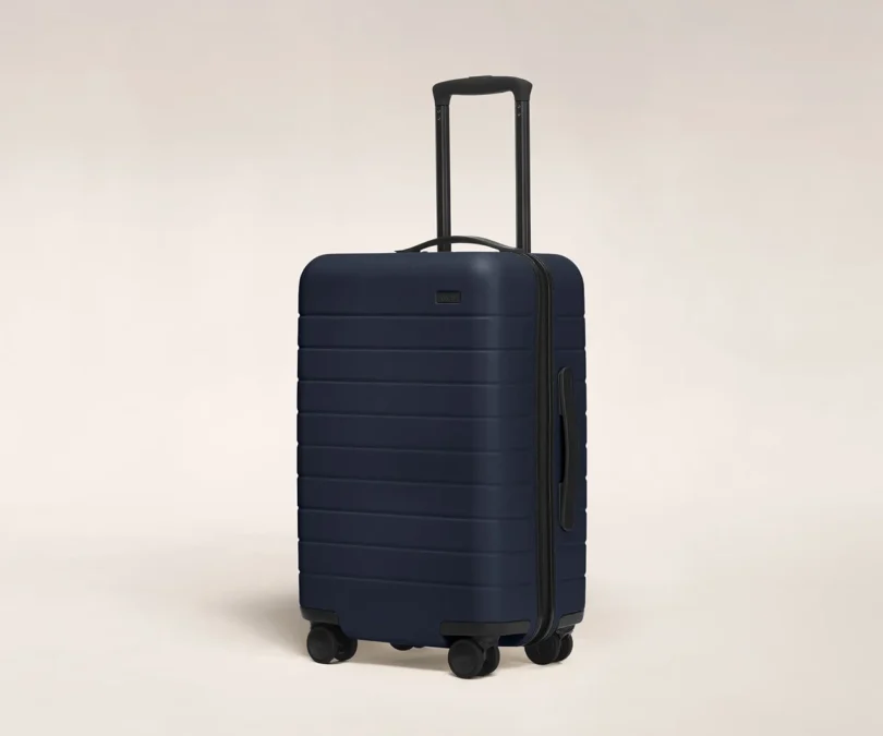
hardshell carry-on suitcase on a white background

5. Travel Items

It is hard to sometimes justify expensive luggage and travel pieces, but it makes all the difference. I love great travel cases by Rimowa and Away, long-term investments that make traveling a thousand times more tolerable, I especially love them even more with some wear and tear over the years. I also love British brand Smythson, they are fun and the quality and practicality are spot on. I have their Panama wallet in orange and a navy Passport holder – a gift from a friend when I became British earlier this year – and both are just perfect. The travel wallet even holds some sachets of Tabasco that I simply cannot travel without.

Work by Jacu Strauss:

interior space with an arched doorway made out of stacked books

Pulitzer Photo courtesy of Lore Group

hotel lobby bar with red statement lighting, large wall art, and various seating areas

One Hundred Shoreditch Lobby Bar Photo courtesy of Lore Group

open interior space with large windows, modern low bench seating, and small table lamps scattered throughout

One Hundred Shoreditch Photo courtesy of Lore Group

Kelly Beall is Director of Branded Content at Design Milk. The Pittsburgh-based writer and designer has had a deep love of art and design for as long as she can remember, from Fashion Plates to MoMA and far beyond. When not searching out the visual arts, she’s likely sharing her favorite finds with others. Kelly can also be found tracking down new music, teaching herself to play the ukulele, or on the couch with her three pets – Bebe, Rainey, and Remy. Find her @designcrush on social.

Tim Brown is helping to restore a 170-year-old photography style

Tim Brown is helping to restore a 170-year-old photography style

Editor’s note: An untold number of unheralded artists live in Colorado, those creators who can’t (or don’t want to) get into galleries and rely on word of mouth, luck or social media to make a living. You’ve likely seen them on Instagram, at festivals or at small-town art fairs. This monthly series, Through the Lens, will introduce you to some of these artists.


Tintype photographs conjure up images of the Old West or soldiers heading out to fight in the Civil War. They evoke a sense of history, nostalgia and a glimpse into the past.

Salida-based Tintype photographer Tim Brown said the process, which was developed in the 1850s, was practically extinct 20 years ago. With the heavy cameras, use of complex chemicals, a complicated multistep procedure and the development of newer camera equipment, the art form was disappearing quickly.

But it is experiencing a renaissance, Brown said.

Subject Corey Hubbard is upside down in the view finder of tintype photographer Tim Brown’s large wet plate camera in his studio in Salida on March 20, 2023. When using the large tintype, or wet plate cameras, the image is upside down when viewed from the back of the camera making it more difficult to compose. In order to see and focus the image, Brown uses a black cloth to block out the light and a photographic loupe to check on the sharpness of the image. (Photo by Helen H. Richardson/The Denver Post)

“People are always blown away by the wet plate process, especially when they see their portrait develop in front of their eyes in the darkroom,” said Brown. “The emotional response to witnessing your tintype come to life can be very compelling, even cathartic. I’ve had clients in tears in my dark room.”

Clients end up with a unique photograph made of silver on tin that they get to take home with them.

“Tintypes can last hundreds of years. My portraits become heirlooms that will be passed down for generations to come. How cool is that? I love offering something tangible to my clients versus digital files that you can’t really touch.”

We asked Brown some questions about his craft. (This interview has been edited for length and clarity.)

Q: How would you describe your art?

A: Unique and compelling. The portraits are created using a wet plate collodion process called Tintype photography. It was invented in England by Frederick Scott Archer in the 1850s. Many images from the Civil War were Tintypes.

As little as 20 years ago, there were just a handful of people in the entire world doing this. Because it had gone by the wayside, there were only books and notes from the late 1800s that described the process and how to do it.

The chemicals used are very toxic and dangerous if handled improperly and this, I believe, is what keeps a lot of people away from learning. There are now workshops available, and wet plate collodion businesses that sell the chemicals and supplies.

image
Tintype photographer Tim Brow styles flowers around Corey Hubbard’s face as she poses while getting her photograph taken in his studio in Salido on March 20, 2023. Brown says that the experience of getting a tintype photograph is fun and unique. “It’s rare that people don’t leave with a new appreciation of the process,” he says. Clients can choose from a collection of hats or clothes and other objects in his studio to add interesting elements to the photograph. (Photo by Helen H. Richardson/The Denver Post)

Q: Briefly explain your process.

A: Before plastic and film, photographers would prepare a plate in the darkroom (metal=tintype, glass=ambrotype) using chemicals to make the plate a light-sensitive negative. The plate is then inserted into a lightproof holder, placed in the camera for exposure, then developed in the darkroom. This process involves coating a piece of tin with liquid silver and other chemicals, to create a light-sensitive negative. The negative is then exposed using my vintage cameras and lenses (hand-made in Europe in the mid-1800s) that I have collected over the years.  Once exposed, the negative is developed using the historic chemical process to create stunning, one-of-a-kind portraits. The process takes about 10 minutes. If the plate dries before it is developed, it will not turn out. So all tintypes must be created, exposed and developed fast before the plate dries. After the plate is washed and dried, it is varnished to protect the plate from tarnishing and/or damaging the silver. The end result is a photograph made of silver on tin that will last hundreds of years.

In taking the images, the process can be cumbersome. The field cameras are large and clunky. There is nothing automated about the cameras, they are 100% manual. Focusing is difficult and composition takes time. Exposures are long. Typically I’m exposing my plates somewhere between two and eight seconds. Any movement with the camera or the subject and everything will be blurry. This process reacts to light much differently than modern photography. It’s most sensitive to ultraviolet light. Among other things, that means that anything on the cool or blue spectrum goes lighter and anything in the warm or red spectrum goes darker. This can really affect the tones in the image.

Things can easily go wrong. Temperature, humidity and contamination all play a role in maintaining your chemicals, and sometimes issues come out of nowhere and take a while to figure out.

image
Tintype photographer Tim Brown processes the tintype photograph of Corey Hubbard in his darkroom in Salida on March 20, 2023. Any step from beginning to end when using the sometimes toxic chemicals can ruin an image. The last step of the tintype process is using a fixer. Historically, tintype photographers used potassium cyanide as a fixer, but today some prefer to use sodium thiosulfate, which is less toxic. Brown uses a mixture with diluted cyanide which helps to develop the image. (Photo by Helen H. Richardson/The Denver Post)

Q: How do you work?

A: I use my studio almost like a theater space. Clients have a selection of items from hats, clothes and other things they can dress in to make the photos more interesting, fun or dramatic. Oftentimes they bring their own items to wear. This helps clients create personalities for their images. I have done pop-ups in a field where clients want on-location images.

image
Tintype photographer Tim Brown and client Corey Hubbard look at the processed photo of Hubbard in Brown’s darkroom in Salida on March 20, 2023. (Photo by Helen H. Richardson/The Denver Post)

Q: What’s your background?

A: I’ve been a self-taught professional photographer for 41 years. Before wet plate collodion, I specialized in adventure travel photography for the commercial and editorial markets. My interest in photography was greatly influenced by my father, who was an avid amateur photographer. I received my first camera when I was 12, by 16 I had a darkroom in my basement and by 21 I left home to pursue adventure photography in Colorado.

Q: How did you transition from adventure photography to tintype?

A: When digital photography arrived, so did approximately 22 million new “pro” photographers. Competition is fierce and everyone’s looking to make a buck. All of this really affected my business as an adventure travel photographer. One by one, I lost a lot of my longtime clients as they could find their photography for much cheaper, or even free. Before digital photography, I did a lot of darkroom work with film. I missed the handmade aspect of photography. It makes each image unique and one of a kind.

In 2014, after opening a studio and gallery in downtown Salida, I began building a darkroom and started focusing on wet plate collodion (tintypes) and film photography. After five years of perfecting the tintype process, and COVID, I sold my downtown gallery and moved my studio to my home just outside Salida to pursue tintype photography in a natural-light studio that I built on-site.

image
A tintype photo of Corey Hubbard dries on a rack with other tintype photographs by photographer Tim Brown in his darkroom in Salida on March 20, 2023. (Photo by Helen H. Richardson/The Denver Post)

Q. Where can we see your art?

A: On my website (timbrownphotography.com), Instagram (timbrownphotography), Facebook or at my studio. Or the occasional show at an art gallery.

Q: What is the price range (or average price) for your works?

A: Prices for tintype portraits start at $98 and go up.

Q: Do you have a favorite art piece? How about one that isn’t yours?

A:  I have a vintage cowboy print from 1920 taken in Salida that I love.

Q: What did your parents say when you told them you wanted to be an artist?

A: Ha ha, my father told me to get into business and sales. He questioned what I was doing in a small, desolate (at the time) mountain town taking pictures and running around in the wilderness.

Q: What one thing bothers you about being an artist?

A: The occasional feeling of being underpaid for what I do. The competition, where so many photographers copy other photographers’ styles and techniques, versus creating that on their own. Tintype can easily be “mimicked” on the computer or through filters on phones. True tintypes can’t be made on computers. Part of the beauty of the image is the very process that it takes to make it and the fact that there is only one image when done.

image
Tintype photographs on display in photographer Tim Brown’s studio in Salida on March 20, 2023. (Photo by Helen H. Richardson/The Denver Post)

Q: What advice would you offer to beginning artists?

A: Be passionate about what you do. Be playful with your art; it doesn’t always have to be about making money.

Q: What are you working on now?

A: A tintype project documenting six men and women as they struggle through the hardships of divorce and being single again. I hope for an October opening in Salida.

Subscribe to our weekly newsletter, In The Know, to get entertainment news sent straight to your inbox.

Tatiane Freitas Splices Contemporary Acrylic Elements Onto Traditional Wooden Furniture

Tatiane Freitas Splices Contemporary Acrylic Elements Onto Traditional Wooden Furniture

All images © Tatiane Freitas, shared with permission

Hitting peak popularity in the mid-20th century, acrylic furniture—sometimes branded as Lucite—represented a fresh, modern take on traditionally functional objects, from tables to headboards to kitchen chairs. The clear thermoplastic can easily steal the show in a room, drawing attention to its own silhouette and contrasting the furnishings that surround it. São Paulo-based artist Tatiane Freitas taps into the legacy of the material and the relationship between past and present in her ongoing My New Old Series.

Redolent of kintsugi, a Japanese philosophy that embraces breakage and repair as part of the history of objects, Freitas molds strikingly transparent replacements for chair arms, spindles, and seats. The artist “aims to explore the dynamic between the past versus present, old versus young, and how this tension can be presented in a physical state,” she says in a statement. The plastic fits precisely into place and mirrors its wooden counterparts, creating an effect that is both solid and spectral.

Freitas has recently translated her full-size sculptures into miniature versions that appear to float on the wall, several of which are currently on view at Guy Hepner in New York City through the end of this month. You can also find more work on the artist’s website and Instagram.


Two wooden chairs that have broken pieces replaced with acrylic molded to complete the design.

A detail of a wooden chair that has broken pieces replaced with acrylic molded to complete the design.

Two images. On the left, an ornate mirror frame has been partially replaced with a geometric shape of acrylic. On the right, a wooden chair has had a leg and the seat replaced with clear acrylic.

A three-legged wooden table has part of the top and one leg replaced with clear acrylic.

A wooden chair has the seat, part of the back, and one leg replaced with clear acrylic.

Tiny wooden chairs with parts replaced in clear acrylic, installed on a wall.

“The Ripple Effect”

A wooden coffee table with one leg and the top replaced with clear acrylic.

Tiny wooden chairs with parts replaced in clear acrylic, installed on a wall.

“The void created”

Do stories and artists like this matter to you? Become a Colossal Member today and support independent arts publishing for as little as $5 per month. The article Tatiane Freitas Splices Contemporary Acrylic Elements Onto Traditional Wooden Furniture appeared first on Colossal.