About

Posts by :

Richard Avedon Once Called Fashion Photography A “Loveless, Lying Art”. Was He Right?

Richard Avedon Once Called Fashion Photography A “Loveless, Lying Art”. Was He Right?
image

But at 19, making mug shots for ID cards for months on end, the poet manqué was still unfulfilled. “I must have taken pictures of maybe 100,000 baffled faces before it ever occurred to me that I was becoming a photographer,” he would later reflect. These quotidian images were pared down to portraiture’s essentials out of necessity: heads and shoulders presented against a seamless white background with one direct source of light. Despite the work’s repetitive nature, its influence can be felt in Avedon’s distinctive later style, in his painstaking scrutiny of faces and expressions.

His portraits are intimate close-ups that reveal every blemish and nuance of physiognomy with an uncompromising, even brutal, honesty. The frontality of his composition and his very lack of “style” set him apart from the majority of his contemporaries, with the exception of his friend Diane Arbus. Between them, they discarded the conventions of the first 100-odd years of portrait photography and, by reducing it to its core, redefined what the essence of portraiture should be. Their subjects stand alone, uneasy and isolated – revealing something intimate and essential about their characters in the process.

This is as true of his first works as his final ones, composed more than half a century apart. An early photograph, from 1947, shows a smiling boy in Noto, Sicily, facing the viewer with his hands resolutely by his sides. The sparse background, barely in focus, is dominated by a tree, its mushroom-shaped branches resembling nothing so much as the aftermath of a nuclear detonation. One of his last portraits was also of a child, his godson Luke Avedon, another young man confronting the world alone. Except he isn’t smiling, and behind him there is a white out – nothing at all.

And yet if Avedon’s harshly seductive outlook was remarkably consistent from 1947 to 2003, his sources of inspiration were innumerable. His journey has its roots in theatre. In 1949, he spent several months as the associate art director of Theatre Arts Magazine. His short tenure served a purpose: focussing his mind on pursuing talents that could interpret something of the human condition through the roles they played. Buster Keaton’s desperate Vaudeville gestures dissolve easily into the existential anguish of Bert Lahr’s Estragon in Waiting for Godot. Avedon’s subsequent scrutiny of fame emphasised its bleakest manifestations: Michelangelo Antonioni is delivered to us half-paralysed from a stroke, Marilyn Monroe is at her most wounded and remote, Ezra Pound is seen in the grip of mania, while the head of Chet Baker, sunken by addiction, barely hovers in the frame at all, as if shortly to slip from view.

Desktop Wallpaper: June 2023

Desktop Wallpaper: June 2023

It’s unofficially time for summer to begin, and we’re celebrating with a bold, geometric Designer Desktop by Daniel Ramirez Perez! A true creative, Daniel works in illustration, design, and motion, launching his own illustration studio in 2014. A background in fashion – he interned at Vivienne Westwood! – helped to quickly advance Daniel’s style and put his career on the fast track. Since then, he’s worked with clients throughout advertising, editorial, music, and culture, such as Lufthansa, Thom Yorke, The Wall Street Journal, Ballhaus Ost, and TBWA/Chiat/Day.

Artwork for Thom Yorke

colorful installation celebrating Pride Month

Love Is Love Project

two illustrated lemons with faces stacked on top of each other smiling

Fruits

outdoor installation of two large pink flowers and a bee

Joy Breeze Mall Installations

light-skinned male with light brown short hair wearing glasses and a turquoise t-shirt while sitting at a laptop on a table

Daniel Ramirez Perez

Download yours with the links below!

DESKTOP: 1024×768 1280×1024 1680×1050 1900×1200 2560×1440

MOBILE: iPhone XS iPhone XS Max iPad Pro

Learn more about Daniel Ramirez Perez here and follow on IG here.

View and download past Designer Desktops here.

Kelly Beall is senior editor at Design Milk. The Pittsburgh-based graphic designer and writer has had a deep love of art and design for as long as she can remember, and enjoys sharing her finds with others. When undistracted by great art and design, she can be found making a mess in the kitchen, consuming as much information as possible, or on the couch with her three pets. Find her @designcrush on social.

Horse Racing Startup Raises $7 Million To Expand Fractional Ownership Beyond Thoroughbreds

Horse Racing Startup Raises $7 Million To Expand Fractional Ownership Beyond Thoroughbreds

Over the past few years, companies have sprung up offering “micro-shares” in everything from commercial real estate to sports cars and fine art. For some buyers, fractional investment is a strategic money play. For most, however, it’s a taste of the high life.

For the more than 4,600 investors who bought $206 shares in the race horse Authentic—among them gold-medal skier Bode Miller and Los Angeles Dodgers pitcher Walker Buehler—the purchase became the ultimate brag: They were co-owners of the thoroughbred that won the 2020 Kentucky Derby.

The company behind that deal, Experiential Squared, announced Thursday that it had raised $7 million in new capital to expand its MyRacehorse product with lead investor 1/ST Racing & Gaming and, eventually, to chase its ambitions beyond the racetrack.

Founder and CEO Michael Behrens declined to disclose Experiential Squared’s total value but says 1/ST will be “significant partners,” likening the raise to a Series A. The company has $50 million in total sales to date, and in the U.S. and Australia, the company’s two biggest markets, it says it operates profitably.

“I don’t need to use this money to subsidize operations or things of that nature,” Behrens tells Forbes. “So I’m going to spend most of the energy and the time working with 1/ST to really reimagine what fractional ownership can be.”

Behrens was the first in American horse racing to land a certification with the Securities and Exchange Commission to sell up to $75 million in securities through crowdfunding. With the approval, and the help of billionaire cofounder B. Wayne Hughes, Behrens built MyRacehorse into a platform offering securitized ownership shares in horses and the perks that come with it—access to the trainers and jockeys and a lottery system to award trips to the paddock or seats in the owner’s box—to more than 50,000 active owners.

Those fractional owners, for the most part, aren’t investing to get rich. Tim Derdenger, an associate professor of marketing and strategy at Carnegie Mellon, says that for people who buy micro-shares of horses—or shares of a fledgling golf or tennis pro’s future earnings—this is “play money.” The investment is risky, and the returns are relatively modest, but the feeling of being involved makes the experience worthwhile.

“This is a passion play,” Derdenger says. Investors may “have some embedded emotional connection to that sport, and this is a way for them to actually remain connected to that sport.”

Behrens agrees that most MyRacehorse users are in it for the “pride of the asset” rather than the payoff. A former chief marketing officer at online mattress brand Casper, he says the platform can be a great marketing tool both for the sport and for potential sponsors who want to reach its highly engaged audience. He says he’ll use the new capital to expand the platform’s content offerings around the ownership experience.

And he’s not stopping there. By early 2024, Behrens says, the company will have a presence in a sport other than horse racing, citing preliminary conversations he’s had with Nascar. Unlike the public ownership of the NFL’s Green Bay Packers, whose shares are mostly a novelty item, Experiential Squared would offer the benefits of true ownership that the company has tested in horse racing.

Derdenger is skeptical of this development. From an investment standpoint, a more mature asset such as a Nascar team is unlikely to provide as much upside, turning the platform into essentially a fan club for premium experiences.

“When you’re putting money where there isn’t a need, it’s less risky, but the return isn’t as great,” Derdenger says. “It’s almost this elite entry point into engaging these super-users, and I just don’t know how valuable that is.”

For other major sports, Experiential Squared’s current model—purchasing each horse through a line of credit and selling it individually to users through a securitized LLC—would simply not work because its current class of SEC regulation requires a controlling interest in each asset it offers, and the price tag for major sports franchises has risen into the billions.

Long term, Behrens says, part of the new capital will be used to build out and get regulatory approvals for a first-of-its-kind online marketplace so the company wouldn’t need to own the assets at all. Instead, the platform would offer a secure place for buyers and sellers across any sport to interact, pocketing a brokerage fee for each transaction.

“Obviously I love MyRacehorse, and I’m a fan of thoroughbred racing,” Behrens says. “What I’m more excited about is just democratizing ownership overall, in all types of asset classes.”

Looping Tendrils and Supple Petals Overflow From Lina Kusaite’s Ethereal Botanical Illustrations

Looping Tendrils and Supple Petals Overflow From Lina Kusaite’s Ethereal Botanical Illustrations

“Lotus Land 1.” All images © Lina Kusaite, shared with permission

“I love spending hours in the art shop, feeling the surfaces of different paper and making connections with all information that I carry with me about the project,” says Lina Kusaite, whose meticulous botanical illustrations range from book pages to expansive wall murals. Mostly focusing on commissions for clients like publishers and hospitality venues, the Brussels-based artist has a knack for collaborating with other designers to determine the scale and scope of an installation or a series of drawings. “I always choose projects that speak to me (and) in one or other way resonate with my point of view, philosophy, and it challenges me,” she says.

Kusaite begins by hand-drawing on paper, focusing on the lines and textures of different materials like graphite and ink. “I choose paper and pencil or watercolors—or both—based on the research and information gathered in the beginning of the process,” she says. “I start testing different combination, colors, lines. After having enough tests on paper, I scan everything and transfer it into Photoshop, where I start playing with digital tools.” Sometimes, one initial drawing can produce hundreds of versions resulting from experiments with color and style, which often spawn new ideas and techniques for future projects.


An illustration of a coffee tree branch.

“Coffee Plant”

Flora features heavily in Kusaite’s practice, forming a basis for commissions that can vary greatly. “Coffee Plant,” for example, straightforwardly depicts the life cycle of the coffee cherry, while the “Lotus Land” pieces, which accompany piano music inspired by the Hans Christian Andersen fairytale “The Marsh King’s Daughter,” required a bit more research. “I spend hours online and in the books, researching different materials that helps me to first learn about the subject, (whether) it be about just plant illustration or storytelling or both,” she says.

From handmade drawing to digital edits, Kusaite’s illustrations are often translated into other handcrafted materials like ceramic tiles or textiles, and she enjoys seeing the work return to an analog presentation. Recently, she designed an extensive wall mural for the Xitan Hotel. She says, “Most of my botanical drawings for the Xitan Hotel project started as hand-drawn, then it went through a digital process, and came out as a fully handmade, 21-meter-long lobby wall embodied into vitreous enamel, or also called porcelain enamel technique. Some works are embroidered by hand.”

Kusaite is currently preparing a large project for the Georgia World Congress Center and adjacent Signia by Hilton hotel in downtown Atlanta. She is also working on designs for the Tazama African Tarot deck and a children’s book scheduled for publication in 2025. Find more on Behance.


An illustration of a coffee tree branch.

Detail of “Coffee Plant”

An illustration of wormwood.

“Artemisia absinthium”

An illustration of rosemary.

“Rosmarin”

An illustration of lotuses.

“Lotus Land 2”

A botanical illustration.

“Lavas Plant”

A botanical illustration of lotuses and poppies.

“Lotus”

An illustration of wormwood.

“Artemesija Plant”

An abstract botanical illustration.

Wall design for Xitan Hotel

Xitan Hotel lobby installation

Do stories and artists like this matter to you? Become a Colossal Member today and support independent arts publishing for as little as $5 per month. The article Looping Tendrils and Supple Petals Overflow From Lina Kusaite’s Ethereal Botanical Illustrations appeared first on Colossal.

L’Inaperçu: Photography à la Carte

L’Inaperçu: Photography à la Carte

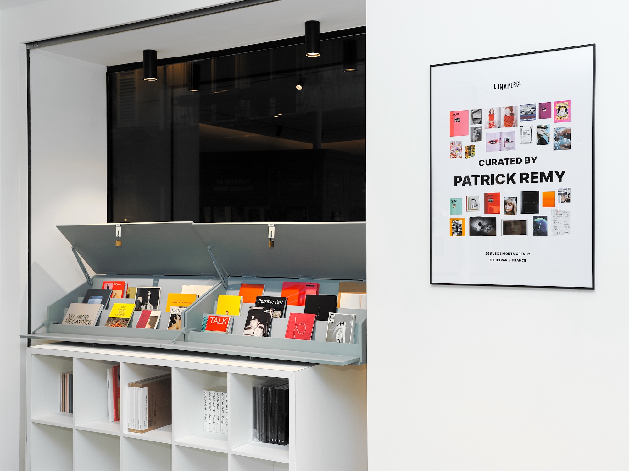
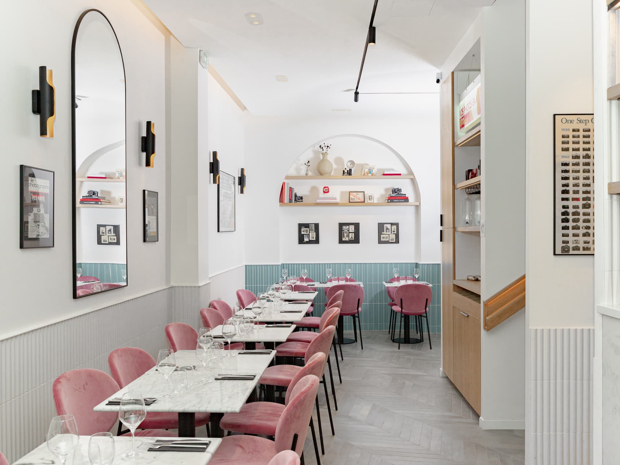
Have you seen it yet? On the corner of rue Beaubourg and rue de Montmorency, l’Inaperçu feels at home in the Marais neighborhood. It’s a unique venue where you can savor a raspberry Pavlova while leafing through the latest Cindy Sherman book.

Jean-Yves Huang, l’Inaperçu’s founder, set himself the challenge of combining culture and photography. It all began with an article in The PhotoBook Review by photography historian Clément Chéroux, dedicated to the “photobook phenomenon.” “When I read the article, I realized that photobooks were not photo albums, but small works of art. It was a revelation,” explains Huang. Initially interested in contemporary art, he then discovered the world of photography, and in particular the photobook. After years of work, l’Inaperçu was born.

© L’Inaperçu

© L’Inaperçu

© L’Inaperçu

Will you have some photography with that?

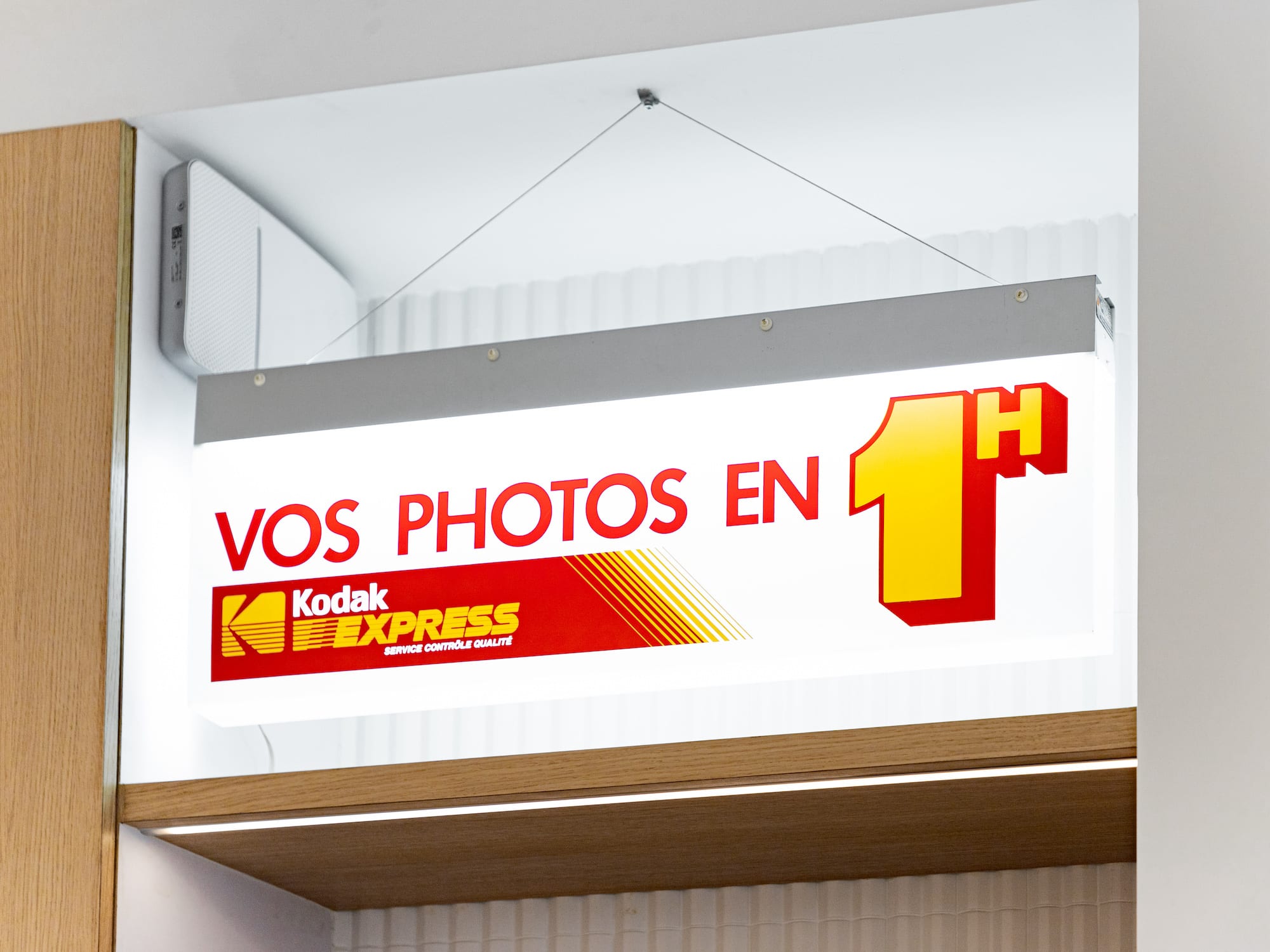
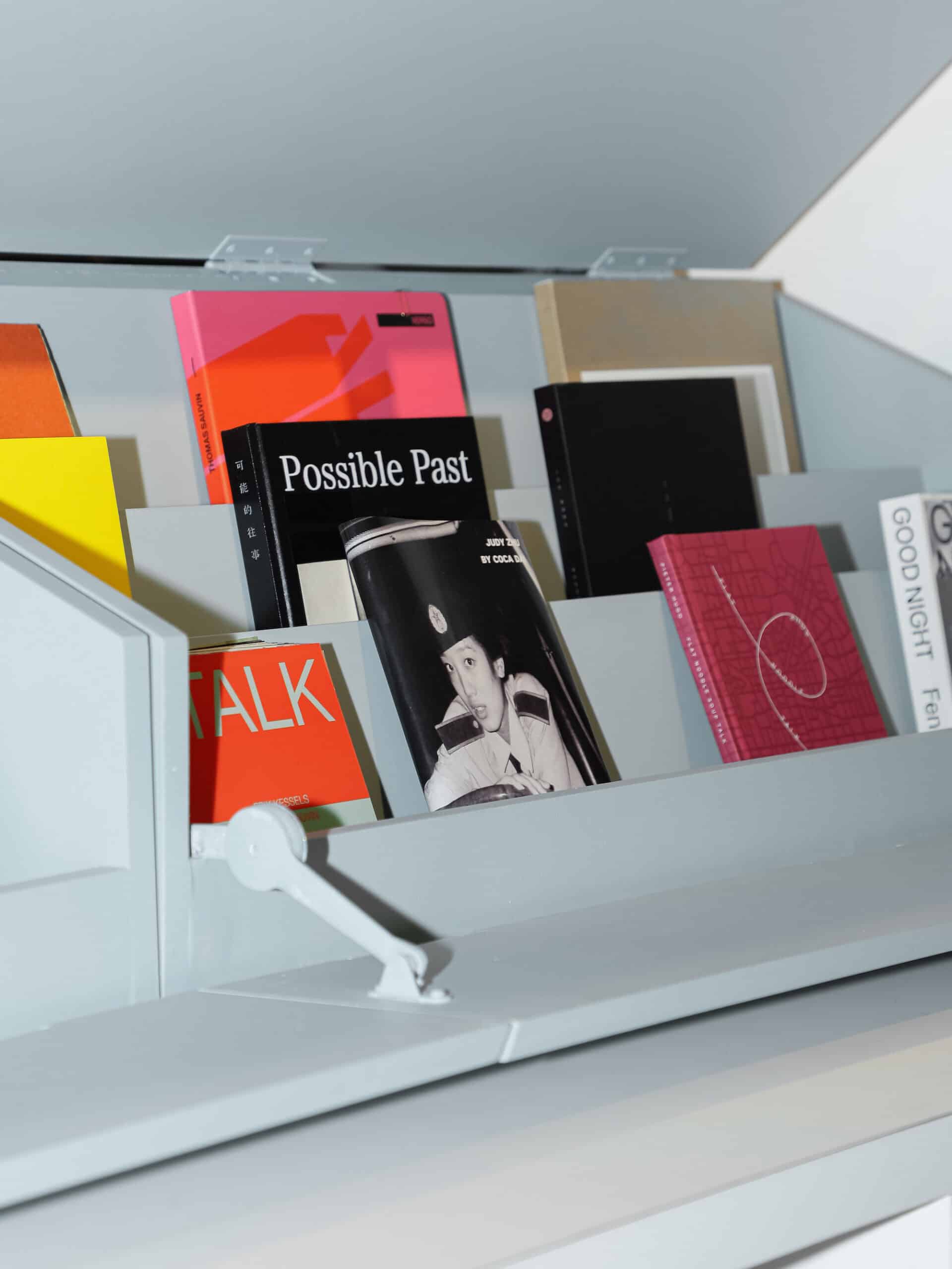
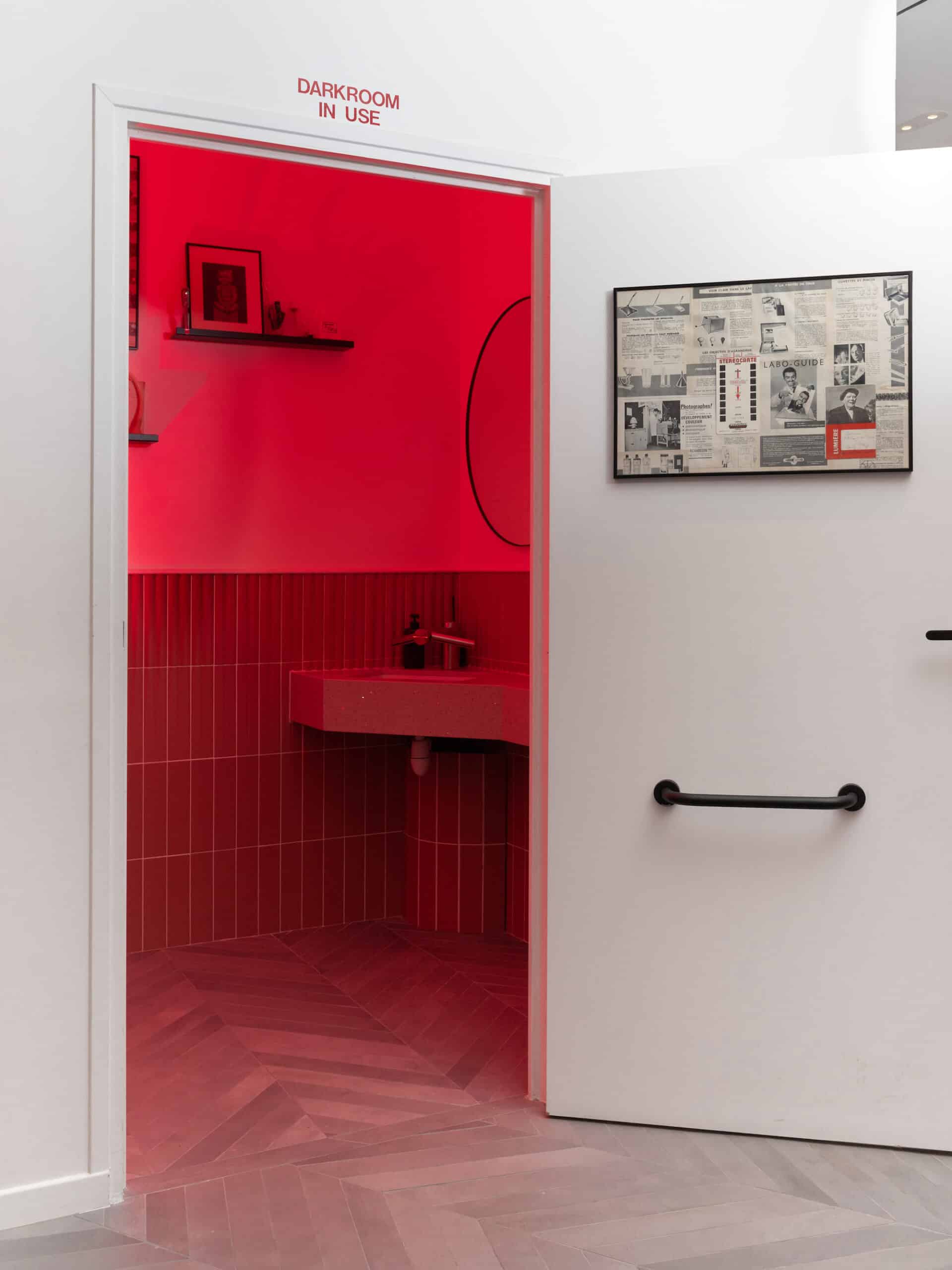
As soon as you walk through the door, it’s like you’re in the literary Paris of the quays of the Seine. Photobooks take up pride of place in the stalls, and a real newsstand features a curated selection of the day. The décor is all celadon blue, the signature color of the place. On the café side, we plunge into vernacular photography of the 1960s. The space is cleverly laid out. The restrooms reproduce the atmosphere of a darkroom, with their red lighting and the photographic bath.

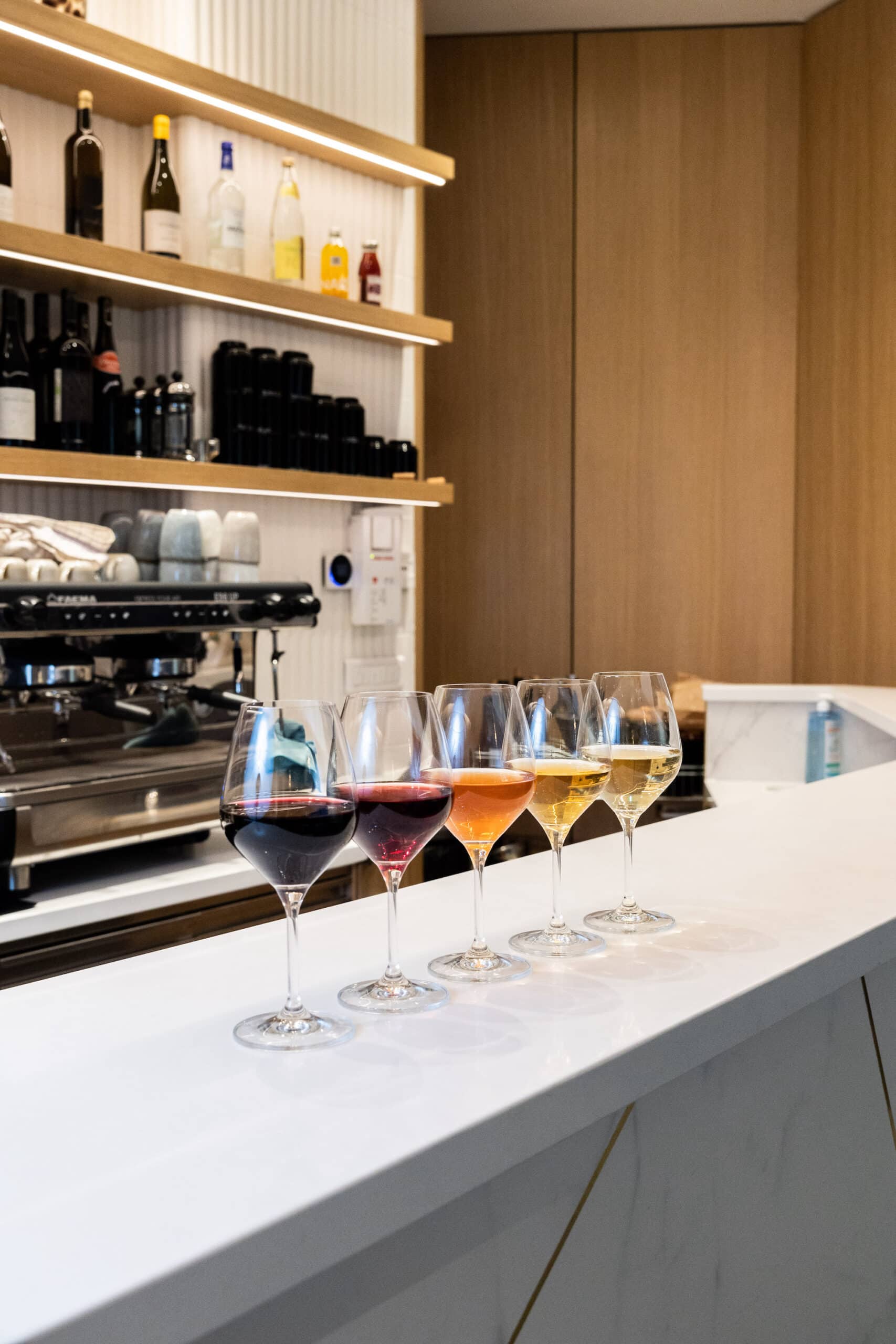
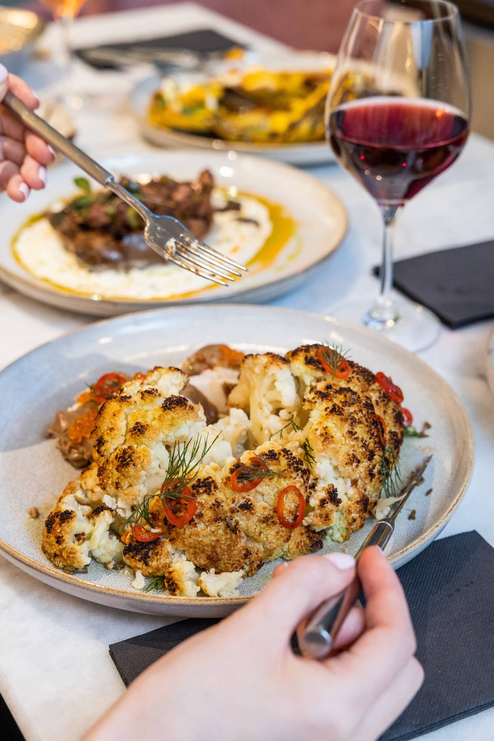
The menu offers original creations that foreground vegetables without being vegetarian: cream of pea soup, red cabbage pickles, smoked duck breast… Each dish is a true work of art: a feast for the eyes and the taste buds.

© L’Inaperçu

© L’Inaperçu

© L’Inaperçu

© L’Inaperçu

Carte blanche to photographers

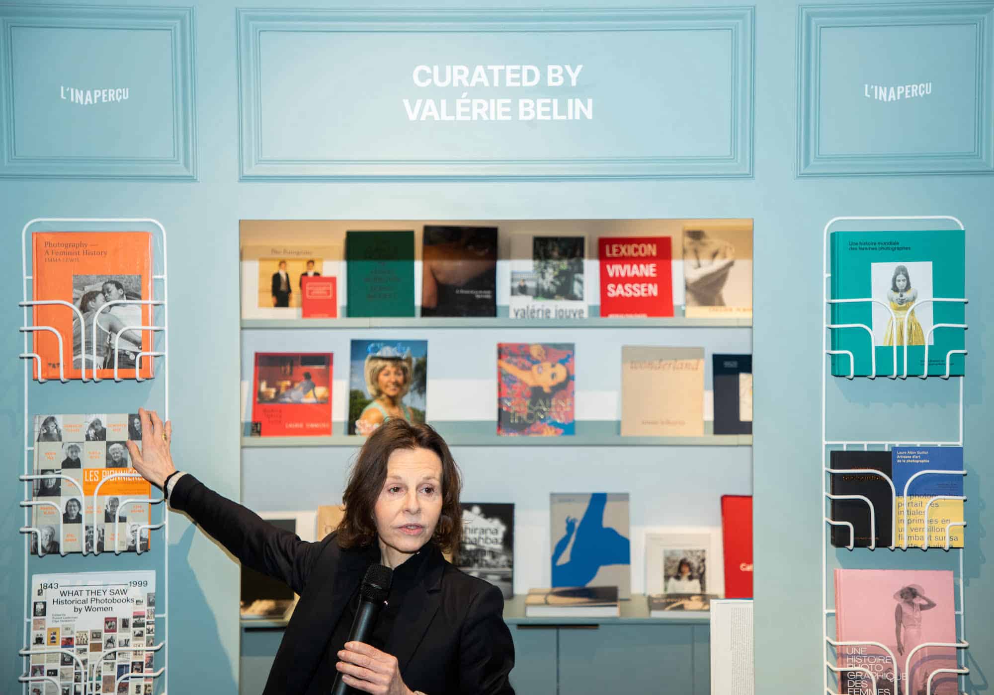
Rare and out-of-print works, collector’s boxes, signed photographic prints… the selection at l’Inaperçu is unprecedented in Paris. The venue adopts a curatorial model, drawing on the French tradition of art photography, publishing houses, and galleries. The latest selection was curated by the photographer Valérie Belin, who handpicked some 60 books celebrating women photographers, including Annie Leibovitz, Sarah Moon, Sabine Weiss, and Tina Barney. Offering carte blanche to the guest photographer, the space is all about idiosyncratic choices. “The more radical the selection, the better,” announces Huang.

Half-bookshop, half-art gallery, l’Inaperçu also hosts cultural events. On April 27, Louis Vuitton held the launch of their latest photography book, Fashion Eye Texas by Sean Thomas. The book is displayed alongside a meticulously picked array of covers, where quality triumphs over quantity. Huang proudly reminds us: “Above all, I’m a collector.”

© L’Inaperçu

L’inaperçu, 65 Rue Beaubourg, 75003 Paris. Bookshop open Tuesday to Saturday, 12pm to 7pm. Café and restaurant open Tuesday to Saturday, 12pm to 10.30pm.

Celebrate Everything: Producers Can Get More From Marketing Around Under-the-Radar Holidays and Causes

Celebrate Everything: Producers Can Get More From Marketing Around Under-the-Radar Holidays and Causes
Advertisement

Leveraging widely recognized but under-utilized events can help initiatives
that might otherwise get lost in a broad marketing blitz get a foothold.

By Kathleen Willcox 

It’s no secret that people love an excuse to open a bottle of the good stuff: New Year’s Eve, anniversaries, birthdays. And if they know that bottle gives back to causes close to their heart? They’re about 70% more likely to whip out their wallet, according to multiple studies.  

Many producers and retailers approach their end-of-year marketing plans like William the Conqueror approaching the Battle of Hastings, with a blitz of e-commerce campaigns and event activations — as if their entire bottom line depended on it. Which, in some ways, it does. New Year’s Eve is the biggest day of the year for alcohol stores, with an increase of 159% on December 31, according to marketing firm Womply. December overall, with its range of religious and secular holidays, is the biggest month of the year for alcohol sales, according to data from the Census Bureau.

But what about second-string holidays, such as Halloween? Sales aren’t up as dramatically, but they do rise. A survey of 15,000 California adults for BevMo revealed that 44% of respondents plan to spend $100 plus on alcohol for Halloween, and on Memorial Day in 2019, Americans spent close to $3 billion on alcohol in retail stores alone for the big day, Nielsen reports. 

To boost bottom lines, year-round, producers should be reaching out to their base — and beyond — with occasional, strategically planned offers and promotions. We reached out to producers to find out what types of activations and outreach work for them. Read on for a cheat sheet on year-round sales initiatives. 

Throw epic annual holiday parties 

Certain holidays call for parties. At Napa’s Bouchaine Vineyards, Halloween transforms the winery into an adults-only dance party.

“We definitely get a lot of our younger wine club members out for this, but it’s all ages,” says Bouchaine’s president and winemaker Chris Kajani. “DJ Sal Castaneta — yes, the KTVU weatherman — spins, and the night includes a costume contest, with everything fueled with fun wines and our favorite taco truck.”

Wine club members get a discounted entry at $40, while everyone else pays $60. Typically, about 120 people attend, and Kajani says many people who aren’t signed up for the wine club when they arrive, leave as members. (Club membership currently hovers around 1,500.)

The Booo-chaine Halloween Dance Party is, Kajani explains, a kind of calling card for everything the winery does. Its critically acclaimed premium wines (generally priced between $29-$150) are made with dead-serious intention, but are intended to be consumed with joy and a sense of fun. 

“Our wine club does everything from this dance party to blending seminars, falconry demos, Sensory Olympics and grape picking and stomping parties,” he says. “We also love chef-led pairing events. We take both our wine and our fun seriously at Bouchaine.”

The response speaks for itself, with consistent sell-out events that inevitably bring in a new batch of wine club recruits. 

Align brand with under-the-radar annual events

Sometimes the opportunity to link an annual event or holiday with a brand is as clear as day.

Quintessential Wines, a fine wine, marketing and sales company based in Napa, is always on the lookout for opportunities like this. This year on the Summer Solstice (June 21), Quintessential will launch its Tropical State of Mind Campaign for Tropical Moscato. 

“Summer Solstice is an overlooked holiday, and we want to take advantage of that,” says Louise Jordan, director of communications at Quintessential. “By associating Tropical Moscato with long summer days — on the longest day of the year — we hope to remain top of mind throughout the summer by bringing a tropical feel to summery celebrations.”

The winery is connecting with 10 influencers to promote the campaign, Jordan explains. 

“When selecting influencers to connect with Tropical, we utilize a multitude of factors,” Jordan says. “We evaluate their content so that it aligns with brand messaging, as well as general engagement on their feeds. For this campaign, we are targeting wine, cocktail and lifestyle influencers, both paid and organic.”

Paid influencers receive product and payment in exchange for promotions, whereas organic influencers work in exchange for a sample of the product — in this case, a bottle of Tropical Moscato along with a branded package with a pool floatie, cocktail shaker and cocktail recipes. 

The social media campaign will also include a sweepstakes and giveaway program at the brand’s handle @tropicalmoscato, in tandem with a program for retail stores (Tropical summer displays) and email blasts advertising a giveaway that includes a Tropical floatie, cocktail set and recipe book.

Leveraging widely recognized but under-utilized holidays also helps initiatives that might otherwise get lost in a broad marketing blitz get a foothold. 

Elevate the less-celebrated

There are a host of special days set aside to toast the people who shape and define our loves. Mother’s Day and Father’s Day are days that are (for good reason) relentlessly used as fodder for special sales. 

But there are dozens of other special days that could serve as serious — or silly — sales fodder. (Why not offer a special around Hammock Day or National Marshmallow Toasting Day?)  

“We are always coming up with creative ways to celebrate every holiday, and we find that having special limited-time product releases and family-friendly public events really work for our demographic,” says Wendy Camacho, chief of customer experience at Keel + Curley Winery in Plant City, Fla. “We release our limited-edition Watermelon Blush, Watermelon Cider and Watermelon Sour Ale in our tasting room on the Fourth of July weekend, and we get a huge response. We do similar seasonal releases all year long.”

Keel + Curley also offers tasting room specials for Teacher Appreciation Week and other weeks that celebrate essential, but less-appreciated workers, and have developed a cult following from those groups of workers as a result, Camacho says. 

“We love announcing our limited-time products on Instagram and Facebook, and they get everyone excited to shop online at midnight, or visit our tasting room on launch day,” Camacho adds. “Since creating these limited-releases and building buzz around the midnight sales time, we’ve consistently sold out of every release within a month.” 

Focus on unique releases around holidays with a heart

Targeting a very specific demographic and group in both a holiday and cause in one fell swoop is no easy task, but that is just what Crystal Head Vodka is doing. The ultra-premium vodka, created by actor Dan Akroyd and artist John Alexander, has always set itself apart, with its distinct skull vessel, and its production process which entails filtering the product through layers of Herkimer Diamonds. 

Crystal Head has also committed itself to supporting the LGBTQ+ community year-round, through partnerships with organizations like Boston Globe Sip the Rainbow and the Human Rights Campaign. The team is stepping it up in June for Pride Month, with a Paint With Pride release, explains Marketing Manager Daniella Vizzari. The limited-edition presentation will feature a colorful, paint-splattered design against a white bottle.

“It will be released globally in select markets,” Vizzari says. “We are working with content creators and bloggers on giveaways throughout the month, and we’ll also be participating in Pride celebrations across the United States, including in Hollywood, Philadelphia and more.”

The Crystal Head team is using the Pride month release to underline its commitment to “diversity, equality, art and expression,” Vizzari explains. “Art is empowerment, inspiring social change and fostering community. The bottle is a piece of artwork and collectible, and we hope it empowers members of the LGTBQ+ community and supporters.”

Previous Pride month releases have sold out, with many preserving the bottle and displaying it on bar shelves, or mantles at home — with Pride. 

Market around specific causes 

Some wineries have found that aligning themselves with a variety of universally appealing causes can simultaneously highlight a range of deserving nonprofits, but also lift their own sales and find new fans and allies that they might otherwise never discover. 

“Our annual charitable giving campaign, called Frank for a Cause, aims to support deserving charities across the nation,” says Napa’s Frank Family Vineyards founder Leslie Frank. “We often focus on causes that are important to the Frank Family team and to our club members, and we build our campaigns around current events to raise awareness and reach new audiences. From Breast Cancer Awareness Month to Arbor Day, our campaigns connect with consumers who hold these causes dear and let us build new relationships while supporting meaningful change.”

Since launching Frank for a Cause in 2018, the winery has raised more than $125,000 to support seven national nonprofits and numerous local organizations, including Feeding America and The Humane Society of the United States.

Last year’s K9 for Warriors campaign raised $25,000, and the campaign is being extended for 2023. For $85, recipients will get one bottle of 2019 Napa Valley Cabernet Sauvignon, a Frank Family bandanna and a matching Cabernet bottle dog toy; 20% of each package is donated to K9s for Warriors. A little back-of-the envelope map shows that 2022’s initiative sold around 1,470 bottles — a win for Frank Family and K9s for Warriors, which is the nation’s largest provider of service dogs for military veterans.   

“At Frank Family, we recognize the opportunity in pairing our wine releases and promotions with causes that have widespread need,” says Frank. “Through this approach, our customers are given the chance to support causes that resonate with them, while enjoying our wines at the same time.”

Can’t argue with the thinking behind that — or the results. 

__________________________________________________________________

Kathleen Willcox
Kathleen Willcox

Kathleen Willcox

Kathleen Willcox writes about wine, food and culture from her home in Saratoga Springs, N.Y. She is keenly interested in sustainability issues, and the business of making ethical drinks and food. Her work appears regularly in Wine Searcher, Wine Enthusiast, Liquor.com and many other publications. Kathleen also co-authored a book called Hudson Valley Wine: A History of Taste & Terroir, which was published in 2017. Follow her wine explorations on Instagram at @kathleenwillcox

Advertisement

‘Together Over Time’ Showcases Work That Balances Fragility + Robustness

‘Together Over Time’ Showcases Work That Balances Fragility + Robustness

Together over time is a debut solo exhibition of works by avant-garde designer Rafael Prieto, the founder and creative director of Savvy Studio, presented at Emma Scully Gallery until June 3rd. The exhibition integrates Prieto’s distinct design aesthetic with the art of emotive observation, harmoniously bringing together elements of furniture, sculpture, and lighting design.

Prieto’s eclectic ensemble of creations serves as a testament to his unique vision and his fascination with the inherent beauty found in everyday life. His careful observation of the world around him forms the bedrock of this interconnected display. Employing an array of materials such as wood, glass, stone, and ceramic, the designer subtly articulates an inherent elegance. Each piece strikes a delicate balance between fragility and robustness, mirroring the nuanced interplay of nature’s forces. The exhibition layout inside the gallery space is meant to inspire a novel spatial understanding that encourages individual interpretations.

The placement of the works within the gallery creates a novel spatial language open to interpretation by the viewer. According to Prieto, the exhibition is akin to a concrete poem or haiku that encourages audience engagement and connection. Nine works are featured in Together over time, consisting of a coffee table, two side tables, a light, two upholstered stools and a bench, and two sculptures that anchor the exhibition.

As explained by Prieto, “I see this as a concrete poem or haiku – something for others to engage with and feel connected to, as I do.” The ceramic inlays used in the tables were made possible with the help of Atelier Lips. The creation of these three pieces was done in close collaboration with Emma Scully Gallery. The crafting process was slow and intensive, involving local craftspeople over a period of six months.

An overall view of the transformed gallery, fully encapsulating Rafael Prieto's artistic vision and design sensibilities.

An overall view of the transformed gallery, fully encapsulating Rafael Prieto's artistic vision and design sensibilities.

A bench, part of a furniture collection with Spoliâ

A tall, kite-like lamp crafted from raw, organic cotton, hanging from the ceiling, its rope anchored by a single stone, as a representation of the collaboration between Prieto and fashion designer Kritika Manchanda.

The Marrow light, a singular sculptural fixture, suspended elegantly against the stark gallery backdrop.

A close-up of a coffee table sculpted from cast glass, stone, wood, and ceramic inlay, highlighting the intricate workmanship and Prieto's unique design aesthetic. Alt-text: Two distinctive side tables, one crafted from wood, stone, and ceramic inl

Photography by Joe Kramm.

Leo Lei translates his passion for minimalism into his daily-updated blog Leibal. In addition, you can find uniquely designed minimalist objects and furniture at the Leibal Store.

The Album Art Studio That Made Pink Floyd’s Pig Fly

The Album Art Studio That Made Pink Floyd’s Pig Fly

The filmmaker Anton Corbijn’s documentary “Squaring the Circle (The Story of Hipgnosis)” tells the tale of the London design company devoted to crafting the perfect LP sleeve.

In early 1980, Aubrey Powell, the then-33-year-old co-founder of the pioneering British design company Hipgnosis, flew to Hawaii to photograph the cover for the British rock band 10cc’s “Look Hear?” album.

The shoot involved a specific sheep (only one was available on Oahu, at a university farm) seated on an old-timey psychiatrist’s couch (which had to be constructed by a Honolulu props company) on the island’s North Shore. The sheep, out of its element and skittish from the crashing waves, ruined the first day of the session, so a veterinarian was called in to tranquilize the animal for day two. Success.

The final cost of the sleeve design, including airfare and a sheep wrangler, came to £5,043 — about $26,000 in today’s money and a big sum for the time. (But then again, as Powell, known as Po, said in an interview, back then the music industry “was awash with money.”) In the end, at the behest of Hipgnosis’ other co-founder, Storm Thorgerson, the U.K. version of the LP jacket was dominated by the words “Are You Normal” in large capital letters. The photo of the sheep on the chaise longue was shrunk to about the size of a postage stamp.

A scene from the documentary shows the 1980 shoot for 10cc’s “Look Hear?” album artwork, which involved a sheep.Aubrey Powell/Hipgnosis Ltd

In an interview, the 10cc singer and bassist Graham Gouldman admitted that though he’d had the album art explained to him in the past, he couldn’t recall what it meant. “But I know it’s a brilliant picture,” he said. As for all that pricey effort for such a tiny image? “It doesn’t matter, does it?” Gouldman said. “It’s art. So it’s got to be done.” He added, “And in Hipgnosis’ case, if you can get the record company to spend the money, then good for them.”

The Dutch filmmaker Anton Corbijn, the director of “Squaring the Circle (The Story of Hipgnosis),” a documentary on the design firm that opens in New York on June 7, had a slightly different take. “It’s just not normal to fly all the way to Hawaii to do that picture,” he said. “But it makes for a good story.”

“Squaring the Circle” is full of this and other good stories about the oft-absurd lengths the London-based Hipgnosis traveled in pursuit of the perfect LP sleeve in the era before Photoshop. Among the 415 album covers Hipgnosis made between 1968 and 1983 was Pink Floyd’s “Animals” (1977), for which a 40-foot inflatable pig was photographed floating between the chimneys of London’s Battersea Power Station. Unfortunately, the single cable affixed to the pig snapped, and up the balloon went — into the flight zone for Heathrow Airport.

“That was all very exciting, and rather alarming,” recalled the Pink Floyd drummer Nick Mason, whose bandmate Roger Waters came up with the idea for the shoot, “because it was obvious that you could have a major disaster for an airline that happened to fly into the escaping pig.” No planes were harmed in the making of the LP cover, but in the end, Hipgnosis had to resort to a photo collage to achieve the desired effect.

Hipgnosis
A selection of Pink Floyd album covers designed by Hipgnosis, clockwise from top left: “Atom Heart Mother,” “Wish You Were Here,” “The Dark Side of the Moon” and “Animals.”Hipgnosis

The documentary — shot largely in high-contrast black and white by Corbijn, himself a rock photographer and video director known for his work with U2 and Depeche Mode — features new interviews with Powell, plus a number of high-profile former Hipgnosis clients, including all three surviving members of Pink Floyd (David Gilmour, Mason and Waters) and Led Zeppelin’s Robert Plant and Jimmy Page. Paul McCartney, Peter Gabriel and Gouldman are also among the talking heads. Noel Gallagher, a fan, provides some modern-day context and comic relief.

Much of the film focuses on the close working relationship between Powell and Thorgerson, who came up together in the Cambridge, England, art scene of the 1960s, where they were friends with young members of Pink Floyd. (Peter Christopherson, a founding member of the British industrial band Throbbing Gristle who died in 2010, became a full partner in Hipgnosis in 1978.) The design studio would end up doing nearly all of Pink Floyd’s album covers, including “Atom Heart Mother” (1970), which was simply a photograph of a cow in a field, and, most famously, “The Dark Side of the Moon” (1973), with its iconic image of a triangular prism refracting light into a rainbow pattern. (Hipgnosis’ second-best-known cover also came out in 1973: Led Zeppelin’s “Houses of the Holy,” which features a group of naked children scaling basalt columns.)

The “Atom Heart Mother” jacket in particular represented a major departure from the style of the time, which Mason described as putting “a picture of the lovable moptops on the front.”

“We started making demands — which Pink Floyd totally backed us on — saying ‘No title, no name of the band on the cover,’” said Powell, now 76. “This was unheard-of in the world of marketing and record companies.” He described presenting the “Atom Heart Mother” artwork to the suits: “When you walked in there with long hair and earrings, showing them a picture of a cover of a cow, they would go apoplectic.”

Thorgerson and Powell took different approaches to communicating with artists and labels.Hipgnosis Ltd

It tended to be Thorgerson, by all accounts a stubborn genius, driving the record executives to apoplexy. “The greatest line about Storm was that ‘He’s a man who wouldn’t take yes for an answer,’” Mason said. “It was almost inevitable that whatever was done, particularly by the record company, would involve Storm having to shout at them.”

Thorgerson, who died in 2013, could be confrontational with the musicians as well. “He didn’t care if it was Paul McCartney or Roger Waters, he would express himself quite vehemently,” Powell said. “And often I would have to go around fighting the fires to maintain some kind of credibility. At the end of the day, it kind of worked because I managed to persuade the artists that it was the idea that was important. Forget about Storm’s personality.”

Corbijn said that, ultimately, the documentary was a “story of love and loss.” Hipgnosis came to an end at the dawn of a new era, in which music videos ruled and compact discs, with their significantly smaller artistic canvases, became the dominant mode of distribution. (Of course, today most people see album art in miniature on their phones.) Thorgerson and Powell, who were moving over to filmmaking, had a falling out over money and didn’t speak for 12 years after that. “It was like the end of a marriage,” Powell said. The two reunited after Thorgerson fell ill; he died of cancer at the age of 69.

In more recent years, Powell said, he’s been heartened to see that Hipgnosis’ album covers have broken “that barrier to be taken seriously as fine art.” He added, “A lot of thought went into those pictures. We didn’t take photographs of the band and slap it on the front with their names big and the title in big white letters. This was work that was taken extremely seriously. And I hope that comes over in the film.”

Powell pointed to Hipgnosis’ cover of Led Zeppelin’s final studio album, “In Through the Out Door” from 1979, which involved lovingly recreating an actual New Orleans juke joint in a studio in London. He indicated that making the album’s visuals (which, after all that work, came wrapped in a brown paper bag) likely cost more than it did for the band to record the music itself.

“You know,” Powell said with a laugh, “that sums up the period of time.”

A Sunny Parisian Cafe Inside a 19th-Century Artist’s Studio

A Sunny Parisian Cafe Inside a 19th-Century Artist’s Studio

Plus: coffee-inspired jewelry, an exhibit of natural ceramics and more recommendations from T Magazine.

Eat Here

Le Rhodia, a new cafe-restaurant in Paris’s Bourdelle Museum, features family-style tables with ceramic bases by the Brittany-based artist Cyril Dennery and handmade rice paper lighting fixtures by the designer Céline Wright.
Le Rhodia, a new cafe-restaurant in Paris’s Bourdelle Museum, features family-style tables with ceramic bases by the Brittany-based artist Cyril Dennery and handmade rice paper lighting fixtures by the designer Céline Wright.Marielle Gaudry

This spring, the recently renovated Bourdelle Museum in Paris’s Montparnasse district opened a luminous new cafe-restaurant, Le Rhodia, named after the French sculptor Antoine Bourdelle’s daughter. The spare, daffodil yellow dining room occupies the second story of a 19th-century artist’s studio where Rhodia Bourdelle and her husband, the Art Deco interior designer Michel Dufet, once lived. “We wanted it to feel like entering someone’s apartment,” says Marc-Antoine Servella, the co-founder of the Parisian architecture studio SAME, who oversaw the cafe’s design. He furnished Le Rhodia with a mix of midcentury flea market finds and custom pieces commissioned from French artisans in materials ranging from travertine to oak, while preserving a few original details like a wood-burning stove and a large oculus window (designed by Dufet in the spirit of the ocean liner cabin décor for which he was best known). Museumgoers can also dine outside on the mezzanine terrace next to a colonnade of watchful bronze busts. The menu offers refreshing fare, with culinary references to Bourdelle’s hometown in the southwest of France and a Latin American influence — a homage, says the French chef Jean-René Chassignol, to the dozens of students from Peru, Chile and Argentina who apprenticed with Bourdelle in these ateliers. Dishes, which skew on the lighter side, include a black-bean purée with pickled beets and corn nuts, and seasonal vegetable empanadas. Pastries, like the Rhodia brioche with orange-blossom cream or the honey-and-thyme-infused Madeleine d’Antoine, are served all day. instagram.com/lerhodia_bourdelle/.


See This

Juan Pablo Echeverri’s “Identidad Payasa: D Charles Morrison” (2017).Courtesy of the Estate of Juan Pablo Echeverri and James Fuentes

When the artist Juan Pablo Echeverri died at the age of 43 last year, he left behind more than 8,000 self-portraits taken in passport photo booths around the world. What had started as a diary of hair styles and piercings grew into a conceptual art project as Echeverri evolved as an artist. This summer, a grid assembled from about 400 of those photos will hang at James Fuentes Gallery in Manhattan; another has been on view at Between Bridges, the nonprofit in Berlin run by Echeverri’s former employer, the photographer Wolfgang Tillmans, who helped curate both shows.

Echeverri’s sudden death from malaria came just as his career was zooming up, with a show in León, Mexico, and work in the collection of the former president of his native Colombia. But it would be a mistake to see the portraits as a somber memento mori. “I don’t want to overburden the work,” says Tillmans, who prefers to see it as Echeverri was: sly, cerebral and self-deprecating. The title of the passport series, “Miss Fotojapón,” yokes together a joke about Colombia’s past failure to win the Miss Universe pageant with the name of a photo processing chain. The exhibit in New York also includes “Identidad Payasa” (2017), a series of double portraits where the artist shared the lens with street clowns in Mexico City. First, Echeverri would take their photos in full costume, then ask the clowns to recreate the look on him, a way of embodying their position. Tillmans says the photos show how much Echeverri empathized with the clowns — they were both artists, putting on a visual performance and wearing masks. “Are they to be taken seriously? Obviously, they’re being laughed at. It’s deep, but he played it light,” he says. “Identidad Perdida” is on view from June 7 to July 29, jamesfuentes.com.


Stay Here

The Texas-based hospitality group Bunkhouse collaborated with the Mexico City architecture firm Reurbano to renovate the 1940s apartment building that’s now Hotel San Fernando.Chad Wadsworth

The Texas-based hotel group Bunkhouse — known for its intimate, community-oriented properties like Hotel Saint Cecilia and Hotel San José in Austin — has lately expanded with openings in Salado, Texas; Louisville, Kentucky, and, most recently, Mexico City. Hotel San Fernando is in Condesa, the neighborhood known for its Art Deco architecture and sprawling, jacaranda-lined parks. Nineteen guest rooms now occupy the Edificio San Fernando, a 1940s apartment building whose jade-hued ceramic-tile floors and stained-glass windows were retained in a renovation by Bunkhouse and the Mexico City architecture firm Reurbano. Plum-colored archways border a sage green lobby, from which guests ascend a spiral stairwell to reach the rooms. The furnishings were mostly made in Mexico, including plywood furniture from the design studio La Metropolitana, red lamps with handblown, opaque glass shades by the Oaxaca studio Oaxifornia and works by local artists such as Pedro Friedeberg and Ricardo Guevara. Guests can enjoy meals on the rooftop, with pastries like vanilla conchas for breakfast and small plates including tostadas and aguachile from midday on. Hotel San Fernando opens June 1; rooms from $215, bunkhousehotels.com.


Covet This

An 18-karat gold-and-diamond ring and necklace from Cartier’s Grain de Café collection, inspired by the coffee bean.Courtesy of Cartier

Cartier’s designers have a habit of creating precious jewelry based on everyday objects. The Juste Un Clou collection transforms a construction nail into diamond-crusted cuffs and collars, while the Cactus de Cartier, a set of spiky domes, imagines the desert plant as a cocktail ring. The Grain de Café collection continues this trend, using coffee beans as inspiration for bracelets, earrings, rings, necklaces and brooches. Originated by the house’s longtime director Jeanne Toussaint, the java-themed charms first appeared in the house’s designs in 1938. Prince Rainier III gifted Grace Kelly a cafe set for their 1956 wedding, and her necklace, studded with small gold bean pendants, served as one reference for the new designs. This June, the company introduces six new pieces to the collection, from a rope-style chain strung with five clustered beans to a two-toned ring set with dangling diamond-dotted beans. They’re all designed to move slightly, emitting an energizing jingle. From $7,250, cartier.com.


View This

A selection of works from Ludmilla Balkis’s forthcoming exhibition at Roman and Williams’s Guild Gallery in New York City that marks the ceramist’s U.S. solo show debut.Colin King

The French ceramist Ludmilla Balkis first began shaping clay into thrown pots, bottles and bowls as a way to let go of her former life in fashion — inspired by the delicate work of the British sculptor Lucie Rie, she wanted to find a natural creative rhythm free from the directive to produce on a fixed schedule. Balkis had trained as a fashion designer and worked under Phoebe Philo at Celine in London; she began making ceramics in 2015. Her paper-thin structures, sculpted from the reddish-brown clay she collects from the French seaside and mixes with sand to achieve a rougher texture, challenge gravity’s pull, threatening to collapse. Items she finds on long walks through nature in France’s Basque Country, where she keeps a studio, are often incorporated into the pieces. In her latest exhibition, “Stasis,” on view beginning next week at Roman and Williams’s Guild Gallery in New York, one white sanded stoneware basin is imprinted with twigs, while a trio of lanternlike vessels have raw edges flecked with dry wood ash. “In a way, the movements and techniques [between ceramics and fashion] are similar,” Balkis says. “Draping fabric around a mannequin consists of pulling and pinning material to create a three-dimensional design. In ceramics, I intuitively repeat that process — I’m creating around empty space, but I work on it like it’s an imaginary body.” “Stasis” will be on view from June 9 through July 15, rwguildgalleryny.com.


Wear This

Clockwise from left: Danielle Frankel’s Chrysanthemum earring; Japanese mum earrings; and ocher rose brooch.Courtesy of Danielle Frankel

The bridal designer Danielle Frankel Hirsch has previously designed collections of pearl jewelry to accompany the silk halter-neck tops and tulle gowns she creates for her label, Danielle Frankel. But as part of her mission to shift wedding traditions in new directions, Frankel Hirsch chose a less expected medium for her latest accessories. “I began with the question ‘If we could cast flowers [in clay], what would that look like?’” she says. She began searching for references and found images of wilting flowers that were originally printed on cigarette cards and had been digitized as part of the George Arents Collection at the New York Public Library. Then she discovered an artisan based in Ukraine whose specialty is creating realistic floral sculpture, using clay molded over a wire frame. Frankel Hirsch is now selling an array of blooms, including lavender anemone and pink magnolia earrings, and lily and rose brooches. She expects brides will appreciate that every design is slightly different from the others and, unlike a bouquet, they can be kept forever. From $1,250, daniellefrankelstudio.com.


From T’s Instagram

Capturing Beauty and Empowering Women: The Visionary Photography of Maya David

Capturing Beauty and Empowering Women: The Visionary Photography of Maya David

Imagine a world where every woman feels beautiful, confident, and empowered in her own skin.

Thanks to the extraordinary talent and passion of English/Irish photographer Maya David, that world is becoming a reality. With her artistic eye and unwavering commitment to celebrating diversity and body positivity, Maya has become a force to be reckoned with in the photography industry.

Maya David 2023

Maya’s journey began years ago, when she discovered her love for capturing the essence of femininity through her camera lens. Drawing inspiration from her travels and the vibrant cultures she encountered, Maya decided to make Bali and Ibiza her creative hubs. These stunning locations serve as the backdrop for her awe-inspiring work, adding an extra touch of magic to each frame.

At the core of Maya’s photography lies a powerful message: every woman deserves to feel comfortable and proud of her natural form. Maya’s determination to challenge societal norms and redefine beauty led her to launch the groundbreaking project, ‘What Makes You Feel Feminine?’ in 2019. This project not only sparked meaningful conversations about femininity but also served as a catalyst for women around the world to embrace their unique bodies.

Maya’s work quickly caught the attention of the fashion world, earning her a well-deserved spot in prestigious publications like Vogue Greece and Vogue Spain. Her images graced the pages of Vogue Greece in 2021, showcasing her ability to capture the strength and beauty of women from all walks of life. The following year, Vogue Spain recognized Maya’s groundbreaking contributions, cementing her status as a trailblazer in the industry.

What sets Maya apart from other photographers is her ability to effortlessly blend artistry with authenticity. Each photograph is a testament to her exceptional skill in capturing the raw emotions and inner beauty of her subjects. Whether she is photographing a free-spirited bohemian bride, a confident businesswoman, or a radiant expectant mother, Maya’s images radiate a sense of joy, liberation, and self-acceptance.

Through her lens, Maya shows us that beauty knows no boundaries and that every body is worthy of celebration. She invites women to let go of societal expectations, embrace their flaws, and recognize the power they hold within themselves. Maya’s photographs are a powerful reminder that true beauty lies not in conformity, but in embracing one’s individuality.

Maya David’s work serves as a beacon of hope and inspiration in a world that often imposes narrow definitions of beauty. With her unwavering dedication to diversity and body positivity, she has become a catalyst for change. Through her lens, she empowers women to love themselves, to embrace their uniqueness, and to stand tall with confidence.

As we continue to navigate the ever-evolving landscape of beauty standards, Maya David remains at the forefront, challenging norms and capturing the true essence of femininity. Her photographs have the power to transform hearts, shift perspectives, and ignite a movement towards self-love and acceptance.

So, the next time you find yourself questioning your own beauty or struggling to fit into a mold, remember Maya’s work and the message she sends: you are perfect just the way you are.