Design

Smeg FAB28 Fridge’s New Colors Are as Inviting as a Summer in Italy

Smeg FAB28 Fridge’s New Colors Are as Inviting as a Summer in Italy

A summer exploring Italy will always be remembered as a journey of color: the palette of pale and rust Mediterranean hues brushed across the countryside, the mineral-laden volcanic soil of Vesuvius, the vivid azure blue sea. Those are just a few of the evocations of tinted memories that inspired luxury Italian appliance brand Smeg to release a new series of colors, enhancing their already iconic FAB28 refrigerator silhouette with a bold refresh that aligns with the growing trend of inviting colors into the kitchen.

Eight colors were initially previewed in Milan in 2022 as candidates to be voted upon before choosing the final “colors of Smeg’s summer 2023.” Voters deemed Azzurro Blue, Perfectly Pale, and Rust as favorites; a Matte Black option was added to round off this quartet of soft touch matte surface refrigerators.

Smeg FAB28 Refrigerator in Rust in open kitchen with herringbone flooring.

As someone who has been mulling over a new refrigerator for our mother-in-law’s kitchenette, the FAB28 proposes a more enriching element to the kitchen than the austere and cold options typical of appliances.

Smeg FAB28 Refrigerator in Rust

Inside, the FAB28 Refrigerator remains the same, housing three adjustable glass shelves, one fixed glass shelf, a bottle rack, fruit and vegetable container, and dairy box. Despite its slim size, there are also two adjustable covered bins, two bottle storage bins, four adjustable bins, and two egg bins across the door, with LED lights illuminating the interior, an adjustable thermostat, and MultiFlow air distribution to keep produce fresh as long as possible.

Smeg Fab28 refrigerator in modern earthen tone kitchen

Except for the blue option, the earthen collection presents a more contemporary, rather than retro, feel.

Smeg FAB28 Refrigerator in Perfectly Pale

While three of these new colors are inspired by hues of the Italian landscape in summer, the matte black addition is marked as the final component of Smeg’s modern matte black range of kitchen appliances and accessories, which includes a kettle, toaster, and new Classic oven finish for an entirely modernist noir aesthetic.

Smeg Fab28 refrigerator in modern earthen tone and wood cabinet decorated kitchen

Smeg FAB28 Refrigerator in Matte Black

angled view of rust colored fridge opened to reveal white shelves

The entire range of new colors for the FAB28 are available for £1,899 via shop.smeguk.com and Smeg’s Regent Street flagship store. No word on if these new colors will make it to the US or not.

Gregory Han is the Managing Editor of Design Milk. A Los Angeles native with a profound love and curiosity for design, hiking, tide pools, and road trips, a selection of his adventures and musings can be found at gregoryhan.com.

WantedDesign Manhattan 2023: Best of Students and Schools Winners

WantedDesign Manhattan 2023: Best of Students and Schools Winners

Now that WantedDesign Manhattan 2023 has wrapped, we’re thrilled to share the final winners for the Best of Students and Schools, a showcase sponsored by iconic Italian housewares brand Alessi and presented with Design Milk.

Words from sponsor Alessi’s president, Alberto Alessi, on what design is today:

[embedded content]

Walking away with the Best of Schools award, UK-based Northumbria University won for their Tools for Everyday Life, a project born from a brief pitched to the school’s BA(Hons) 3D Design program (including academic staff, graduates, and Designers in Residence). They were asked to design everyday products that are enjoyable to use. The ongoing project of designing tools helps designers understand the materials and processes via making the tools and using them, in hopes of empowering users to connect to the products and develop skills along the way.

angled view of Northumbria best of schools award winning booth

Rickard Whittingham, Assistant Professor, shares: “This project challenges its designers to share knowledge, skills, and experiences in the designing and making of ubiquitous objects. The aim is to celebrate the process and results of collaboration between designers at various stages of their education and careers in the creation of beautiful and useful things that meaningfully connect with people. We hope to highlight the important role design schools can have in bringing people together from diverse backgrounds to learn from each other.”

angled view of Northumbria best of schools award winning booth

“The Tools for Everyday Life project champions the value of material and processes knowledge and making skills in the realization of contemporary products. The belief is that these skills and sensitivity to the physical world make for objects that are rewarding in their use.”

angled view of Northumbria best of schools award winning booth

five people posing for camera featuring winner of design award

Assistant Professor Rickard Whittingham accepting the Best of Schools award for Northumbria University

angled view of booth at trade show with design objects on tables with people standing aroudn

Walking away with the Best of Students prize, was a group of 25 industrial students from the Design Department at the Mexico-based Universidad Iberoamericana. The group presented 13 projects inspired by Mexican oral traditions. The Best of Students award gives recognition to students from design schools around the world and presents them on a global platform. It helps the universities to recruit new students while also networking with other schools for potential partnerships or exchange programs. This year, 14 schools participated, including: CEDIM, Central Saint Martins, Cranbrook Academy of Art, École Boulle, IED, University of Iowa, Northumbria University, Parsons School of Design, Pratt Institute, RISD, SAIC, SCAD, Tec Monterrey, and Universidad Iberoamericana.

Some of the student’s winning work:

bulbous three pot planter with green plant

Bahui by Diego Blanco, Luis Ernesto Belchez, and Manuel Alvarez

stepped wooden tray

Gizaba by Camila Moreno, Joaquin Barrera, and Jimena Moreno-Lacalle

teal green pottery

Xoco by Bruno Calderon and Sofia Zavala

grey stand with wooden leaf like bowls

Nikté by Casandra Alanis, Frida Juárez, and Mariana de Alba

Congratulations to the 2023 winners!

Caroline Williamson is Editor-in-Chief of Design Milk. She has a BFA in photography from SCAD and can usually be found searching for vintage wares, doing New York Times crossword puzzles in pen, or reworking playlists on Spotify.

N90N: Candy-Colored, Surrealist Furniture by Ezra Ardolino x Timbur

N90N: Candy-Colored, Surrealist Furniture by Ezra Ardolino x Timbur

N90N, a three-piece collection of surrealist furniture, was introduced to the public at Tuleste Factory during NYCxDesign 2023 as part of the Harmonious Proportions show. The limited edition series was created by Ezra Ardolino, founder and designer of digital fabrication studio Timbur, that produces large, custom commissions for artists and brands. N90N is inspired by Ardolino’s overall fascination with geometric shapes and his interest in the limits of sculptural wood formations. Living somewhere between the digital and physical worlds, the series plays with the concept of infinitely-sided polygons through the use of laminated plywood.

5P1R4L

“There is a dialogue that unfolds when working in a material practice. The material – in this case plywood – communicates its unique textural qualities, and as a designer, I work to immerse myself in this conversation by pushing the dimensional envelope while operating in the digital space,” remarks Ezra Ardolino, designer and founder of Timbur.

The three sculptural furniture pieces – 5P1R4L (“SPIRAL”), D0U8L3 (“DOUBLE”), and 7R1PL3 (“TRIPLE”) – use Timbur’s signature process of stacking lamination as a medium. When the designs are viewed virtually, the polygons are clearly visible, but as pieces are hand-sanded and smoothed the count expands, eventually approaching infinity, or “N.”

5P1R4L

The 5P1R4L bench explores the shape of a spiral with subtle, ergonomic divots for sitting. Featuring continuous, smooth organic shapes, the D0U8L3 side table and 7R1PL3 coffee table are formed by the connection of two and three plywood spheres, respectively. Each draws inspiration from the concept of a metaball, a 3D geometric object defined by the merging of two or more individual spheres. N90N’s three pieces are colorized using custom transparent automotive “kandy” urethane, highlighting the surface definition and creating a futuristic depiction of wood texture.

detail of glossy cyan blue twisted stacked plywood table

5P1R4L

detail of glossy cyan blue twisted stacked plywood table

5P1R4L

detail of glossy cyan blue twisted stacked plywood table

5P1R4L

glossy red geometric stacked plywood table

7R1PL3

glossy red geometric stacked plywood table

7R1PL3

glossy red geometric stacked plywood table

7R1PL3

detail of glossy red geometric stacked plywood table

7R1PL3

glossy purple curvaceous stacked plywood table

D0U8L3

glossy purple curvaceous stacked plywood table

D0U8L3

glossy purple curvaceous stacked plywood table

D0U8L3

detail of glossy purple curvaceous stacked plywood table

D0U8L3

light-skinned man sitting on a short stool and surrounded by others in warm pastels tones

Ezra Ardolino Photo: Matthew Gordon

To learn more about N90N, visit timburllc.com.

Kelly Beall is senior editor at Design Milk. The Pittsburgh-based graphic designer and writer has had a deep love of art and design for as long as she can remember, and enjoys sharing her finds with others. When undistracted by great art and design, she can be found making a mess in the kitchen, consuming as much information as possible, or on the couch with her three pets. Find her @designcrush on social.

Böste Refreshes the Classic Adirondack Chair + Ottoman

Böste Refreshes the Classic Adirondack Chair + Ottoman

It’s common in the design world to see several takes on the same object. In this case, it’s the Böste outdoor chair and ottoman that are a refreshed version of the classic Adirondack chair. Swedish outdoor furniture producer Skargaarden worked with designer Stefan Borselius to bring its version of the icon to life. The chair and ottoman get their name from Borselius´ hometown of Böste, located in southern Sweden, where it´s not uncommon to see a few chairs in this style among the dunes.

Created as early as 1903, the first Adirondack chair was designed by Thomas Lee. He created the piece of furniture as the “perfect outdoor chair” for his home in Westport, located on Lake Champlain, and it was originally named the Westport chair. It was patented and sent into production the following year by Lee’s friend Harry Bunnel, who ran a carpentry workshop. The Westport chair was an immediate hit, and has been reinterpreted over and over again under various names ever since. Adirondack chairs, as we commonly refer to the style today, are still popular in gardens, on beaches, and in other outdoor environments for their leisurely comfort.

Designer Stefan Borselius has built his career by developing innovative solutions using materials, form, and function. His interpretation of the iconic chair is a durable, powder-coated stainless steel and teak version that can be left outdoors year round. The rounded edges and softer shapes used in Böste are welcoming and feature armrests wide enough to be used as small tables for a glass or book. Over the years, the wood surface will turn into a silver-grey patina that can only add to its charm.

modern wood adirondack chair next to a pool

”For many years we have tried with various designers, but have not been able to achieve a worthy interpretation,” says Jari Visuri, co-founder and CEO of Skargaarden. “It was when we met furniture designer Stefan Borselius that we felt we had a chair worthy of paying tribute to the Westport chair. Stefan lives on the shore of Sweden´s southernmost tip, where you can´t avoid looking for similar chairs along the sandy beach. In hindsight, we now see why it was Stefan who understood what we were looking for and got the design right.”

four modern wood adirondack chairs next to a pool

two modern wood adirondack chairs on the beach

modern wood adirondack chair

modern wood adirondack ottoman

modern wood adirondack chair and ottoman

To learn more about the Böste chair and ottoman, visit skargaarden.com.

Kelly Beall is senior editor at Design Milk. The Pittsburgh-based graphic designer and writer has had a deep love of art and design for as long as she can remember, and enjoys sharing her finds with others. When undistracted by great art and design, she can be found making a mess in the kitchen, consuming as much information as possible, or on the couch with her three pets. Find her @designcrush on social.

Ikra Arshad Adds Graphic, Pastel Stamp Onto Art Pod During Residency

Ikra Arshad Adds Graphic, Pastel Stamp Onto Art Pod During Residency

Every year, East Quay enlists an artist for their Pod 5 Artist Residency, which invites a creative to live in and transform a small living space called Pod 5 in Watchet, West Somerset, United Kingdom. For 2023, they tapped London-based artist Ikra Arshad, known for her large-scale murals and installations, to stay for two weeks and put her mark on the space. Arshad brought her playful style merging pastel shades and monochrome tones with geometric patterns for a lively, energetic feel.

She incorporated orange to reflect the local Somerset clay, along with pink, purple, and green that give nod to the noteworthy sunsets and local flora. Rounding out the pastels are more graphic sections with black and white stripes, black geometric shapes, and a white/black grid found on the bedding. The space comes together for a bold yet calming aesthetic.

small space interior with pastel wall art and black and white details

small space interior with pastel wall art and black and white details

The mezzanine is turned into “The Dreaming Room” as a relaxing space for visitors to ideate and reflect.

small space interior loft with pastel wall art and black and white details

Arshad says: “As the sun rises and sets on the harbor, the mural and shelf objects will change and shift in its appearance, acting as a prominent sundial throughout the day whilst people experience the artworks. The immersive artworks will act as a creative intervention, sparking the viewer’s curiosity and a fresh perspective of seeing the world.”

small space interior loft with pastel wall art and black and white details

small space interior with pastel wall art and black and white details

The elevated pod lives atop the East Quay building overlooking the Bristol Channel and marina, making for an inspiring location. Along with renovating Pod 5, Arshad spent her two-week residency leading creative workshops with the local community, from toddlers to adults.

small space interior with pastel wall art and black and white details

small space interior with pastel wall art and black and white details

Launched in 2021, East Quay is a thriving hub in the Watchet community for creativity and activity, with galleries, artist studios, education space, print studio, paper mill, restaurant, and five accommodation pods, including Pod 5.

small space interior with pastel wall art and black and white details

small kitchen interior with lavender and white checked walls

angled view of small kitchen with lavender and white checkered walls and small bar

small kitchen interior with one wall in purple and white checkered design and one with two tone green triangle

closeup of small kitchen interior wall with two tone green triangle

closeup view of white wall shelf in kitchen holding dishes

exterior view of elevated living pod

angled view of door exterior of elevated living pod

angled view of door exterior of elevated living pod

side view of woman in black painting stripes on wall

Artist Ikra Arshad painting art pod Photo: George Harwood Smith

angled interior view of small bedroom with graffiti art on walls

Previous interior of art pod designed by Bristol artist Andy Council Photo: Joseph Horton

Want to call Pod 5, or any of the other four pods, home for a short or extended stay? You can book them here.

Photos, except where noted, by Jesse Wild.

Caroline Williamson is Editor-in-Chief of Design Milk. She has a BFA in photography from SCAD and can usually be found searching for vintage wares, doing New York Times crossword puzzles in pen, or reworking playlists on Spotify.

skinflint Restores 1920s–1970s Lighting for Homes, Restaurants + Shops

skinflint Restores 1920s–1970s Lighting for Homes, Restaurants + Shops

“We don’t make lights, we find them,” says British lighting brand skinflint. They have been giving new lives to vintage lights for more than a decade – and in that time they have saved more than 50,000 lights from landfill. They rescue lighting from all over the world, from abandoned glassworks in Budapest to old Navy ships in shipbreakers’ yards in Gujarat, restoring every light to modern electrical standards without compromising character. Design Milk speaks to co-founder Chris Miller to find out more.

Chris Miller

Tell me about your childhood, education, background, and how you first became interested in repair.

Repairing, restoring, fixing, mending – they were all the norm in my household growing up. We didn’t just throw things away. But it wasn’t until I got a little older that I realized my mindset differed from the predominantly throwaway culture elsewhere. When I look back, I realize it’s this that led me towards restoration as a career path – skinflint was founded on a mission to stop vintage lights from going to landfill; repairing vintage lights has always been an act of care for our planet and our people.

A row of pendant lights hangs above a set table in a restaurant

What appeals to you about repairing objects versus creating something new?

And a triple-bottom-line approach underpins everything we do. As a Certified B Corp, we will always prioritize people and the planet over profit. And restoring and repairing vintage lights is how we achieve this. Our vision is to buck ‘fast furniture’ fashion trends, so it wouldn’t make sense for us to design and manufacture new lights and add to the waste pile. Vintage lights were made to last, designed before the notion of ‘planned obsolescence’. That’s why we often find them in amazing locations around the world, outliving the buildings they exist within. The ceilings may be falling down but the lights are still standing!

A white women in her 30s holds a screwdriver to the inside of a pendant light

There are many words for repair with slight nuances in their meaning – mending, fixing, hacking, restoring, repurposing… which do you prefer in relation to your work and why?

‘Restoration’ is the word that best sums up what we get up to at skinflint. To us, it means working with each vintage light to preserve as much of the original character as possible. We ensure each light meets modern-day technological standards but also preserve signs of age and patina; they’re the bits that tell the story of where the lights have been – everywhere from churches in the UK to private residences in Prague and factories in the Eastern Bloc.

Three strip lights hang from a black-painted high ceiling

What is the inspiration behind it – where did the idea come from?

We’ve always wanted to challenge the status quo; why can’t modern-day homes, hotels, shops, and restaurants be fitted with salvaged and restored vintage lights? In 2009, we put the theory to the test in a Victorian home in North London, and with that, skinflint was born. Fourteen years later we’ve grown, but always stayed true to our founding mission. Our ethos means we continue to make business a force for good and ensure we give back through initiatives like 1% for the Planet every year.

restaurant interior with pendant lights lit

Which repair techniques are you using and why? How did you learn the techniques you’re using and why?

We treat each vintage light differently, there is no one-size-fits-all approach! Some lights are soda-blasted to remove old paint, some are polished, some are lacquered – restoration is a slow and steady process. But regardless of the intricacies, we will always work sustainably and prioritize the environment in our processes.

A white hand holds a vintage industrial light

How do your repairs change the function or story of the object?

The aim of the game is to preserve. We never want to change the function of salvaged vintage lights, just ensure that they’re able to live on to tell their story. That’s part of the beauty of what we do at skinflint – the first chapter in a light’s life might be illuminating old mine shafts, but the possibilities of where it could go next are endless. We work closely with other B Corps like Aesop and Patagonia, who now have skinflint lights that once lit 1940s factories suspended from their ceilings!

A set of pendant lights hangs above a green-tiled bar

How visible or invisible is the repair and why is that important?

We talk a lot about never compromising character. Signs of patina are an added bonus; it’s these little details that all add to the story of each individual light. They’re great conversation starters above dining room tables! But we will always ensure that the electrical components meet modern-day technological standards. As a proud member of the UK Lighting Industry Association, we’re independently audited, approved, and verified at every stage to ensure that all of our lights are expertly restored to modern standards for faultless functionality.

A white man in a shirt and a cap is adjusting a chandelier

How have people reacted to this project or body of work? How do you feel opinions towards mending and repair are changing?

Consumer behavior is definitely changing. As individuals, we’re all a lot more aware of our impact on the environment and the proof is in the questions our clients are asking. They want to know we’re working sustainably and that we’re kept in check. And we are! Our B Corp Certification means that we’re legally obligated to consider our impact – and to report on it. It’s the little reminder we need to continue to evolve our ways of working, and making sure the work we do is truly circular. That’s why we recently introduced Full Circle, our product buy-back scheme. It means our clients can return their skinflint vintage lights for a 50% credit towards a future purchase. It keeps vintage lights in existence for longer and we also offer a lifetime guarantee, meaning we’ll repair any lights that need a little extra TLC.

A white man in a shirt and cap adjusts a desk lamp

What do you think the future holds for repair and restoration?

We’re proud to be the first vintage lighting company to introduce a product buy-back scheme and we like to think of ourselves as a game-changer in the industry. What we’ve done is demonstrate that a fully circular approach to vintage lighting is absolutely possible. And we hope that others in the industry will follow suit, bringing change to the sector as a whole. We’re excited to see what the future holds.

advertisement for wasted by katie treggiden

Katie Treggiden is a purpose-driven journalist, author and, podcaster championing a circular approach to design – because Planet Earth needs better stories. She is also the founder and director of Making Design Circular, a program and membership community for designer-makers who want to join the circular economy. With 20 years’ experience in the creative industries, she regularly contributes to publications such as The Guardian, Crafts Magazine and Monocle24 – as well as being Editor at Large for Design Milk. She is currently exploring the question ‘can craft save the world?’ through an emerging body of work that includes her fifth book, Wasted: When Trash Becomes Treasure (Ludion, 2020), and a podcast, Circular with Katie Treggiden.

KYT Merges Medicine + Fashion With Innovative Bag Collection

KYT Merges Medicine + Fashion With Innovative Bag Collection

At the age of 20, designer and KYT (Keeping You Together) founder Bridget Scanlan was diagnosed with Type 1 Diabetes. As her pancreas stopped producing insulin, she had to learn to manage blood glucose tests and insulin injections – as well as all of the equipment that comes with it. Soon, KYT released three designer bags meant to empower diabetics and streamline their daily treatment in a stylish way.

“From talking to diabetics around the world, I got universal insights into the daily diabetes struggle,” Scanlan says. “It sparked a thought: could smarter design empower people to feel better about dealing with daily treatment? I wanted to redesign diabetes, so we could all redefine it.”

Jumping into action, her background in fashion design and entrepreneurship led the way. “Every zip, every angle, every equipment detail has been influenced by the insights gathered from the hundreds of incredible diabetics who have opened up and shared their diabetes stories (and gripes) with me,” she shared.

light-skinned hand interacting with diabetes tools in a black bag

The contemporary bag designs feature smart layouts, using quality materials such as gold-rated Italian leather and solid brass hardware, and are ethically crafted. Each bag holds and organizes the carrier’s diabetic supplies, such as a testing kit, pump consumables, and insulin pens.

four black bags on pedestals

The SideKYT is a crossbody bag that streamlines users’ essential diabetes supplies by splitting into two sections: life essentials up front and diabetes equipment in the back. A testing station allows blood glucose levels to be evaluated straight from the bag.

If you’re looking for something larger, the SideKYT+ style might be for you. It’s a larger crossbody bag designed for pump users or those who want to carry more equipment or spares.

Lastly is the StarterKYT. The compact case allows users to discreetly carry supplies, measuring in at the size of a sunglasses case. It locks together with magnets and unfolds flat to create a testing station, then can be easily folded up again.

Currently, all three bags are available for pre-order, which includes a 15% price cut. 

light-skinned hands interacting with diabetes tools in a black bag on a table

light-skinned hand picking up a black case

light-skinned hand removing a black case from a brown bag

light-skinned hands interacting with diabetes tools in a black bag on a picnic blanket

light-skinned person wearing a black and white garment while carrying a black bag

light-skinned person wearing all white carrying a black bag while walking

light-skinned person wearing a bold geometric short-sleeved shirt and carrying a black backpack

light-skinned person wearing a bold geometric short-sleeved shirt and carrying a black backpack

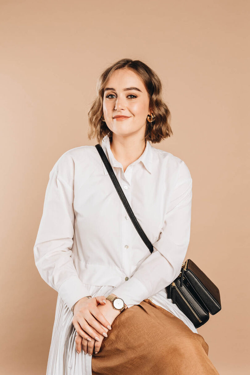
light-skinned woman with short brown hair wearing a button-down white shirt and a crossbody black bag

Bridget Scanlan

A donation from every KYT bag sold helps diabetes charities get crucial supplies to those in need. To learn more or pre-order, visit kytbags.com.

Kelly Beall is senior editor at Design Milk. The Pittsburgh-based graphic designer and writer has had a deep love of art and design for as long as she can remember, and enjoys sharing her finds with others. When undistracted by great art and design, she can be found making a mess in the kitchen, consuming as much information as possible, or on the couch with her three pets. Find her @designcrush on social.

KYT Merges Medicine + Fashion With Innovative Bag Collection

KYT Merges Medicine + Fashion With Innovative Bag Collection

At the age of 20, designer and KYT (Keeping You Together) founder Bridget Scanlan was diagnosed with Type 1 Diabetes. As her pancreas stopped producing insulin, she had to learn to manage blood glucose tests and insulin injections – as well as all of the equipment that comes with it. Soon, KYT released three designer bags meant to empower diabetics and streamline their daily treatment in a stylish way.

“From talking to diabetics around the world, I got universal insights into the daily diabetes struggle,” Scanlan says. “It sparked a thought: could smarter design empower people to feel better about dealing with daily treatment? I wanted to redesign diabetes, so we could all redefine it.”

Jumping into action, her background in fashion design and entrepreneurship led the way. “Every zip, every angle, every equipment detail has been influenced by the insights gathered from the hundreds of incredible diabetics who have opened up and shared their diabetes stories (and gripes) with me,” she shared.

light-skinned hand interacting with diabetes tools in a black bag

The contemporary bag designs feature smart layouts, using quality materials such as gold-rated Italian leather and solid brass hardware, and are ethically crafted. Each bag holds and organizes the carrier’s diabetic supplies, such as a testing kit, pump consumables, and insulin pens.

four black bags on pedestals

The SideKYT is a crossbody bag that streamlines users’ essential diabetes supplies by splitting into two sections: life essentials up front and diabetes equipment in the back. A testing station allows blood glucose levels to be evaluated straight from the bag.

If you’re looking for something larger, the SideKYT+ style might be for you. It’s a larger crossbody bag designed for pump users or those who want to carry more equipment or spares.

Lastly is the StarterKYT. The compact case allows users to discreetly carry supplies, measuring in at the size of a sunglasses case. It locks together with magnets and unfolds flat to create a testing station, then can be easily folded up again.

Currently, all three bags are available for pre-order, which includes a 15% price cut. 

light-skinned hands interacting with diabetes tools in a black bag on a table

light-skinned hand picking up a black case

light-skinned hand removing a black case from a brown bag

light-skinned hands interacting with diabetes tools in a black bag on a picnic blanket

light-skinned person wearing a black and white garment while carrying a black bag

light-skinned person wearing all white carrying a black bag while walking

light-skinned person wearing a bold geometric short-sleeved shirt and carrying a black backpack

light-skinned person wearing a bold geometric short-sleeved shirt and carrying a black backpack

light-skinned woman with short brown hair wearing a button-down white shirt and a crossbody black bag

Bridget Scanlan

A donation from every KYT bag sold helps diabetes charities get crucial supplies to those in need. To learn more or pre-order, visit kytbags.com.

Kelly Beall is senior editor at Design Milk. The Pittsburgh-based graphic designer and writer has had a deep love of art and design for as long as she can remember, and enjoys sharing her finds with others. When undistracted by great art and design, she can be found making a mess in the kitchen, consuming as much information as possible, or on the couch with her three pets. Find her @designcrush on social.

RIT’s Metaproject 13 Encouraged Students To Push the Boundaries of Seating

RIT’s Metaproject 13 Encouraged Students To Push the Boundaries of Seating

RIT’s annual Metaproject is now in its 13th iteration, encouraging students to produce design that’s “semantically correct, syntactically correct, and pragmatically understandable, but also visually powerful, intellectually elegant, and timeless.” All while staying in line with the Design is One philosophy at the school’s Vignelli Center for Design Studies. For Metaproject 13, students partnered with alumni-owned, high-end furniture brand Lazzoni and shared their work during NYCxDesign 2023.

The term “metaproject” acts as an overarching theme when referring to an industry partnership that places the students’ work into a more global view. The school’s philosophy is part of the conversation of Metaproject in order to make use of and challenge modernist ideological foundations in practice, learning from available archival resources. Lazzoni shares this same point of view, asking the students to develop a unique seating solution based on the mindset.

scale models of furniture surrounded by students

building front reading LAZZONI

Students taking part in Metaproject 13 presented their scaled ideas knowing that there was the possibility of their seating project being manufactured and added to Lazzoni’s catalogue – a first for Metaproject. On May 20th, the full-scale versions of contemporary chairs and sofa prototypes were showcased at Lazzoni’s Madison Avenue showroom. Dylan Malone’s Shell Chair, a convertible armchair that becomes a lounge with a simple pull, was crowned as the winning design that will move on to production and become available to consumers.

exterior window reading metaproject in yellow

showcase interior with modern furniture

showcase interior with modern grey furniture

armchair with pull out ottoman

Shell Chair, Dylan Malone Transforms from a sleek armchair into a relaxing lounge with just a pull. The tri-tone upholstery gives near infinite customization for any modern home or office. The design language is expandable to a wide range of related products such as loveseats and sectionals.

triangular shaped furniture

Hareket, Clare Maxwell The Hareket seating system utilizes inventive typology through simple geometry and encourages rearrangement to promote various social interactions. The simplicity of the form leaves its use to interpretation.

modular seating system

Hagia Sophia Seating System, Danny Harig The modular Hagia Sophia Seating System brings endless combinations of seating solutions into a living space. Inspired by Turkish architecture and tempered by the Vignellis’ restrained approach, it is a home of relaxation and conversation.

person sitting on light pink sofa with curved backrests

The Stage Lounge, Emma Yee The Stage Lounge is a place that supports togetherness or separation, collaboration or solitude, work, rest, or even play. The movable, weighted cushions allow for an easy shift from one scene to another.

grey armchair made of blocks

Şebeke, Joey Ruan This gridded system of tufted modules can be easily reconfigured from an armless chair to a sofa. With a back that can fold down in two orientations, one can create varying seat depths and widths, armrests, and surfaces..

curvaceous modern grey armchair

Enjoy Chair, Linying Xu The Enjoy Chair intends to create a space for relaxation and a place for small items which often get lost. TV remote, phones, and other items fit neatly into the storage slots in the chair’s arm. Combining functions leads to an enjoyable seating experience.

modern black and chrome barstool

Hafiza, Matt Hotaling The Hafıza is a minimal but elegant barstool for the home. Inspired by the Laz typography, hafıza means memory in Turkish, a perfect name for remembering and creating new memories.

orange and patterned modern sofa

Temel (root) Sofa, Rebecca Arens Emerging from the ground, this sofa brings the user down to their roots. Comfortably seating two, the curvilinear form is soft and welcomes you to sink in and relax.

hexagonal grey armchair

The Honeycomb Collection, Max von Bartheld The Honeycomb Collection is a basic geometric shape elevated to incorporate design and comfort, inspired by nature and the vast honey culture of the Turkish people and the Las tribe. The Honeycomb Loveseat is a compact chair that holds two people for a closer connection.

curvaceous modern grey chair

Havadan Sudan, Ruth Shin Havadan Sudan seating defies typical seating classifications and cultivates a micro-climate of shared consciousness for its participants who are challenged to sit in, on, and with its physical structure.

reclining black armchair with person reading seated

Arc, Rebecca Harris Arc is an interactive seating device designed for – and not to constrain – the body. Using Vignelli’s design sensibilities and Lazzoni’s established brand language, this is a seat for the home that allows for lounging, focused work, and everything in between.

modern black chair and ottoman

Moon Chair, Will Davis A chair that takes inspiration from the crescent moon pictured on the Turkish flag to create a space for the placement of a circular ottoman. The design is meant to be unique and recognizable to serve as an iconic chair, while also utilizing a cohesive, minimal, and elegant design language that fits into the Lazzoni brand.

modern white chaise sofa with a person sitting on it

Tas, Brynna Justice Tas seating holds space for the user and encourages conversation within the vessel. It has the ability to be modular and custom for large scale contract work, while also developing an open and comfortable environment for every user and every activity.

To learn more about Metaproject, or 2023’s Metaproject 13, visit rit.edu.

Kelly Beall is senior editor at Design Milk. The Pittsburgh-based graphic designer and writer has had a deep love of art and design for as long as she can remember, and enjoys sharing her finds with others. When undistracted by great art and design, she can be found making a mess in the kitchen, consuming as much information as possible, or on the couch with her three pets. Find her @designcrush on social.

Camille Walala’s Vibrant Studio Where Happiness + Joy Are Created

Camille Walala’s Vibrant Studio Where Happiness + Joy Are Created

If ever there was an artist that could instantaneously spread utter happiness and pure joy, it would be the London-based Camille Walala. Known for her use of geometric patterns and bold colors, the French artist partnered with Our Department to translate her aesthetic into a vibrant new studio that is 100% inspiring. The new space at Regent Studios is equal parts Memphis, Pop art, and post-modernism – instantly recognizable with Walala’s signature stamp. There is zero doubt that nothing but magic happens here.

Having landed in London over 25 years ago, Walala has worked out of many offices along with her creative + life partner, Julia Jomaa. The duo brought in another pair – Simon Sawyer and Gustave Andre, aka Our Department – to help transform their abstract ideas into a functional space where they can bring their imaginative visions to life. Together, they realized a bright and dynamic space that’s bound to spark endless creativity.

bright colorful office with geometric patterns and vibrant prints on wall

The studio is separated into two rooms: one where they can get messy with paint and model building, and the other for the “clean” work on computers. While fairly modest in size, the two spaces produce a plethora of work, including large-scale public project collaborations, and then smaller scale art, from paintings to sculptures to ceramics, that Walala creates herself.

bright colorful office with geometric patterns and prints on wall

closeup of colorful office with small grouping of colorful art and shelves of paint

At first, Walala was concerned about bringing in too much pattern and color, not wanting it to overtake the ongoing work rotating through the studio. “I enjoy the ambiance of the studio when I’m working. I want to inhabit the aesthetic fully, and push it in a new direction,” she said. “But I don’t want any Walala style at home, Julia and I just have artworks by other people we like.”

artist sitting sideways in bright yellow sweater at desk surrounded by art

Each project starts with a sketch or drawing to get the inspiration going.

overhead view of artists hands working on geometric artwork

interior view of modern office with bold geometric kitchen

In the kitchen, the door and drawer fronts are painted in four bright colors, all unified with black outlines, a feature often seen throughout Walala’s work.

interior view of modern office with bold geometric kitchen

closeup angled view of brightly colored kitchen cabinets

corner view of vibrant studio office with geometric artwork

view of vibrant studio office with geometric artwork

view of vibrant studio office with geometric artwork

To ensure an overall cohesive space, Walala and Jomaa made a model of the design in SketchUp. Durable materials are used in order make the spaces as functional as possible, while guaranteeing they would last and maintain the aesthetic as long as they plan to stay there.

view of vibrant studio office with geometric artwork

closeup of colorful cabinets with black and white stripes and teal green

Her vivid color palette is grounded with the use of black, and in particular, black and white stripes.

closeup of geometric memphis style sculpture

view of vibrant studio office with geometric artwork and mural

Most everything is custom designed and built by Our Department out of smaller components that made it easier to put together on site. When they chose to leave the studio, the furniture and structures can easily be disassembled and moved.

closeup of colorful geometric mural in vibrant studio office

two women working in colorful office with small pieces of vibrant art on walls

angled office view with colorful geometric walls and gold velvet sofa with white dog on floor in front

down view of white dog in blue sweater on black and white and gold dog bed

angled view of corner with memphis colorful shelf holding books and objects

One of the most iconic pieces from the Memphis era, the Bookcase by Ettore Sottsass from 1981, stands out yet blends in perfectly.

interior view of seating area with Memphis bookshelf with books and objects on it.

closeup of Memphis bookshelf with books and objects on it.

edge of Memphis bookshelf with colorful geometric print on wall behind it

Camille Walala in bright neon yellow sweater in front of geometric cabinets

Camille Walala

three women standing in front of colorful kitchen

Camille Walala and team

Photos by Taran Wilkhu.

Caroline Williamson is Editor-in-Chief of Design Milk. She has a BFA in photography from SCAD and can usually be found searching for vintage wares, doing New York Times crossword puzzles in pen, or reworking playlists on Spotify.