Capture your favorite memories with Queen Creek-based photographer Amy Harrison

Capture your favorite memories with Queen Creek-based photographer Amy Harrison

Lifestyle photographer Amy Harrison focuses on capturing the feelings happening behind the lens. Originally from the Bay area in California, Harrison grew up always being drawn to nature and art. In 2014 she made the move to Arizona and now calls Queen Creek home.

As a kid Harrison was always painting and drawing, but photography was always something that had interested her. She was that friend that would always take the best photos for everyone’s social media accounts. It was one of her friends that pushed her to pursue photography.

“It took a lot for me to take the leap and financially invest in myself,” said Harrison, owner of Emotion Photography. “I finally decided to invest in the equipment and then I just started and it’s been amazing. I feel like the artist part of me got unlocked again.”

It was the summer of 2022 when she first started buying gear and learning the ins and outs of her camera. In October of 2022 she started doing photo sessions. 

Shooting everything from maternity to senior pictures, weddings to family portraits, branding shoots and more, Harrison encourages people to reach out to her for whatever event they may need covered. She’s open to anything!

“I really feel like our relationships are the most important thing that we have in this life and I think that’s why it’s magnified when there’s people together that love each other… trying to capture that and bring that feeling out in a photograph is what brings me so much passion,” Harrison said. “It’s capturing the way his hand is in her hair or the way she’s holding her face. The way they’re kissing, the way a mother is holding their baby or the way this beautiful person is just looking off… it’s just capturing these little snippets of them and their interactions that highlight the depth of a relationship.” 

Instead of focusing on getting that perfectly posed photograph, her goal is to capture you. With the belief that everyone has a beauty to them, Harrison’s goal is to allow that to shine through in her work. 

“It’s almost like I’m just documenting you being you, you being with your favorite people, you having fun at the lake or whatever it is that we’re at… it’s more so that I’m documenting what’s taking place versus a posed, frozen, perfectly in place photo,” Harrison said. “It’s capturing the little special moments that happen as people are interacting.”

Having put her artistic roots aside for a while due to other priorities, Harrison’s happy to get back into creating. It’s given her a chance to reawaken that creative part of her that had become dormant. 

Looking ahead to her short-term goals, Harrison wants to master her craft and continue to build her business. Long-term, she’d love to become a destination elopement photographer. 

This job allows her to be a part of all of these magical moments people share. She wants her subjects to feel comfortable enough around her so they can be themselves as if the camera isn’t there. That’s when the photos with the most emotion come out. 

“It’s these happy and beautiful moments, things that they want to cherish forever that I get to be a part of by capturing those memories for them,” Harrison said.

To see some of Harrison’s work with Emotion Photography or to book a photo shoot, visit emotionphotography.org. She can also be reached on her Instagram and Facebook.

The Course of Events: A Journey Through the Lens of Street Photography

The Course of Events: A Journey Through the Lens of Street Photography

The Course of Events: A Journey Through the Lens of Street Photography

The Course of Events, a compelling exhibition held at the Fundació Foto Colectania, presents a powerful gaze into the evolution of Spanish and Portuguese societies since the mid-20th century. Displaying 160 select works from a collection of 3,000, the exhibition is a testament to the narrative potency of street photography and the critical socio-cultural dialogues it can foster.

The Collection and Its Architects

The collection, painstakingly amassed over time, comprises works by 80 authors, including the archive of Francisco Gómez, a celebrated name in the realm of photography. Distinguished photographers like Joan Colom, renowned for his vivid portrayal of Barcelona’s Chinese neighborhood, find their place alongside others such as Leopoldo Pomés and Xavier Miserachs, known for their male voyeuristic bias. The exhibition serves as a platform for these varying perspectives to converge, thereby enabling a richer and more nuanced understanding of the societies they represent.

An Unconventional Lens

Under the curatorship of Carles Guerra, the exhibition endeavours to recontextualize street photography, emphasizing the importance of viewing it through the lens of the photographers themselves. This includes a gender perspective, an often overlooked aspect in the discourse surrounding the medium. The inclusion of such diverse perspectives not only enriches the narrative but also pushes the boundaries of conventional photographic representation.

Thematic Blocks and Dialogues

The exhibition is thoughtfully organized into eight thematic blocks, creating dialogues between different generations of photographers and fostering collective reflection on the medium. Featuring works by photographers such as Ricard Terré, Clemente Bernad, Adriana López Sanfeliu, Laia Abril, and others, the exhibition navigates through a wide array of themes, from urban planning and economic struggles to climate change. The exhibition does not merely reflect on the past but also critically engages with contemporary issues, making it a timely and relevant discourse.

The Course of Events is slated to travel to Miami in the fall, coinciding with the Art Bassel celebration. This move aims to disseminate Spanish photography on an international platform, further broadening the reach and impact of these powerful visual narratives.

Ukrainian Photographers Demand Removal of Russian Judge From World Press Photo Jury

Ukrainian Photographers Demand Removal of Russian Judge From World Press Photo Jury

World Press Photo

The Ukrainian Association of Professional Photographers (UAPP) is officially oppsing the inclusion of Russian photographer, Mary Gelman, called “Maria” in some publications, as part of the jury for the World Press Photo 2024 competition.

Fear of Bias on the Jury

“The Ukrainian Association of Professional Photographers opposes the participation of Russian Maria Gelman in the jury of the competition World Press Photo 2024,” the UAPP explains in the English-language version of its statement.

“The Ukrainian Association of Professional Photographers appeals to the competition management with an urgent demand to change the composition of the jury and exclude the representative of the Russian Federation from its ranks. UAPP considers Gelman’s participation to be illogical and may affect the objectivity of decision-making when evaluating the participants’ works. In addition, Russia’s unprovoked, aggressive, cruel and unjust war against Ukraine has been going on for the 10 years in a row, and we believe that the participation of the representative of the Russian Federation, Maria Gelman, raises a lot of ethical issues,” the association continues.

Ukrainian photographer Valentyn Kuzan, a member of the UAPP, has noted on Facebook that, based on his knowledge, Gelman has not actively reported on Russia’s military operations in Ukraine.

“Especially considering that she, to my knowledge, did not participate in reporting the horrors of this war. But if she would, unlikely it would give her the moral right to evaluate the works of Ukrainian authors,” Kuzan writes in a machine-translated version of his Facebook post.

Kuzan questions whether a Russian photographer should evaluate images of the war in Ukraine, especially when judging photos captured by a Ukrainian photographer.

While a documentary photographer, Gelman has no apparent history as a conflict or war photographer, so it is not evident that she would have cause to photograph Russia’s ongoing military aggression.

There are also some concerns about Gelman having reportedly traveled to Crimea after Russia’s annexation of the Ukrainian territory in 2014.

“Gelman’s photos from Yalta, the city in occupied Crimea, were published in the Russian-language outlet Bird in Flight. The article is from 2015, and according to Ukrainian law, foreigners were allowed to enter Crimea only through the checkpoints from the Ukrainian-controlled side of the administrative border with Russian-occupied Crimea. Gelman has not mentioned how she got to Yalta,” reports the Kyiv Independent.

In the World Press Photo 2023 contest, Ukrainian photographer Evgeniy Maloletka won the “Stories” photo series category in the European region for his photos showing the Russian siege on Mariupol, Ukraine. Some Ukrainian photographers question whether photos showing similar stories will be fairly judged in this year’s competition given Gelman’s participation.

Photojournalists in Ukraine face extreme dangers. According to the Committee to Protect Journalists (CPJ), there are 17 confirmed journalists who have been killed in the Russia-Ukraine war, including 15 with a confirmed motive.

This year’s contest entries have closed, and judging is underway. The regional winners will be announced on April 3rd. As of now, Gelman is among five judges for the European region, sitting alongside chair Anastasia Taylor-Lind (United Kingdom/Sweden), Andreas Trampe (Germany), Gilles Steinmann (Switzerland), and Mariama Attah (United Kingdom). Gelman is an acclaimed photographer and was previously awarded in the 2022 edition of the World Press Photo Contest.

The World Press Photo Foundation’s Stance

This is a complex situation, and some photographers in Ukraine and beyond are understandably extremely concerned about Russia’s influence over its citizens, so PetaPixel contacted the World Press Photo Foundation.

“Photographers and other civilians in Ukraine are facing a brutal situation due to Russia’s continuing attacks,” says Andrew Davies, the World Press Photo Foundation’s communications director. “We have total respect for the journalists who are documenting Russia’s war on Ukraine for the world to see, often doing so with great risks and difficulties. In 2023, images recording these atrocities were showcased to millions around the world through our exhibitions and online channels.”

As for jury selection, the process of selecting jurors is extensive.

“In each regional jury of the contest, we aim for a balance of different characteristics such as professional experience, gender, and approach to photography. Putting this independent jury together is a thorough and careful process, resulting in the selection of 31 experts (five jury members per region, plus a global jury chair),” Davies explains.

“Like all jury members, Gelman was chosen for her high degree of professionalism and expertise. Her work on vulnerability, repression, and the LGBTQ+ community in an increasingly hostile environment is touching, honest, and technically excellent. We trust her ability, as a person and photographer, to fulfill this role,” Davies tells PetaPixel.

“After graduating with a degree in sociology, Mary got involved in photography. She often explores themes such as identity, trauma, vulnerability, and resilience, and seeks to challenge stereotypes and prejudices. She also focuses on life and the ideology of alternative communities and different social groups facing discrimination. The most important part of her practice is diving deeper into the topics and interactions with people, where empathy, trust, and understanding are significant,” writes the World Press Photo Foundation on Gelman’s juror page.

While some international competitions, including many sporting events, have opted to prohibit people from competing under a Russian flag, few have outright excluded Russian citizens altogether. After all, the Russian people are not inherently responsible for the actions of the Russian government or the Russian military. The relationship between a country’s people and that nation’s actions on a global stage is obviously complicated. The World Press Photo Foundation does not exclude photographers from any country from its prestigious competition.

“At the same time, we ensure the jury has the information it needs to judge the work in the context it is produced. So the jury is given the photographer’s nationality, where they are based, information relating to how and why the story was made — such as the motivation to work on the project, the type of project (assignment/personal project), and funding of the project,” Davies says. “The story behind the photography is an important part of the judging criteria, as is accuracy.”

The judging deliberations and voting are kept private. Per the World Press Photo Foundation, “All proceedings and deliberations of each jury are conducted in confidence. Jurors are required to sign a non-disclosure agreement to ensure they do not reveal any details of the deliberations.”

Davies says each judge is “selected carefully” for their expertise and professionalism. “We are confident in the ability of all of them to judge fairly.”

“Every year, we trust jurors to judge topics they might feel a connection to (because of their nationality, etc.). This includes jurors from countries that are at war or have repressive governments,” says Davies.

For those concerned that this personal connection by a single judge could significantly impact the results, Davies expresses no such concern.

“Our judging process is also rigorous and tested. No jury member can block any entry from winning. The final decision about both regional and global winners is made by the global jury, which is composed of the regional jury chairs plus the global jury chair.”

Balancing Diversity of Perspective Against Concerns of Fairness

It is easy to understand the UAPP’s concerns. However, demanding an outright ban on a Russian photographer from judging the World Press Photo 2024 competition risks conflating Russian civilians with the actions of the Russian government. A Russian’s lack of public demonization of their government’s actions is not the same as outright approval. While some can reasonably consider someone’s silence or inaction as a tacit agreement, the situation is not so clear in a country with tightly controlled media and strict laws against dissent.

What is clear is that by including Gelman on the European jury for this year’s World Press Photo awards, the World Press Photo Foundation has opened itself to this controversy. However, it may be a conversation, however challenging, that needs to take place because photography and photojournalism are vital in the fight for justice and peace worldwide, and the role photographers from certain countries should serve remains unsettled.

Unlocking the Power of Photoshop Levels for Photography

Unlocking the Power of Photoshop Levels for Photography

Levels often seems like a boring old tool in photo-editing programs. Maybe you’d use it to quickly fine-tune contrast by dragging the left and right sliders inwards. But it’s good for much more than that.

In some ways, Levels is less powerful than Curves: its chief rival. Even so, a Levels tool tells you vital things about an image’s color at a glance. Having adjustable RGB histograms at your fingertips is a big plus.

Table of Contents

The Hidden Colors Of Levels

In Levels, you can view and adjust discrete red, green, and blue histograms. It’d be easy to think these histograms only represent the three primary RGB colors, but that’s untrue.

Yes, if you drag the right-hand sliders inwards, you’ll add red, green, or blue to an image via the respective channel. However, the left-hand sliders modify the opposing secondary color in each case.

Red, green and blue histograms also embody opposite secondary colors.

Thus, the left-hand sliders add cyan in the red channel, magenta in the green channel, and yellow in the blue channel. This is useful to visualize when correcting color, especially in photos that have no neutral tones to help you.

The individual color channels define black and white points, too. Any pixel fully saturated in red, green, and blue becomes pure white with no textural detail. Any pixel likewise saturated in cyan, magenta, and yellow becomes black.

Here are some other points to note about RGB histograms:

  • Pure cyan (0, 255, 255 *) is a blend of green and blue and contains no red.
  • Pure magenta (255, 0, 255) is a blend of red and blue and contains no green.
  • Pure yellow (255, 255, 0) is a blend of red and green and contains no blue.
  • Big gaps on either side of a red, green, or blue histogram can signify a color cast.

* RGB values.

Color Corrections Using Levels

There are several ways to correct color using Levels. Some are also possible in Curves. Below, you’ll find three such methods.

1. Simple Levels Eyedropper Method

You’ll see three eyedroppers in Levels and Curves tools. You’d use the outer two to set the image’s black and white points, though this isn’t often needed. It’s the middle eyedropper tool—the mid-tone eyedropper—that you can use to correct color.

One of the easiest ways to remove a color cast is to find a neutral gray area in the image (like concrete or dark clouds) and click on it using the dropper tool. You may need to do this a few times before you get a result you like.

This method is akin to a white balance adjustment. As such, it’s better performed at the raw processing stage if you have that chance. A problem arises when there are no neutral tones in the image, as is often the case in nature. You can feed a gray card into your photo shoots to make color correction easier.

In photos shot under mixed lighting (e.g., daylight and artificial), white balance corrections in general become more difficult. You’ll correct a cold hue in one part of an image, only to increase the orange hue elsewhere. Levels layer masks can help in that situation, enabling you to address specific areas.

A Delft vase shot under artificial lighting and corrected using a Levels middle eyedropper.

2. The Average Blur Method

This method also uses the middle eyedropper tool in Levels or Curves. It works well on images that have no obvious neutral tones to guide you. However, don’t use it on photos that are dominated by one color.

First, duplicate your background layer. In Photoshop, go to Filter>Blur>Average and click on it. Your duplicated layer will turn into one solid color, which represents the averaged hue of the whole image.

Open a Levels layer and, using the middle eyedropper tool, click on the single color of the duplicated layer. It will turn into a mid-gray. Delete the duplicated layer and merge the Levels layer with the background image.

Using average blur and Levels to remove a yellow color cast.

3. Individual Histogram Method

One way to get rid of color casts and improve the overall look of an image is to examine the separate red, green, and blue histograms in Levels. When there’s a strong color cast in a photo, it’ll show itself in a Levels histogram.

An example of the above is a photo that has a cold blue cast. That being the case, you should see an absence of blue histogram data to the left. You can remove the cold cast by moving the left slider inward to add yellow. Because yellow is a mixture of green and red, you’ll enrich those colors at the same time.

Removing a blue cast in an image by moving the left-hand slider to the right in the blue channel.

A color cast on the magenta-green axis is more likely to come from artificial lighting than daylight. Modern artificial lighting (i.e., fluorescent and LED) uses a correlated color temperature with this precise potential. The backlighting in your monitor is the same, making calibration and profiling all the more important.

It’s possible to improve pictures by adjusting contrast in all three RGB Levels channels one by one. However, this can also create color problems, so it’s not something you’d do religiously. Try it on photos containing a variety of hues.

Viewing the RGB histograms separately can help you make editing decisions and affirm your assessment of an image. Being aware of secondary colors in Levels helps.

Types of Levels Histograms

Aside from the individual red, green, and blue channels in Photoshop Levels, you also have the composite RGB histogram. As you’d expect, this is a blend of the three.

RGB Histogram vs Luminosity Histogram

The RGB histogram warns you about clipping in any or all of the three red, green, or blue colors. Clipping refers to overexposure or underexposure, which always causes a degree of detail loss. If at least one of the three RGB channels still holds data, some detail is still possible (that’s what highlight recovery tools depend on.)

A luminosity histogram represents the perceived brightness of an image. To account for human color sensitivity, green is weighted with 59% of a histogram’s luminosity, with red at 30% and blue at 11%. This histogram is also sometimes called a luminance histogram (e.g., in ACDSee software), which is technically imprecise.

You can see the 11%, 30% and 59% weighting of fully saturated blue, red and green in this Luminance Levels tool.

Photoshop only includes an RGB histogram in Levels. Other programs vary. A luminosity histogram won’t show highlight clipping unless all three channels are clipped. With monochrome images, the RGB histogram is identical to a luminosity histogram.

Luminosity histograms and RGB histograms are the same in black and white photos.

You can use Levels inside Photoshop whilst looking at the histogram window for extra info if you want. For instance, the Colors histogram would give extra live detail on any channels being clipped.

The Clipping Display

In Photoshop and other programs, a clipping display lets you see which areas of detail are being lost. To access it, hold down the Alt/Option key and move the right or left Levels sliders inwards. You’d usually stop once pixels begin to appear on either side.

There are times when Levels adjustments aren’t so easy. An example is when there are many pixels close to full saturation while the main subject sits stranded in the middle of the histogram. In such a case, the outer sliders will forfeit detail if moved. One solution is to adjust the mid-tones with the middle slider and limit your use of the outer sliders.

This highlights clipping display in Photoshop shows the brightest areas of a crocus image.

Highlight clipping is often more important than shadow clipping as it catches the eye. Even so, you wouldn’t usually want to block large areas of shadow (denoted by black pixels against a white clipping display.)

If a photo already has clipped Levels channels before you start editing, don’t go overboard trying to fix it. Doing so will often spoil the image, and the look of said image always trumps what the numbers and graphs tell you.

Making Sacrifices

It’s useful to note that some instances of clipping aren’t disastrous. For instance, no one expects to see detail in reflected sunlight (i.e., specular highlights.) You’ll need to make judgment calls about how much you can afford to sacrifice.

The size of an area being clipped is a vital factor, as it’ll certainly ruin a photo if you have large swathes of emptiness where detail once was. Color clipping (rather than luminance clipping) can also cause ugly posterization effects.

Shooting into the sun will often cause blown highlights. This isn’t necessarily a problem if it looks natural.

Game-Changing Possibilities?

You can now use content-aware fill and generative fill in Photoshop to help you patch up lost detail. This might affect how far you’re willing to go to prevent clipping, especially in a secondary area of the image.

Output Levels

Input Levels are most commonly used in Photoshop, but beneath those you have Output Levels sliders. Output Levels limit the tonal range of Input Levels, though by default they’re set to the same 0-255 span.

One nice use of output Levels is to achieve a more print-like feel to your online photos. Pull the left and right output sliders in to suppress highlights and shadows until you achieve a look you like.

The dynamic range of this black-and-white image has been reduced with Output Levels for a more print-like effect.

You can also pull in output sliders before the use of high-contrast LUTs or micro-contrast tools like Clarity. This helps to prevent clipping, albeit by reining in the result a little.

The use of Output Levels compresses the histogram, regardless of whether the image was originally clipped. What it can’t do is restore detail in formerly blown areas, alas.

The Levels Auto Options

An auto button is tempting in editing programs, especially if it gets you close to where you want to be. In Photoshop Levels, its effect varies depending on the algorithm selected under the Options tab. There are four in all.

Enhance Brightness and Contrast

Enhance Brightness and Contrast is the default selection, largely because it’s the smartest and most refined. One way it differs from the other three choices is by making intelligent tweaks with the mid-tone slider. It often clips individual RGB channels while avoiding luminance clipping. Image brightness is sometimes overcooked.

Find Dark and Light Colors

This choice with Snap Neutral Tones selected is the equivalent of Auto Color under the Photoshop Image tab. It was once the default setting and often gives a nice result. However, it clips your photo by the amounts specified under Target Colors and Clipping, so there’s no smart editing going on.

Enhance Per Channel Contrast

Enhance Per Channel Contrast is the equivalent of Auto Tone under the Photoshop Image tab. This option may create color casts as it routinely adjusts contrast in the discrete red, green, and blue channels. It works well when it works, making pictures pop with extra color contrast.

Enhance Monochromatic Contrast

This selection is akin to Auto Contrast under the Photoshop Image tab. It doesn’t dive into the distinct RGB channels. Rather, it sticks only to black-and-white contrast, like a Luminosity Levels adjustment. On the plus side, it won’t create color casts. You can also alter Target Colors and Clipping to minimize clipping.

The Enhance Brightness and Contrast auto option adjusts all three Input Levels sliders.

Wrapping Up

Simple tools like Levels or Curves might not be as magical as the latest AI-powered potions, but they still offer satisfying results. These are the tools you’re likely to use on every picture in some form. They can be used creatively, but at the very least they’ll imbue your photography with an underlying quality and understanding.

Lois Greenfield Moving Still is Chicken Soup for the Photographer

Lois Greenfield Moving Still is Chicken Soup for the Photographer

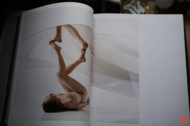
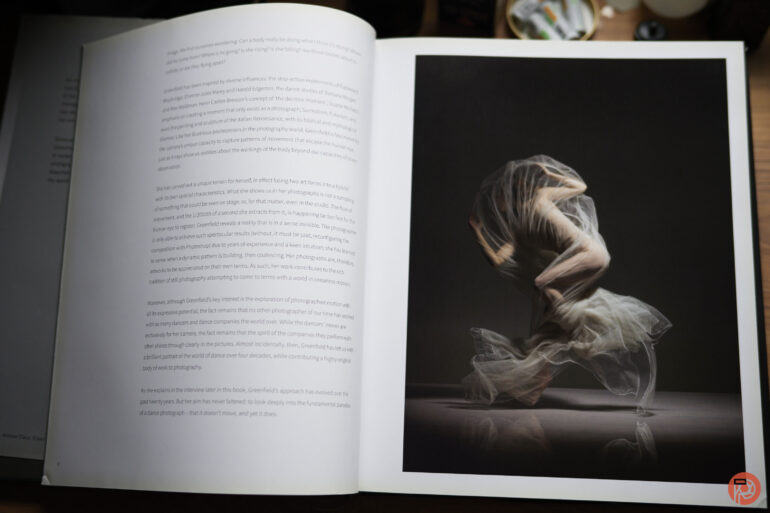
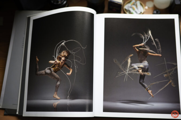
Years ago, I interviewed photographer Lois Greenfield for our Inside the Photographer’s Mind podcast. She gifted me her book, Moving Still. But it’s only recently that I got the chance to truly look through it. We’ve featured Lois a ton of times here on the site. Though now that I think about it, her work is some of the most perfect fodder for the creation of a photography book. Indeed, Lois Greenfield Moving Still takes her work and puts it into a way that you’ll want to page through and reference for inspiration. If you’re a dance photographer, this will really apply to you. But if you’re a studio photographer, you’ll totally understand where I’m coming from.

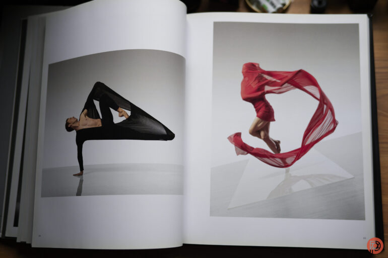
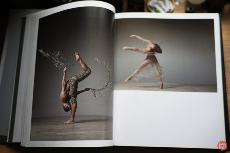
Lois Greenfield Moving Still is a book that’s vertical format. The images are printed on a mostly matte paper with only a little bit of sheen on them. Seriously, I wish more prints were made on paper like this. It suits itself to be very versatile and it looks good almost anywhere. But I thumbed through this book with diffused southern daylight coming from a window. I also slightly propped the book up to give it a bit more diffusion. As you turn the pages, you get an experience that the screen of your phone or computer can’t give you.

These are big images that have bold color, beautiful lighting, and pop in more ways than one. If it’s not Lois’s use of color, it has to do with the lighting, the background, etc. But most of all, the poses that the dancers are in are something that seem almost impossible to get. After talking with Lois, she told us that she gets the shots pretty much the way they are in-camera. Not to say that I don’t believe her, but Lois should be teaching lighting, color theory, and timing to all photographers today. She’s proof that you don’t need a camera that shoots at 120 frames a second. Many times, Lois can get the shot in a single frame — something that I’m aware is possible because I used to be able to do it when I had better vision.

Lois’s work is treated with the utmost respect as nearly every photograph has its own dedicated page. And in the rare cases that it doesn’t, the photography doesn’t feel like you should roll your eyes very hard. However, I’ll fully admit that they would look better centered onto a single page.

There are also various sections of the book that are more or less separated by things like the background, the lighting, the types of costumes worn, etc. Despite this, I’m constantly in awe of all of it.

Her photography is something that has to be very carefully done. It takes the street dance idea that so many other photographers abide by and grabs it by the shoulders while yelling at it to do the photographs properly. I remember Lois telling me that not much post-production, if any, is done on the photographs. This amazes me even more. And it’s bound to amaze any photographer that picks this book up.

Lois Greenfield Moving Still is a book for any photographer that wants to master lighting, adores paintings, likes dance photography, or just needs inspiration. It’s a reference tool for your aspirations which I think many photographers need to look at in a day where we’re devaluing the idea of a single photograph so much.


Rating: 4 out of 5.

We’re giving Lois Greenfield Moving Still four out of five stars. Want one? Check it out on Amazon.

Lois Greenfield Moving Still is Chicken Soup for the Soul of a Strobist
Lois Greenfield Moving Still is a book for any photographer that wants to master lighting, adores paintings, likes dance photography, or just needs inspiration. It’s a reference tool for your aspirations which I think many photographers need to look at in a day where we’re devaluing the idea of a single photograph so much.

PhotoSpot Debuts App for Enhanced Travel Photography Experiences

PhotoSpot Debuts App for Enhanced Travel Photography Experiences
image

NEW YORK, NEW YORK , UNITED STATES , January 17, 2024 /EINPresswire.com/ — PhotoSpot has officially launched its app, aiming to assist travelers and photographers in finding locations conducive to capturing engaging travel photos. Initially available in New York City, the app is now expanding to additional cities, broadening its scope and utility for a diverse range of users.

The app addresses a common challenge in travel photography: finding locations that offer compelling compositions. By guiding users to suitable locations, PhotoSpot facilitates the creation of visually appealing photographs, catering to both amateur and professional photographers.

Vaibhav Srivastava, the founder of PhotoSpot, explains the motivation behind the app: “We recognized a gap in the travel photography experience – the difficulty in finding the right composition for photos. PhotoSpot was developed to bridge this gap, making it easier for people to capture the essence of their travels in their photographs.”

The app goes beyond just suggesting locations. It integrates local knowledge, providing users with a rich, authentic experience. Over the coming year, PhotoSpot plans to extend its reach, identifying prime photography spots in various destinations. This expansion includes collaboration with local photographers, enhancing the authenticity and appeal of the locations suggested by the app.

Currently operational in New York City, PhotoSpot is on a trajectory to become a valuable tool for those seeking to enhance their travel photography skills in various urban landscapes.

For additional details, interviews, or inquiries, please reach out to Sabrena Gartland at sabrena@frogmanmediagroup.com.

Sabrena Gartland
Frogman Media Group
+1 310-427-7706
email us here

image

Unprecedented Footage Shows Plants ‘Talking’ to Their Neighbors about Potential Predators

Unprecedented Footage Shows Plants ‘Talking’ to Their Neighbors about Potential Predators

The touch-me-not plant, officially known as mimosa pudica, quickly contracts its leaves when shaken or brushed by assumed predators. When one of these specimens senses danger like a nearby herbivore ready to take a bite, calcium erupts within its system, prompting exposed areas to recoil.

Scientists have known since the 1980s that other plants, not just those deemed sensitive like the touch-me-not, similarly transmit such warnings. And thanks to molecular biologists at Japan’s Saitama University, we now have visual evidence of the process.

A video released by Science Alert shows bright green quickly illuminating the leaves of the thale cress, or Arabidopsis thaliana. Researchers had genetically modified the plant so that when calcium flowed through their cells in greater proportions, a biosensor fluoresced. This color change occurred in response to airborne chemicals emitted by nearby plants overrun with caterpillars. The damaged specimens released the compounds to warn their fellow flora, which then triggered the calcium reaction in their neighbors.

You can read more about the science behind the groundbreaking study in Nature. (via PetaPixel)


Do stories and artists like this matter to you? Become a Colossal Member today and support independent arts publishing for as little as $5 per month. The article Unprecedented Footage Shows Plants ‘Talking’ to Their Neighbors about Potential Predators appeared first on Colossal.