About

Posts by :

Vintage Pic of a Bearded, Masked Man Inspired ‘Batman’?

Vintage Pic of a Bearded, Masked Man Inspired ‘Batman’?
image
Claim:

A vintage 1892 photograph of a bearded butcher, Bill Smith, in a bat mask, was the inspiration for the character of Batman.

For years, a purported vintage photograph of a bearded man in a mask has circulated on the internet claiming to be the inspiration for the famed comic-book vigilante Batman. While we’ve done Batman-related legends before, this one has certainly spread far and wide without much evidence to support it. 

The claim has many variations. A number of posts on X claimed Wayne Bruce, a Scottish man who was the descendant of the Scottish king Robert the Bruce, was the inspiration for Bruce Wayne, the man who would go on to don Batman’s mask, including one in April 2024: 

According to another story attached to this photo, the man was a butcher named Bill Smith and the photograph was taken in New York City in 1892. 

The above photograph was not actually the inspiration for the character of Batman. 

We searched for the origins of the photo using reverse-image search and were directed to numerous reposts, as well as articles that claimed different sources. The photograph was on Reddit back in 2017, and appeared on Bandcamp, an audio distribution site, as a profile picture for user Dennis Kelly

The photograph also appears on the art and photography workshop Foto Marvellini, which was founded in 2011 and appeared to specialize in editing photographs to make them appear vintage. Titled “Bat barbone,” the image appears alongside other vintage photographs of people from different time periods wearing similar masks. Per the “Bat barbone” image description, it was “Printed in the darkroom and treated with tannic acid” and “Mounted in a wooden frame from the early 1900s.”

Andrea and Carlo Marvellini of Foto Marvellini confirmed to us that this was their original work and the first “Bat barbone” print was made in 2012. They digitally manipulated original photographs sourced from the U.S. Library of Congress from the 1860s and 1890s, inserting a mask in post-production. They also shared articles from art magazine Artribune and newspaper il Fatto Quotidiano, which covered their work in 2014 and 2016. 

They described their reasoning behind such works:

Our collective declines the theme of the “fake” in photography, plays with the absurd, celebrates past techniques, creates credible ancestors and faithful post-mortems. With [our] deliberately “deceptive” works, Foto Marvelli invites the viewer to remember that images in general, by nature, trigger and shape his emotions and his understanding of the world.

The claim that this man was the original inspiration for Batman also appeared back in 2016 on the website of the Suffolk Gazette, which claimed that Smith got into trouble with the law and “was first indicted in 1878 for catching and punching a thief who had run out of the shop with a leg of lamb over his shoulder.”

The article then claimed:

Mr Smith, then aged 43, was set free by the sympathetic judge, who was no doubt fed up with the never-ending list of petty criminals being hauled up before him.

The episode inspired Mr Smith who, according to parish records, had left Dallinghoo in Suffolk where he worked as a farm labourer to board a liner from Liverpool to New York to seek a better life.

Spurred on by a one-paragraph report of his court appearance in the New-York Tribune, he went on to tackle more thieves and soon gained notoriety as a vigilante.

It took four more years for him to adopt his famous head mask – to make him look like a bat and to hide his real identity. He then patrolled his neighbourhood by night looking for baddies.

However, the website Suffolk Gazette is satirical in nature. It even posted on Facebook in 2020, clarifying that the story was not real. 

So what were Batman’s actual origins? Created by Bob Kane and his partner Bill Finger, the first comic strip featuring the masked vigilante appeared in 1939 in Detective Comics. According to a 1998 New York Times obituary of Kane, he was inspired by “a 1920s movie called ‘The Mark of Zorro,’ a radio show called ‘The Shadow’ and a 1930 movie called ‘The Bat Whispers.’ That movie featured a criminal with a cape who shines his bat insignia on the wall just before he is about to kill his victims, and who, in at least one scene, stands on the roof of a building and spreads his cape out.”

Kane also credited artist Leonardo da Vinci for helping inspire him: “I remember when I was 12 or 13 I was an ardent reader of books on how things began … and I came across a book about Leonardo da Vinci. This had a picture of a flying machine with huge bat wings. … It looked like a bat man to me.”

Finger came up with the name Bruce Wayne, as well as Batman’s key features, like the scalloped edges of his cape and the blank white eyes. 

“When I first drew him I had eyes in there and it didn’t look right,” Kane once said. “Bill Finger said, ‘Take them out.”‘

Given that the photograph of the bearded man in a bat mask appears to be the original artwork from an Italian artists’ collective, has appeared in numerous online venues that are not connected to the comic book caped crusader, and that the original creators of Batman cited other sources of inspiration, we rate this claim about the image as “Miscaptioned.” 

2024 Venice Biennale highlights art of the Global South

2024 Venice Biennale highlights art of the Global South

Elisabetta Galla

04/20/2024April 20, 2024

Under the title “Foreigners Everywhere,” the 60th Venice Biennale is putting the art of the Global South in the spotlight. The exhibition, curated by the Biennale’s first curator from Latin America, Adriano Pedrosa, showcases work from marginalized groups — especially Indigenous artists.

https://p.dw.com/p/4ezfY

Sharpening showdown: Topaz Photo AI vs Luminar Neo

Sharpening showdown: Topaz Photo AI vs Luminar Neo

Sharpening software can sometimes take away the blur. But with Luminar Neo and Topaz Photo AI both offering powerful AI sharpening tools, choosing the right one can be challenging. We use a blurry, rocky arch to figure out what works here.

No, there will be no bird sharpening comparisons today!

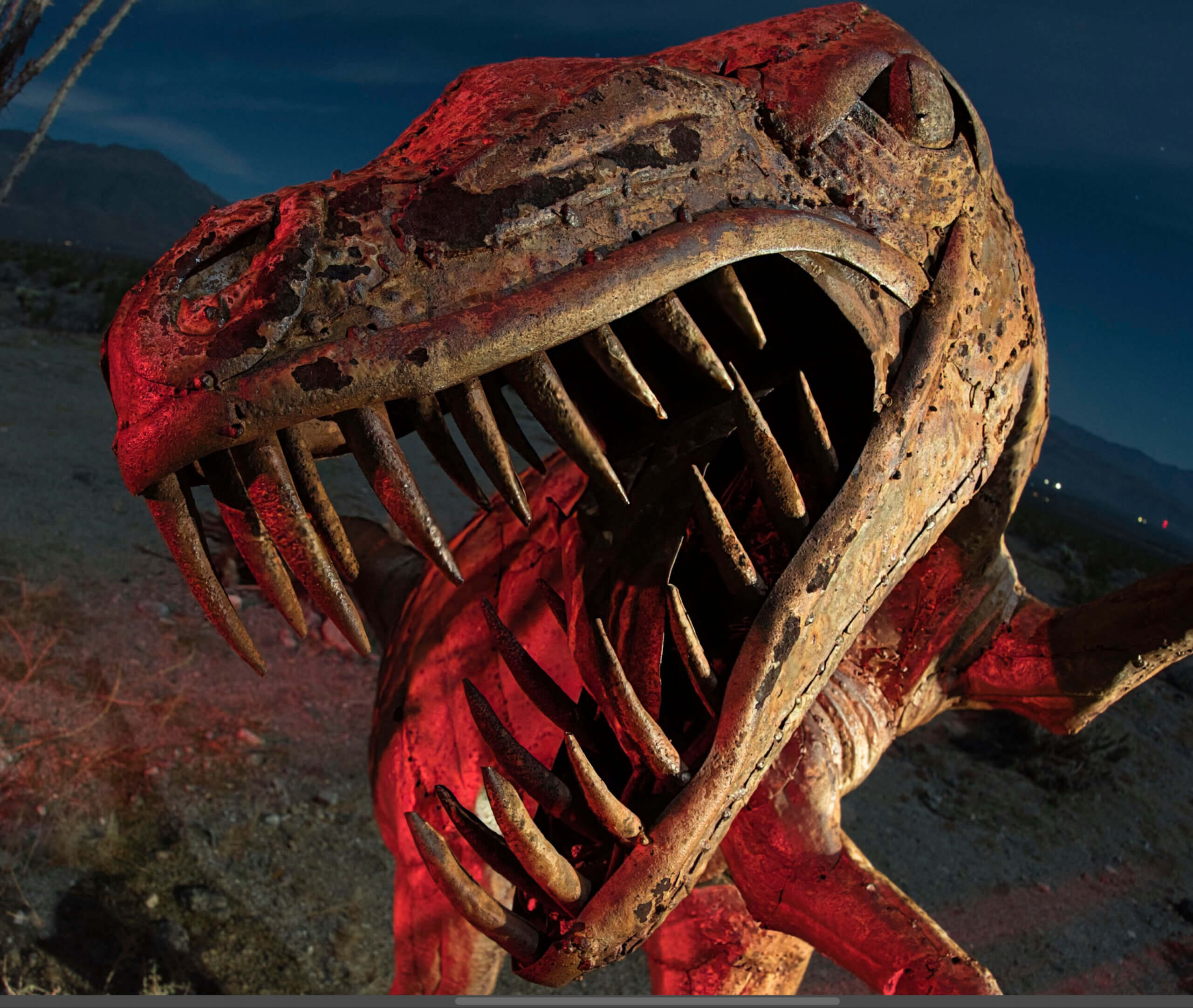
Sharpening software companies frequently like to advertise how great they work with birds. And with the feathery plumes and eyes, it does give a lot for sharpening software to sense. But I was wondering how it would work with night photos where part of the image was out of focus. I did two comparisons: one with a sculpture of a velociraptor in Borrego Springs, CA, and another with an old photo of Mobius Arch in Alabama Hills, CA.

I used only RAW files for each of the two comparisons. However, both programs are capable of sharpening TIFF or JPG files.

For our attempt at comparison, I used Topaz Labs Photo AI 2.4.2, which is the second version of Photo AI, and Luminar Neo 1.18.3, which had been just updated prior to writing this article. I didn’t intend this to be a comparison. I was going to simply kick the tires with Photo AI. But, well, things happen. Right as I got ready to submit this article, Topaz released Photo AI 3. However, all comparisons are still valid.

At the end of this article, I will share some brief thoughts about the ethical nature of using AI sharpening software for certain genres of photography, such as photojournalism.

Using Topaz Photo AI V2: Velociraptor sculpture

I first began with a velociraptor sculpture photo. I focused on the eye, and because I was so close to the sculpture, this left the snout a little out of focus.

Sharpening a sculpture using Topaz Photo AI V2.
Sharpening a sculpture using Topaz Photo AI V2. Autopilot began sensing what to do immediately.

Topaz Photo AI began using Autopilot to sense what the photo needed.

Sharpening a sculpture using Topaz Photo AI V2. This was the default setting from Autopilot.

I went with the default setting from Autopilot because it looked good, and it was a reasonably medium setting. The default was Standard with a setting of Strength of 57 and Minor Deblur of 16.

Sharpening a sculpture using Topaz Photo AI V2. Mask.
Sharpening a sculpture using Topaz Photo AI V2. The mask was done automatically by Photo AI.

Impressively, when I went to create a mask so I would only sharpen the sculpture, it was already done. This is great. If you are going to advertise that you are going to make things easier for photographers, this is the way to do it.

Luminar Neo: Velociraptor sculpture

Next up? Luminar Neo, using Supersharp.

Sharpening a sculpture using Luminar NEO SuperSharp. Mask.
Sharpening a sculpture using Luminar Neo Supersharp. This was the closest I could get with their Mask AI feature. I ended up using a brush to add on to their mask. In other words, Topaz Photo AI did a better job automatically sensing the mask, and even did so automatically.

Upon loading, I selected Supersharp, as it didn’t load this automatically a la some sort of Autopilot as Photo AI does.

Luminar Neo does not have a slider. I selected the medium strength for sharpening because I felt it would be closest to Photo AI. It put on a display of patterns moving back and forth, which at least tells you that it’s working on something. It takes a while for this to process, but once it does, everything works swiftly.

The Mask AI feature offered some choices, none of them, not surprisingly, a dinosaur. “Architecture” was the closest. I then used a brush to add to the rest of the mask so I would only sharpen the sculpture and nothing else.

Sharpening examples: Topaz Photo AI or Luminar Neo Supersharp — Velociraptor sculpture

Topaz Photo AI after sharpening: Velociraptor sculpture

Screenshot of sharpened image, Topaz Photo AI (Standard at a Strength of 57 and Minor Deblur of 16 from a RAW file.
Screenshot of sharpened image, Topaz Photo AI (Standard at a Strength of 57 and Minor Deblur of 16 from a RAW file).

Full size of the above image.

Luminar Neo Supersharp after sharpening: Velociraptor sculpture

Screenshot of sharpened image, Luminar NEO Medium SuperSharp from a RAW file.
Screenshot of sharpened image, Luminar NEO Medium Supersharp from a RAW file.

Full size of the above image.

RAW file with no sharpening: Velociraptor sculpture

Screenshot of RAW file, unsharpened.

Full size of the above image.

Results: Topaz Photo AI vs. Luminar Neo Supersharp — Velociraptor sculpture

Bearing in mind that I was using as close to medium settings as I could possibly get them, I would say that Topaz Photo AI gets the nod here, if for no other reason than it did it automatically, and made it as easy as it could possibly be to sharpen this. It actually did all the processing via Autopilot quicker than Luminar Neo did after selecting Supersharp. Also, the image was slightly sharper.

I am quite sure that if I fiddled with Luminar Neo Supersharp, I could get to address the blur as well as Photo AI. Perhaps simply using the strong selection might do it. But here, see for yourself. This time, I will also have high-resolution screenshots for you to look at as well in the hopes that you can decide for yourself.

Hey, one more comparison!

It’s very important to realize that sharpening software has different strengths and abilities. With that in mind, I thought I would try a single-exposure Milky Way photo from summer 2017.

The stars are beautifully sharp in this photo. The problem is that Mobius Arch is not. Why? I was a little too close to the arch for it to be regarded as “infinity” by the lens. Consequently, it’s a little blurry. It’s very challenging to determine whether something like this is perfectly in focus in the field. It’s dark, after all. But what I should have done was to examine it more carefully on my cameras LED screen. I could have then taken a second photo while focused on the arch, and blended them together.

Would either of these programs be able to rescue my mistake?

Using Topaz Photo AI V2: Mobius Arch

Topaz Photo AI. Sharpening at a medium setting, Strength of 50, Minor Denoise of 50.

For this next comparison, I wanted to do two attempts at sharpening. For the first one, I selected “Standard,” also selecting a Strength of 50 and a Minor Denoise of 50. This would be the generally moderate setting, just to see how it would do. One of the aspects of AI photo processing that critics frequently overlook is the ability, just like with many other programs, of selecting the setting you want instead of going with an automatic setting.

Topaz Photo AI. This is the mask it automatically selected, getting most of the arch.

Like before, Photo AI automatically selected a mask, this time automatically choosing “Subject.” It got most of Mobius Arch, as you can see.

Topaz Photo AI. Sharpening at a strong setting, Strength of 100.

As mentioned, I made two attempts at sharpening. This one was maxed out, using the Strong setting, and at a Strength of 100. We shall soon compare them to Luminar Neo’s attempts.

Using Luminar Neo: Mobius Arch

Luminar NEO Supersharp, selecting “High” for the setting.

I selected two settings, just as I did with Photo AI. Here, the choices given were Medium and High. Since there are no sharpening adjustments other than that, I just went with it. Of course, I also tested its ability to mask easily.

Luminar NEO Supersharp. This is the mask it selected after selecting “Mountains”.

Unlike Photo AI, you have to select a Mask unless you want it to sharpen the entire image. After clicking on “Mask AI”, Luminar Neo offered two settings, “Mountains and “Natural Ground”. “Mountains” worked better.

Sharpening examples: Topaz Photo AI or Luminar NEO Supersharp — Mobius Arch

Topaz Photo AI after sharpening: Mobius Arch

Screenshot of sharpened image, Topaz Photo AI (Standard at a Strength of 50 and Minor Deblur of 50 from a RAW file).

Full size of the above image.

Screenshot of sharpened image, Topaz Photo AI (Strong at a Strength of 100 from a RAW file).

Full size of the above image.

Luminar Neo Supersharp after sharpening: Velociraptor sculpture

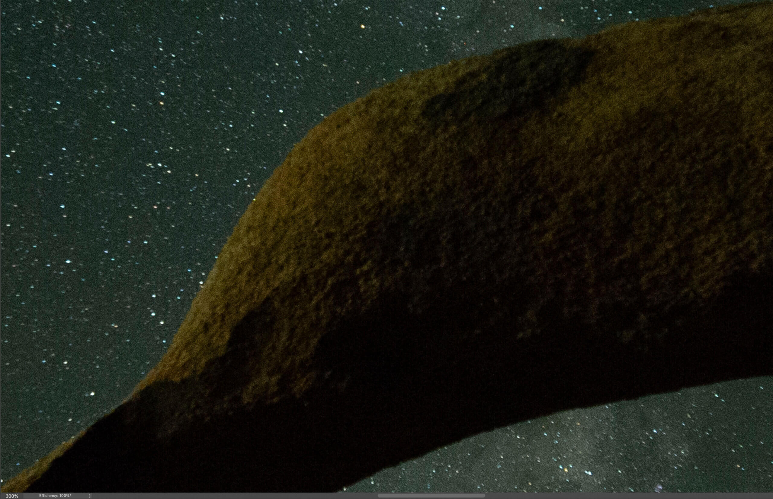
Screenshot of sharpened image, Luminar NEO Medium SuperSharp from a RAW file. 300% magnification.
Screenshot of sharpened image, Luminar NEO Medium Supersharp from a RAW file. 300% magnification.

Full size of the above image.

To try to compare photos to the sharpened ones from Photo AI, I made two different images, one sharpened on a medium setting (above), and one on a high setting (below).

Screenshot of sharpened image, Luminar NEO High SuperSharp from a RAW file. 300% magnification.
Screenshot of sharpened image, Luminar Neo High Supersharp from a RAW file. 300% magnification.

Full size of the above image.

RAW file with no sharpening: Velociraptor sculpture

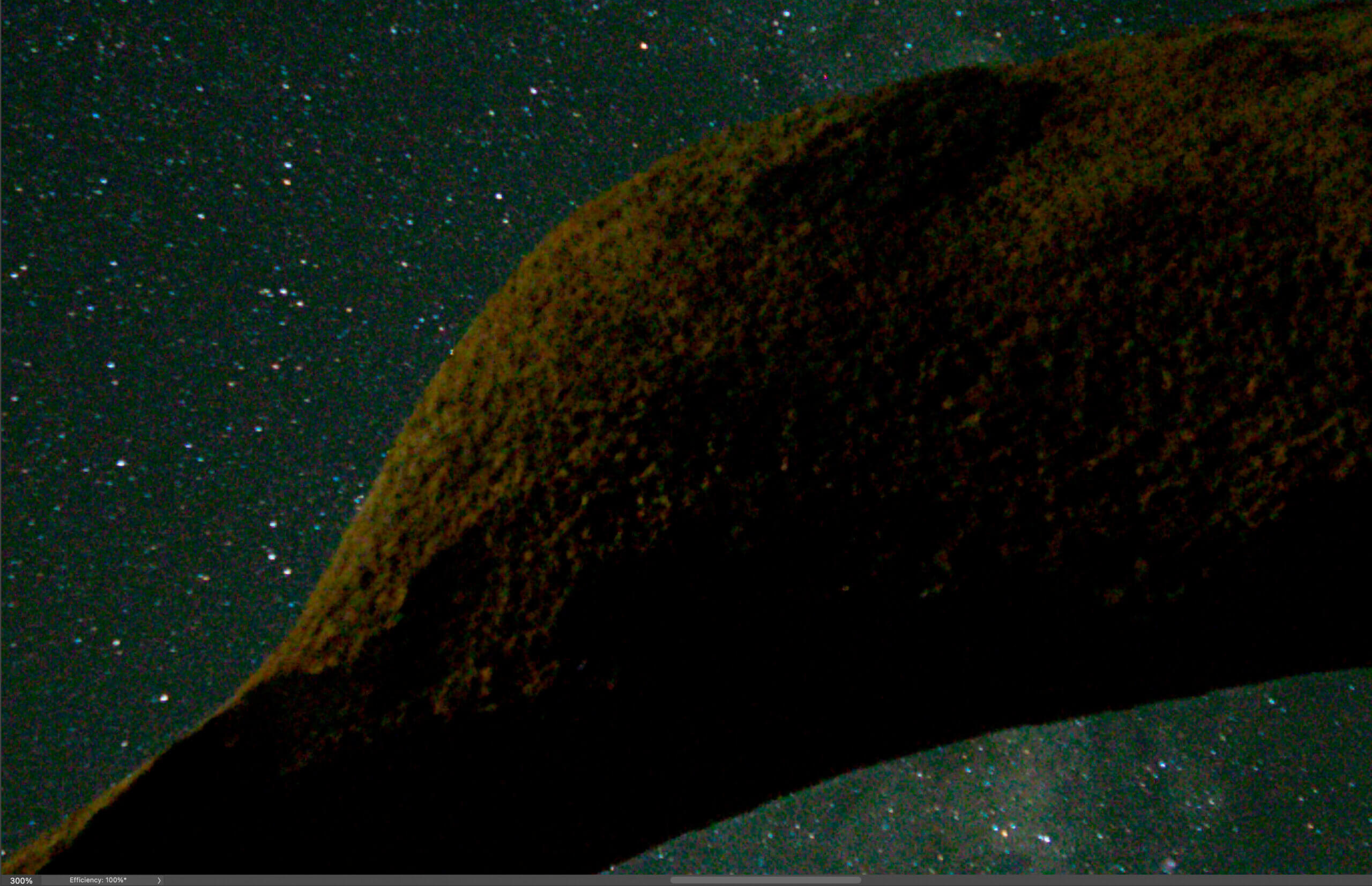
Screenshot of RAW file, unsharpened. 300% magnification.

Full size of the above image.

Results: Topaz Photo AI vs. Luminar Neo Supersharp — Mobius Arch

Here, the results were a little different from the dinosaur sculpture.

Comparisons of the medium sharpening settings: Topaz Photo AI vs. Luminar Neo Supersharp

At the medium settings, Photo AI produced sharper settings while still not having artifacts. However, it also made the sky much darker. This is particularly curious since I had masked the arch so I would only sharpen that.

Comparisons of the strong sharpening settings: Topaz Photo AI vs. Luminar Neo Superharp

At the strong settings, Photo AI produced more detail without too many artifacts. Like the medium settings, it made the sky much darker. And this again with the same mask.

As mentioned before, Photo AI was considerably quicker at processing everything via Autopilot automatically upon loading. This includes applying denoising, and it also includes the mask for sharpening. If you like denoising and sharpening applied easily, Photo AI is pretty great. Luminar Neo, on the other hand, requires that you select SuperSharp, then takes a longer time after you select the amount of sharpening. Then if you want to apply an automatic mask, this also require more processing time. It’s a much slower process.

As you can see, depending on the type of photo and the subject, the results can be very different. If I just do one kind of photo, one software might consistently excel over the other. But when you select different kinds of photos, the choice is not so clear.

Topaz Photo AI 3.0 is here

As I was getting ready to submit this article, Topaz released Photo AI 3.0. 3.0’s new features include presets, flexible ordering of enhancements, panel docking & collapsing, enabling RAW color and lighting adjustments, and more. This new version includes the ability to adjust the color balance and lighting for RAW files as well as denoising. The presets allow you to create various filter combinations and settings. You now can reorder and combine enhancements in any order. But, as previously mentioned, the discussion and comparisons in this article (and the previous Photo AI V2 articles) are still relevant.

Is it ethical to use AI sharpening in genres such as photojournalism?

If you compare the sharpening in general to the RAW files, you’ll notice that the details aren’t identical. And you’ll notice that the details aren’t identical between each sharpening software either. The sharpening software with each of these programs is essentially making an educated guess, based on machine learning, as to what should go there. This approach is considerably more obvious with the Mobius Arch photo, which is why I chose this photo to share with you. There’s more “interpretation” with the texture of the rocks than there is with the better-defined sculpture of the dinosaur.

This raises potentially interesting questions. For instance, should a photojournalist take a photo for a magazine or newspaper, process it with an AI-based sharpening software program, and submit it to news agencies? Is it okay if the software has not changed the texture of the photo? While it certainly is vastly different compared to, say, using generative fill to add elements that were not there, is it still ethical?

When I had my photo in National Geographic Books, I had to submit my RAW file so they could verify that it was indeed a real photo. But not everyone has time to do this, and not everyone has time to pixel-peep all their photos when there are deadlines.

I use AI-based sharpening software, and it rarely changes the texture in a photo. But that’s because almost all my photos are already very sharp and well-defined. Here, though, the Mobius Arch photo is blurry enough that AI sharpening has altered the texture a bit. It’s not enough to get me to stop using it, but I do wonder about how this affects certain genres of photography. Also, I would also think that for photos expressly used for scientific research, you wouldn’t be able to use software like this at all.

Regardless, while it’s hardly perfect, sharpening software already works quite well. And the amazing part is that this technology is still in its infancy. As machine learning progresses, we will see incredible advances in this technology in the coming years.

What is your opinion on using AI sharpening software for genres such as photojournalism? What is your opinions on how well Topaz Photo AI V2 or Luminar Neo SuperSharp sharpen photos right now? Please leave your opinions in the comments!

The legacy and mystery of the display of Native American art at the 1932 Venice Biennale

The legacy and mystery of the display of Native American art at the 1932 Venice Biennale

In December 1931, the Italian commissioner of the 18th Venice Biennale penned a plea to organisers of the United States pavilion, who had yet to fully deliver their vision for the impending international art exhibition. “We should like some of your very great artists like Whistler,” he wrote, “and as for the living ones we should allow a room for [Paul] Manship as Sculptor, and [Maurice Sterne], or some others, as painters.”

The following January—four months before the exhibition’s opening—a reply arrived from New York. It confirmed that the US pavilion would feature, out of four rooms, one devoted to art by Native Americans, among them the Pueblo painters Fred Kabotie and Awa Tsireh. It would include neither Whistlers, nor Homers, nor Sargents—conspicuously setting aside the era’s assumed “great artists” to shine an international spotlight on lesser-known Indigenous names.

The resulting display was historic: it marked the first time that Native American artists represented the United States at the prestigious art exhibition, a distinction that has repeated only this month, with the Chocktow Cherokee artist Jeffrey Gibson’s takeover of the US pavilion at the 60th edition of the Biennale (until 24 November). Yet it has largely been forgotten, according to Jessica L. Horton, a professor of modern and contemporary Native American art at the University of Delaware.

“We are versed in a truism that Native artists have never exhibited in the US pavilion,” she argued in a 2015 paper. That claim was repeated as recently as last year: The New York Times issued a correction to an article that had erased this history, apparently relying on information provided by the commissioners of the 2024 US pavilion.

Installation view of the space in which to place me, Jeffrey Gibson’s exhibition for the United States pavilion at the 60th Venice Biennale, 20 April-24 November 24. At centre: WE HOLD THESE TRUTHS TO BE SELF-EVIDENT, 2024 Photograph by Timothy Schenck.

Today, little information remains about the Native art section of the 1932 pavilion, despite its commissioner, Martin Birnbaum, proclaiming it “the most popular exhibition of the entire display of all the nations”, the Times reported that May. Horton dove into historical archives during a 2011 trip to Venice, where she found the exhibition catalogue listing the participating artists: Ma Pe Wi, Santiago Cruz, Oqwa Pi, Tonita Peña, Awa Tsireh, Julian Martinez, Pen Yo Pin, Tse Ye Mo, Otis Polelonema and Fred Kabotie. Among their contributions, only one painting by Kabotie, Mountain Sheep Dance (undated), was reproduced in the catalogue, which did not include serious discussion of their work, Horton says. Installation photographs revealed that textiles, jewelry and pottery were shown alongside paintings, many of them depicting the motions and rituals of Pueblo dance. Most of their makers, excepting the potters Maria Martinez and Tonita Roybal, remain anonymous. It was “a very ethnographic type of presentation”, Kathleen Ash-Milby, a co-commissioner of Gibson’s 2024 pavilion, told NPR.

Other rooms of the 1932 pavilion featured paintings by non-Native artists including George Bellows, Arthur B. Davis and John Sloan, who is credited with assembling the Native art selection. Sloan had once described Pueblo watercolours as “the only 100% American art produced in this country”, and in 1931 had co-organised The Exposition of Indian Tribal Arts, a blockbuster touring exhibition of Native objects and paintings. Due to its success, a large selection of the works from that show were sent to Venice.

‘Aesthetic nationalism’

“His whole argument rested on Native art offering a modern aesthetic with ancient roots on the continent,” Horton tells The Art Newspaper. Contemporaneous reports affirmed this sentiment: responding to the 1931 exposition in a WOR radio broadcast, the critic and collector Christian Brinton claimed Native art “as an artistic treasury not only older but fresher and purer than anything Europe has to offer”. A Times headline announcing “Venice to exhibit art of Americans” was accompanied by the subheading: “An entire gallery to be given over to work of Indians.”

But this “export of aesthetic nationalism” to Venice, Horton argues, resulted in what she calls the pavilion’s ultimate “malfunction” as conflicting values came to the fore.

“There’s always been this complexity around who [Native artists] represent when we try to nationalise art, and that came out really clearly in the competing nationalisms on both sides of the Atlantic in the 1930s,” she says. “That made it hard for the organisers of the pavilion to swallow this choice, that Native artists could represent the United States as the nation’s great artists. Not everyone was ready to get on board with that, and so it was not claimed proudly by the organisers as a success.”

In her research, she details how Birnbaum slighted the pavilion in his introduction to the catalogue, suggesting that the country’s “truly outstanding works” were absent. Organisers also found the press response, which overwhelmingly failed to mention in detail the Native artists, disappointing. “They determine that this was a failure of representation,” Horton says.

Such transatlantic exhibitions of Native American art were not infrequent in the 1920s and 30s, reflecting collectors’ and patrons’ burgeoning interest in the Santa Fe market in particular. Most of the work was made by Native artists for consumption beyond their communities, with the knowledge that their art might travel. However, it was not often that overseas exhibitions, like the US pavilion show at the 1932 Venice Biennale, parsed the full complexities of artists’ visual and cultural choices, especially given that artistic merit was evaluated through a Western lens and by Eurocentric standards.

Radical for its time

Still, Horton says it would be a simplification to attribute the diminished legacy of the 1932 pavilion to a failure of well-intentioned white patrons to properly contextualise the work. “Sloan was doing something politically radical for his moment,” she says. “Within the cultural politics of the moment—especially in the 1920s, when Native American dancing was outlawed—just to be a champion of Native art and culture was a fairly radical decision to make as a white person circling in elite East Coast circles.”

The historical record further illuminates how the 1932 pavilion faded from dominant narratives. There is surprisingly little scholarship on the display despite its import. The whereabouts of many works in Sloan’s selection are unknown; due to the scarcity of information in the catalogue, Horton was able to locate only Kabotie’s paintings Mountain Sheep Dance and Snake Dance (around 1930) in the collection of the Smithsonian’s National Museum of the American Indian. Tonita Peña’s painting Basket Dance was later acquired by the Whitney Museum of American Art for $225.87—setting a record for the highest price paid for a Pueblo painting at the time. But Basket Dance has since disappeared from the Whitney’s collection, along with all related records.

Much has evolved in the ways institutions curate and care for Native contemporary art. But the US pavilion at the 1932 Biennale highlights complexities in the field that are unchanging and ever important, around notions of sovereignty, citizenship, rights and representation.

“Native American art didn’t fit that paradigm [of nationalism] neatly or clearly in the 1930s, any more than it does today,” Horton says. “The fact that it’s taken this long for a Native artist to again be invited into that position speaks to some real ambivalence, politically, around where art and sovereignty intersect.”

Steamroller Print Event

Steamroller Print Event
RMCAD is proud to host students, artists and the community to come together in a cooperative event to celebrate the art of printmaking!

Brazilian photographer Sebastiao Salgado is known in particular for his work in the Amazon

Brazilian photographer Sebastiao Salgado is known in particular for his work in the Amazon

Keep it Clean. Please avoid obscene, vulgar, lewd,
racist or sexually-oriented language.
PLEASE TURN OFF YOUR CAPS LOCK.
Don’t Threaten. Threats of harming another
person will not be tolerated.
Be Truthful. Don’t knowingly lie about anyone
or anything.
Be Nice. No racism, sexism or any sort of -ism
that is degrading to another person.
Be Proactive. Use the ‘Report’ link on
each comment to let us know of abusive posts.
Share with Us. We’d love to hear eyewitness
accounts, the history behind an article.

Tali Weinberg Entwines Human and Ecological Health with Climate Data Sculptures

Tali Weinberg Entwines Human and Ecological Health with Climate Data Sculptures

Detail of “Bound (1.6).” All images © Tali Weinberg, shared with permission

Anyone who’s tried to untangle a ball of yarn understands that fibers have a habit of knotting in ways that can seem impossible to unwind. These twisting, interlaced qualities ground much of Tali Weinberg’s fiber-based work as she pulls at the individual threads of our changing climate, using abstract weavings and textile sculptures to explore the inextricable nature of the crisis and the necessity for human intervention.

The Illinois-based artist begins with data from the National Oceanic and Atmospheric Administration that she translates into visual works using organic and synthetic materials. “These weavings and coiled sculptures are not data visualizations,” Weinberg notes. “Rather, I use the data as a scaffold, choosing materials, patterns, and colors to evoke places and add the social-political dimensions of the climate crisis back into the story the data tells.”


red, pink, brown, and other colored threads wrap around tubes suspended from a bar as a tapestry

Installation view of “Heat Waves/Water Falls” (2023)

“Heat Waves/Water Falls,” for example, wraps naturally dyed cotton threads around plastic medical tubing, which dangles from a horizontal pole. Made during 2023, the hottest year on record, the sculpture incorporates the annual average temperatures for 18 major river basins in the continental U.S., data that corresponds to the thread colors. It also tethers environmental health to that of people. The artist elaborates:

As the pollution from human life on land runs downstream, watersheds become one window into the interdependence of ecological and human health. While the plastic medical tubing is an expression of the buildup of toxic plastics in our bodies and waterways, wrapping and bundling these tubes by hand becomes an expression of care for our interconnected lives.

“Heat Waves/Water Falls” is one of about 30 works on view at Denver Botanic Gardens for Weinberg’s solo show, The Space Between Threads. The exhibition focuses on the ongoing Climate Datascapes series, which she began in 2015 to better understand the climate crisis and to add an emotional, embodied tenor to sterile, even abstract science. Today, Weinberg considers the series a way of “seeking out and re-weaving otherwise obscured relationships—relationships between climate change, water, extractive industry, illness, and displacement; between disparate places; between personal and communal loss; between corporeal and ecological bodies; and between art, science, and social change.”

If you’re in Denver, you can see The Space Between Threads through June 9. Find more from Weinberg on Instagram. You might also enjoy The Tempestry Project.


pink, beige, and brown threads wrap around tubes and dangle down

“Heat Waves/Water Falls” (2023)

a pink and yellow tapestry hangs from the ceiling

“Heat Waves” (2023)

a square woven tapestry with striped colors

“Silt Study: Lower Mississippi River Basin” (2021)

a detail of woven threads in stripes of green, pink, yellow, and gray

Detail of “Silt Study: Arkansas White River Basin” (2021)

curling fiber-covered tubes sit on a pedestal in the center of a gallery with square tapestries in grids on the surrounding walls

Installation view at Denver Botanic Gardens. Left wall: “Silt Studies” (2021). Back wall: “Fissures” (2018). Pedestal: “Bound (1.6)” (2017-2024)

Do stories and artists like this matter to you? Become a Colossal Member today and support independent arts publishing for as little as $5 per month. The article Tali Weinberg Entwines Human and Ecological Health with Climate Data Sculptures appeared first on Colossal.

Intimate Photos of Kurt Cobain and Courtney Love’s Family in the 90s

Intimate Photos of Kurt Cobain and Courtney Love’s Family in the 90s
Black and white image of Courtney Love and Kurt Cobain

This post may contain affiliate links. If you make a purchase, My Modern Met may earn an affiliate commission. Please read our disclosure for more info.

In the 30 years that have passed since Kurt Cobain’s death, the myth around him has only grown. Regarded as a genius musician and a misunderstood artist, many forget about the real man behind the success of Nirvana. One of the most revealing displays of this was a 1992 photoshoot by husband-and-wife photography duo Russell Peacock and Constance Hansen—together known as Guzman—who captured Cobain, his wife Courtney Love, and their daughter, Frances Bean, in the intimacy of their home. Now, powerHouse Books will publish a new book featuring never-before-seen images from this shoot.

In 1992, Kurt Cobain and Courtney Love were at the height of their fame. They were the leads in two of the biggest rock bands in the world; he was in Nirvana, while she was in Hole. Hoping to share a different, more domestic side to them, Spin magazine tasked Guzman with shooting a cover story. And so, the couple made their way to the musicians’ home in Hollywood.

However, the shoot didn’t go according to plan. The hair and make-up team were asked to leave for bringing up the negative press, and Cobain just wouldn’t get ready or leave the bed. Rather than call it off, the photographers made their way to the bedroom, and took the images there. The photographers later admitted this was what they were hoping for. By capturing them in their pajamas while playing with their daughter, they showed an opposite perspective to the rockstar lifestyle they both led.

Five images taken that day were published in the December edition of Spin, which celebrated the year in music. The now-iconic cover sees Cobain in bed, carrying his daughter in one arm while Love rests on his other shoulder. The story was titled “Family Values”—a name shared with the new photography book that will include all 90 images from the shoot; as well as two essays from Michael Azerrad, author of Come As You Are: The Story of Nirvana and a friend of Cobain; and Guzman, who tells the story behind these images.

“Kurt Cobain and Courtney Love picked a heck of a time to have a baby,” writes Azerrad. “Their daughter Frances was born on August 18th, 1992, the day before the 1992 Republican National Convention’s ‘family values night.’ The Republican Party was hell-bent on denouncing heathen libertines, a.k.a. Democrats, and so ‘family values,’ wrote The New York Times columnist William Safire, became ‘the G.O.P.’s political attack phrase.’”

But the conclusion hits closer to home. “There are many good ways to be a family,” reflects the author. “In 1992, that was a difficult thing for some people to get their heads around, and it still is. But, as these very moving photographs demonstrate, there is only one true family value, and that is love.”

Family Values: Kurt, Courtney & Frances Bean comes out June 4, 2024. You can preorder a copy on Bookshop and Amazon.

PowerHouse Books will publish a new book featuring never-before-seen images of Kurt Cobain and Courtney Love’s family life.

Kurt Cobain, Courtney Love, and daughter Frances Bean

Kurt Cobain, Courtney Love, and daughter Frances Bean

The 1992 images were taken by husband-and-wife photography duo Guzman, who captured Cobain, Love, and their daughter, Frances Bean, in the intimacy of their home.

Black and White image of Kurt Cobain holding daughter Frances Bean next to Courtney Love

Black and White image of Kurt Cobain holding daughter Frances Bean next to Courtney Love

Five images taken that day were published in the December edition of Spin, but the new book will feature all 90 of them.

Black and White image of Kurt Cobain

Black and White image of Kurt Cobain

By capturing Cobain and Love in their pajamas while playing with their daughter, Guzman showed an opposite perspective to the rockstar lifestyle they both led.

Courtney Love and daughter Frances Bean

Courtney Love and daughter Frances Bean

Black and white image of Courtney Love

Black and white image of Courtney Love

Kurt Cobain, Courtney Love, and daughter Frances Bean in bed

Kurt Cobain, Courtney Love, and daughter Frances Bean in bed

powerHouse Books: Website

My Modern Met granted permission to feature photos by powerHouse Books.

Related Articles:

Book Reveals Hundreds of Frida Kahlo’s Fascinating Personal Photography Collection

Paul McCartney’s Photos Documenting The Beatles’ Rise to Stardom Coming to the Brooklyn Museum

Photography Collective Highlights Washington State’s Beautiful Vistas in New Book

Artist Paints Blue Portraits To Celebrate the Legacy of Hispanic Artists and Pop Culture Legends

Still Photography is Focus of New May AC

Still Photography is Focus of New May AC

Our May 2024 issue of American Cinematographer presents a special focus on ASC members’ still photography; coverage of the nominees for the inaugural ASC Music Video Award; a photographic recap of the 38th Annual ASC Awards; and a look at the art of on-set still photography.

image
On Our Cover: Bike (2023), depicts “reflections at dawn on the Gulf of Mexico,” says the photographer, Mark Vargo, ASC.

Inside:

President’s Desk: ASC President Shelly Johnson discusses ways in which still photography has informed his work ethic and instincts.

AC presents three galleries of Society members’ still photography: People, Places and Still Life.

image

image
image

Cinematographers Jon Joffin, ASC; Scott Cunningham, ASC; and Andrey Nikolaev discuss working on their ASC Award-nominated music videos: Jon Bryant’s “At Home” (Joffin), Little Simz’s “Gorilla” (Cunningham) and Cassie Marin’s “Tanto” (Nikolaev).

A photoessay celebrating the 38th Annual ASC Awards shines a light on a festive weekend.

Shot Craft: A look at the skills and approaches that help create good set photography, including examples and tips.

image
Autumn Durald Arkapaw, ASC plans a shot with actor Winston Duke on the set of Black Panther: Wakanda Forever (AC Dec. ’22).

Wrap Shot: Threshold, a still by Alice Brooks, ASC.

Our print and digital subscribers will be receiving this issue soon.

Not an AC subscriber yet? Do it today.